Banner ads remain a powerful tool to capture the attention of prospects, especially in today’s competitive digital landscape. But what makes a banner genuinely effective? Here are ten examples of websites that mastered the art of banner advertising. Let’s dive deep into what works so you can apply these insights to your own brand.
Table of Contents
- Citibank
- Disney+
- Amazon Web Services (AWS)
- TestRail
- AARP
- Samsung
- The New Yorker
- Starbucks
- Mailchimp
- Petco
1. Citibank

With its minimalistic design, this Citibank banner ad may seem vague, giving an air of mystery. Its lack of information may also be confusing, yet it is very intriguing, making the viewers want to learn more. Its call-to-action button is highlighted well with its black box and white font; you’re sure it’s not going to be missed. It has more space than design elements, which is proof that you don’t need ornate designs to make your website banner ad stand out.
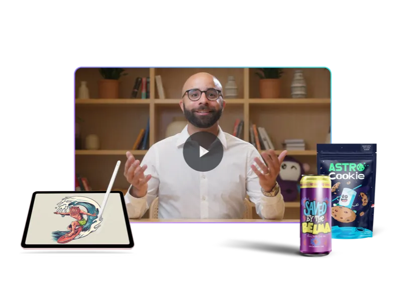
Boost your business with unlimited website banner designs
Outsource all your design needs to the pros

2. Disney+

Whether you’re a Star Wars fan or not, this website banner ad of Disney+ is sure to pique any movie buff’s attention. Its free trial CTA is enough to hook in viewers, more so with the image of the Mandalorian looking ready for battle. And since Disney+ is the sole owner of this franchise, this can be an enticing ploy to get more viewers, thanks to its exclusivity. It has negative space all around, adding to the mystery and intrigue,
3. Amazon Web Services (AWS)

This web banner example from Amazon is enough to surprise anyone, as this big brand seems successful even without the help of advertising. Amazon Web Services still needs to prove itself, if only to emphasize that it is the best cloud to run Windows. It included its bragging rights with statistics to show it means business. Design-wise, it looks innovative, trendy, and modern, perfectly illustrating the brand’s use of cutting-edge technology and placing it at the forefront of innovation.
4. TestRail

This web banner example from TestRail uses a clear, professional layout and is noteworthy for anyone looking to craft effective web banner designs. Its font pairings and minimal colors create a design that leads the eyes to where they should go. The use of a plain background helps keep the viewers’ focus on the text. The CTA button encourages user interaction, with the 14-day trial written in big letters to reel in prospects looking for a bargain.
5. AARP

For a more dynamic approach to website banner ads, you can copy what AARP did. It used GIFs that flash four different images showing more information about the brand. Each image has CTA buttons and the brand name proudly displayed at the top. This offers you options to add more elements without cluttering the design and overwhelming your viewers. Plus, it can catch attention better than static banner ads, as it flashes in white and red boxes. Also, the upright rectangle is an excellent turn from the usual horizontal positioning of website banner ads.
6. Samsung

An excellent technique to keep in mind when designing your website banner ads is to use as few design elements as possible. This helps avoid inundating the viewers with too much information, making them want to escape from you as soon as possible. This website banner ad from Samsung is the perfect example of this. It uses very few fonts and images, using only three-word sentences that define its message, and it does so exceptionally clearly. The pink flower on the laptop monitor gets the viewers’ focus on the product they are selling.
7. The New Yorker

As mentioned above, website banners must be concise and free from clutter. This design from The New Yorker is another excellent example of a simple yet impactful web banner. Its light color is powerful when placed on either a white or colored background. The image of the woman looks in sync with the brand’s vintage appeal. Lastly, the limited-time offer and free tote are hooks that are sure to get everyone interested.
8. Starbucks

Colors are effective tools in conveying a message, especially when the space you’re using is constrained. This website banner ad from Starbucks has a predominantly pink color scheme, emphasizing its seasonal offering. It can quickly grab attention as it is a bright shade of pink with green accents. Its glitter effects add a touch of festivity that suits the ad quite well. The fonts are basic, making them easy to read and understand, an essential factor in website banner ads. This proves that sans-serif fonts are the top choice when creating website banner ads.
9. Mailchimp

Using its brand color, Mailchimp stands out like a sore thumb with this web banner design example. And that is precisely what you need to achieve: to overcome all the online noise and let viewers see your brand above all else. While the brand name is on a small corner of the ad, the text “You’re ready to grow. Now what?” more than makes up for its diminutive size. It has two CTA buttons to ensure the viewers will never get lost. Its use of a witty illustration of a man’s legs is a perfect addition to make this ad as lively and as dynamic as possible.
10. Petco

Who doesn’t like free stuff? This is what Petco was thinking when it designed this website banner ad. It offers free shipping while adding the logo of one of the brands it carries. This is an excellent design as it targets pet owners looking to take care of their pets while getting discounts and freebies. It uses a blue color scheme to match its brand identity. The splash of red adds interest to the design. The white fonts go well with the colors, making the information easy on the eyes.
Final Thoughts
These websites with banner ads effectively get their message across using a variety of creative ways. These brands all have one thing in common: simplicity and readability. These are the most crucial factors you need to take into consideration when crafting your own.
Of course, you can always turn to the pros to get your website banner ads. Click here to start working with Penji and our talented designers.
Solve Your Design Dilemma for Good
Try Penji risk-free for 30 days & get all the custom designs you need


About the author

Celeste Zosimo
Celeste is a former traditional animator and now an SEO content writer specializing in graphic design and marketing topics. When she's not writing or ranking her articles, she's being bossed around by her cat and two dogs.