Billboard graphic design can play an important role in any ad campaign. It’s the process of creating visuals that are meant to be displayed on a billboard or other large format media. This type of design requires creative and technical skills, as well as knowledge of marketing and communication principles. The goal of billboard graphic design is to create an eye-catching, attention-grabbing visual that will draw the attention of potential customers. With the help of a skilled designer, businesses can create visuals that will help them reach their target audience more effectively.
If you’re going to invest in a billboard, you might as well do it right. In this post, we explore what makes a brilliant billboard ad with examples.
1. Tell a story.
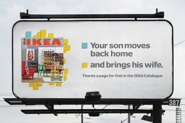
We don’t always remember facts, but humans remember stories. So, think of what you want drivers to take away from your billboard. For example, do you want them to purchase tickets to an event? Stop at the next exit for tacos? Or call a certain lawyer if they need legal advice?
To identify your story, take your key message and add value by solving a problem, being the source of enjoyment, evoking an emotion, or fulfilling a need. For example:
- Your New Year’s Eve party will be the biggest in town, and if people attend they’ll have fun and feel good about starting the new year.
- Your tacos are delicious and affordable and service is quick, so people will be able to improve their day without paying much or wasting time.
- You can offer valuable legal representation and offer solutions to people who are feeling lost, confused and scared.
Because billboards are visual, you have to convey your story in a compelling way using images and words to an audience who is driving down a highway. In other words, billboard graphic design is not easy!
2. Follow the seven word rule.
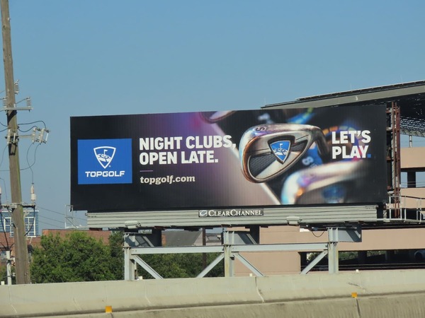
The widely accepted best practice for billboard text is to keep it to seven words or less. Research has shown that people “look at” signs rather than read them, and only have time to see and comprehend seven words when moving at a high rate of speed.
You’ll want a clever, quick play on words or even a rhyme to make your message memorable. The seven words also include the call to action, exit number, dates, or anything else you need to say.
3. Make the call to action prominent.
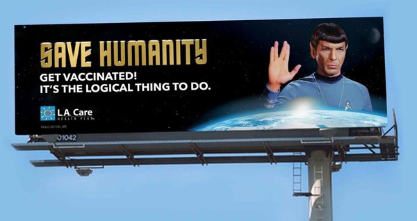
Your call to action is the end objective. It’s what you’re persuading people to do through your ad – visit a website, call to make an appointment, make a purchase during a sale. So, leading with your call to action is a smart, simple, powerful way to make the most of the space you have.
4. Make it bold and colorful.
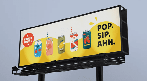
When it comes to billboard graphic design, your goal should be to make it readable from as far away as possible. It has to pop in terms of text and color. Avoid cursive or decorative fonts; sans serif fonts are what you want. The words should be large and the font should be bold and straight. Also, make sure there is enough space between the letters, words and lines.
In terms of color, choose contrasting shades to make it as readable as possible. The best color combinations include black, white and a vibrant primary color like blue or yellow; and black text on yellow. Avoid pastels and earth tones in this situation.
5. Work the location into your ad concept.
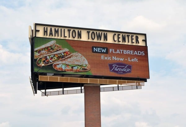
A unique aspect of billboard graphic design is that you can creatively acknowledge what the people looking at it are experiencing at the time. Taking this approach will help to make your billboard visually memorable.
For example, if your billboard is on a highway known for its leavy traffic, you can suggest that people remedy the stress of sitting in traffic by getting off at the next exit and eating at your restaurant. Or, if your ad is going up in the historical section of Philadelphia, for instance, you could make a playful comment about the Founding Fathers.
6. Think carefully about including a phone number.

As we mentioned, you want to keep your billboard’s word count to seven, so it’s important to be strategic about what to include. Putting a phone number into a digital ad makes perfect sense, but giving your phone number to drivers whipping down the highway might not be the best use of space.
However, if you have a custom phone number that’s easy to remember, like 888-TACOLADY,, definitely use it in your billboard graphic design. Businesses that don’t have a catchy phone number are better off using your billboard to make your brand as memorable as possible. People can then use Google to find your contact information.
7. Ensure that your billboard aligns with your other advertising.
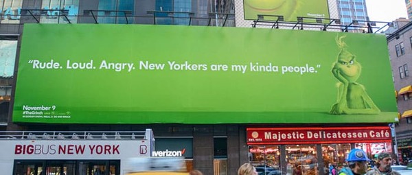
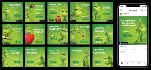
The best way to get results from your billboard is to make it part of a larger ad campaign. If people see similar messaging in several different places, it will become more memorable. You can reinforce consistent messaging across several platforms, including paid social and paid search ads and other traditional forms of advertising, such as print.
The key is to make sure the campaign ad designs are all cohesive. You’ll need to take into account how your campaign would translate into a billboard graphic design to maximize its impact.
8. Consider your logo.
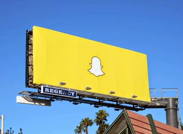
To build as much brand recognition as possible, you should include your logo on your billboard. An even smarter approach is to incorporate your logo’s colors and/or other elements to create a cohesive look. Make sure your logo doesn’t get lost, though. The idea is to have it stand out while also looking like it belongs.
Get unlimited graphic design for any format
Did you know you can get unlimited graphic designs for any format without having to hire a full-time designer (or deal with unreliable freelancers)?
- billboards
- social posts
- product packaging
- branding
- digital ads
- merchandise
- and much more
About the author
Table of Contents
- 1. Tell a story.
- 2. Follow the seven word rule.
- 3. Make the call to action prominent.
- 4. Make it bold and colorful.
- 5. Work the location into your ad concept.
- 6. Think carefully about including a phone number.
- 7. Ensure that your billboard aligns with your other advertising.
- 8. Consider your logo.
- Get unlimited graphic design for any format


