
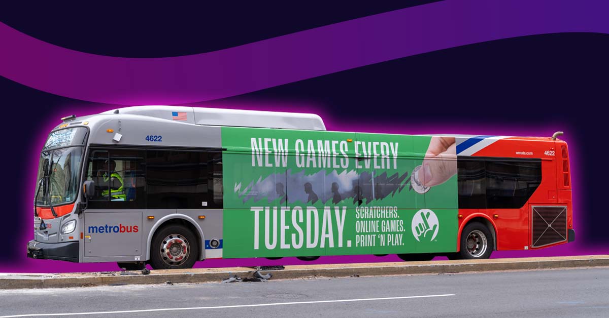
Every business has been there; stumped over how to design an advertisement. When it comes to ads on buses, things get even more complicated. Unlike your typical billboard or poster, buses have moving parts, windows, lights, and doors to keep in mind. It isn’t a simple rectangular canvas.
What if we told you, however, that these things can be used to your benefit? Or what if we told you that, despite its complications, ads on buses offer a more creative avenue to promote your brand? With public transportation, the possibilities are endless. To provide some inspiration, we’ve gathered 13 ads on buses. Here, you’ll learn exactly how they’ve gained success.
13. Adobe
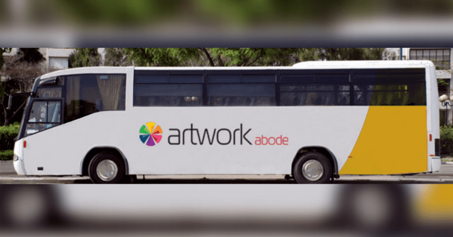
Let’s start with this Adobe advertisement. This one may seem rather simple at first. In fact, it is simple. This bus ad displays a clean-looking website logo, with a color wheel beside it. A little pop of yellow, and red typography to catch your attention. Sometimes, less is more. In this case, adobe does a pleasant job of promoting brand loyalty.
12. Ready To Quit?
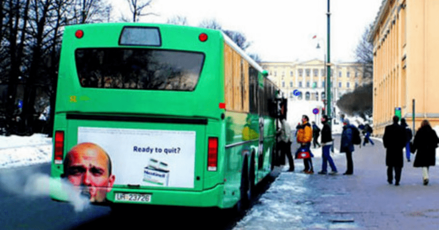
Of course, not all great ads on buses need a full wrap. This anti-smoking ad does wonders with its intelligent placement. Despite being of lower cost, the creative imagery is enough to stop traffic. The quick question works as a call to action that speaks volumes to people addicted to tobacco.
[in_content_ads gallery=”logos” logo=”on” title=”Need graphic design help?” subtitle=”Try Penji’s Unlimited Graphic Design and get all your branding, digital, print, and UXUI designs done in one place.” btntext=”Learn More” btnlink=”https://penji.co”]
11. Mentos
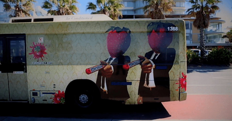
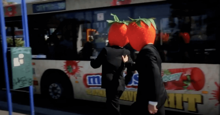
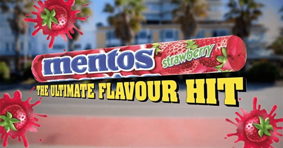
Do you recall those crazy mentos commercials featuring these strawberry hitmen? Well, even if you don’t, these images are sure to inspire you. Shown in one of Mentos’ promotional videos, this bus ad uses mascot recognition and humor. It helps bring awareness to their newest flavor at the time. From multiple viewpoints, you could see the logo in bold letters.
10. Pepsi
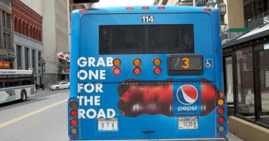
This ad may seem minuscule as well, but ads on buses aren’t always about the dazzling special effects. Sometimes, all it takes is a good catchphrase to influence a buyer’s decision. This statement cheekily acknowledges its status as a mobile advertisement. It knows that if it has a viewer, then that person is likely on the road.
Relatability goes a long way. And so does the image of a large, appetizing soda bottle.
9. This Dramatic Hell on Wheels Bus
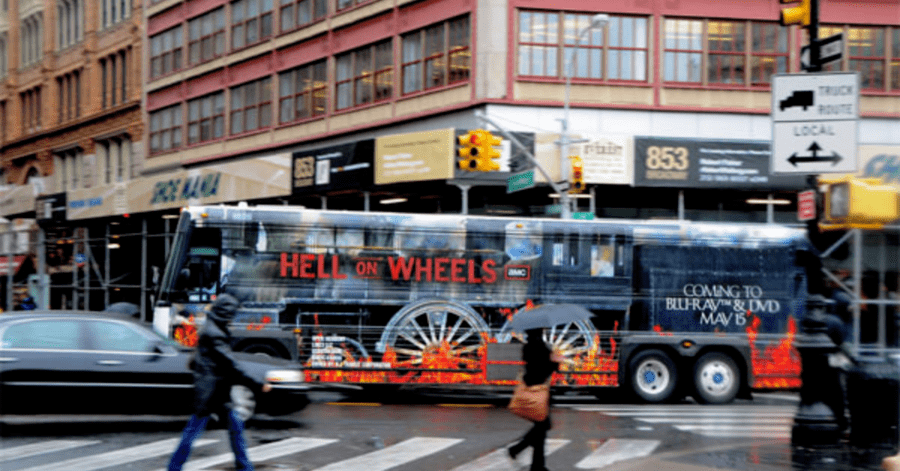
In efforts to promote their BluRay and DVD sales, the western period drama, Hell on Wheels, decided to use transportation. This image uses the bus’ wheels to its advantage, sporting flames near the bottom to alert any onlookers. The advertisement does a great job of setting the tone of the show while giving a subtle call to action.
8. The Perfect Match
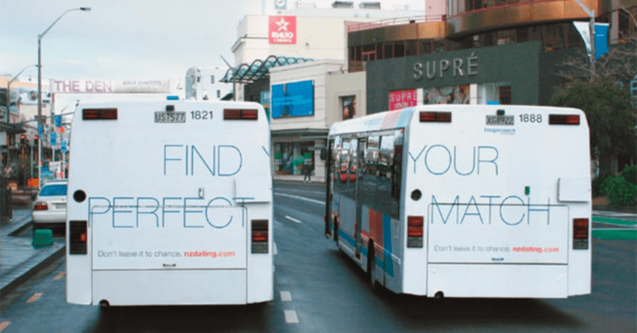
This advertisement creatively uses two buses to promote a dating website. By themselves, they get a message across that while looking incomplete and mysterious. When the two buses come together, they form a perfect sentence. Both buses still contain the same quick catchphrase to give viewers more context.
This design is best used on buses that take similar routes, and are likely to drive near each other. To execute this plan, advertisers must research bus schedules and locations
7. Don’t Jump.
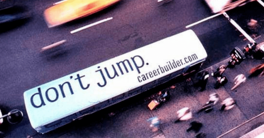
It’s no secret that unemployment affects many people. For some, it is hard to go through life without thinking of drastic alternatives. This simple, but effective ad lets people know that there are resources to help them get on the right track. It can not only be seen from the top of a tall building. People looking down from a window may be able to see this as well. It raises awareness for an important issue while displaying a quick call to action.
6. A Super Bendy Toothbrush
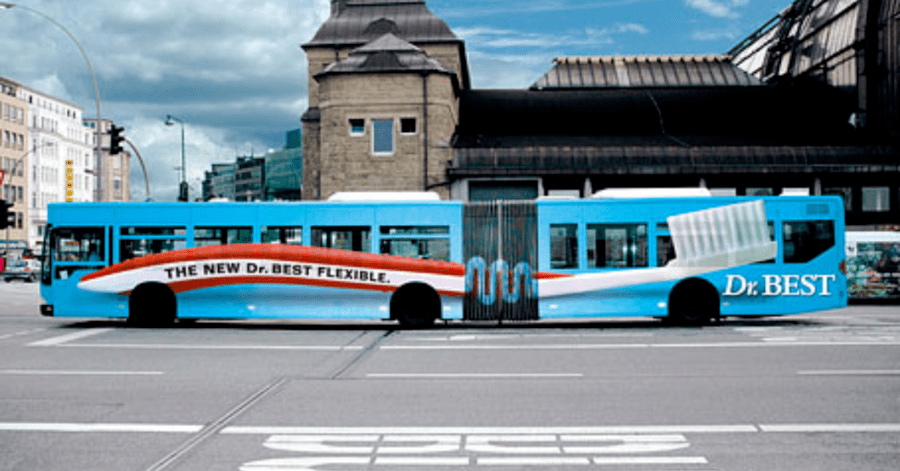
This toothbrush advertisement makes clever use of the pivoting joint. Viewers of the ad know exactly what the product is, and how it can benefit them. The two primary colors, red and blue, draw attention, while the bold catchphrase keeps people hooked. Of course, no bus advertisement is complete without a company logo to promote brand awareness.
5. National Geographic’s Shark Ad
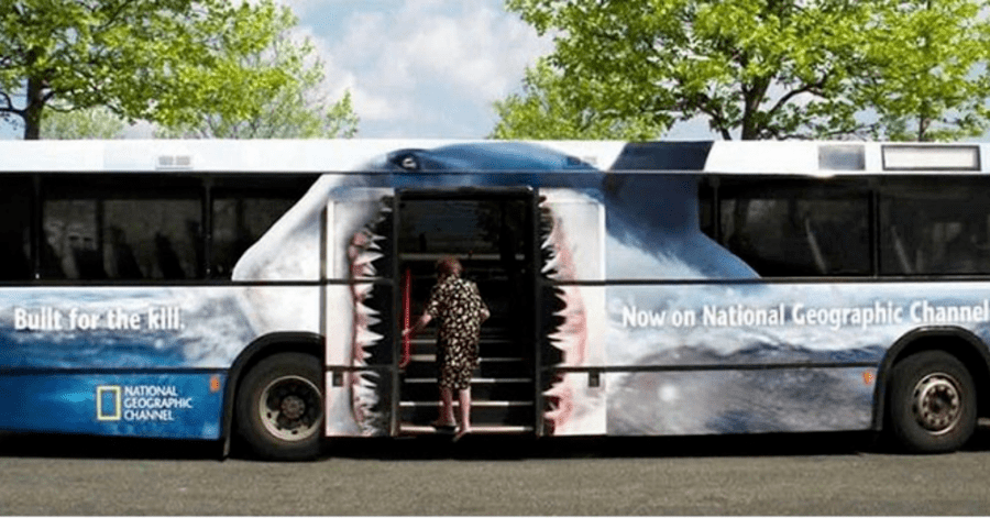
Not only is this an ad on the bus, but it’s also an interactive ad. The National Geographic ad uses the bus doors to its advantage. As a passenger walks in to take their seat, they appear to be getting eaten by a giant shark. The channel’s logo is in clear view without being invasive.
As this shark draws attention to itself, more people become intrigued by what National Geographic has to say about it. No wonder it’s one of the most recognizable documentary channels.
4. Air India Express
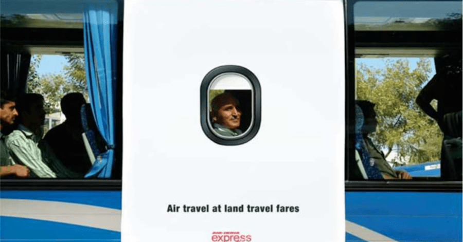
Here’s another conveniently placed ad. It draws attention by purposely looking out of place, then hooking you in with that one sentence. The catchphrase is simple, easy to understand, and offers something beneficial to the viewer. Who doesn’t want air travel at land travel fares? After taking in the ad’s initial absurdity, many viewers are likely to rush to their phones and search up Air India Express.
3. A Perplexing Zoo Advertisement
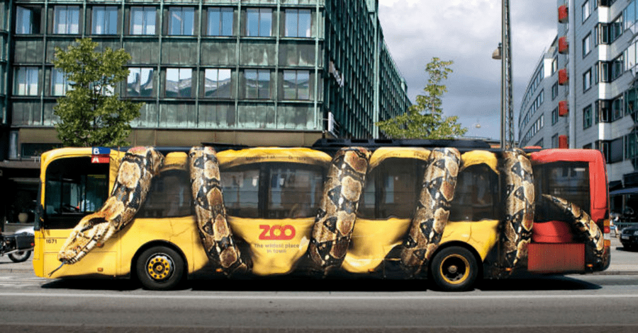
This zoo advertisement makes a huge impact with its use of illusion. From afar, the bus looks as if it’s being suffocated by a giant snake. You can clearly see the detail in the snake’s pattern, as well as the use of two primary colors. This draws so much attention from the human eye, that it’s nearly impossible to look away.
Despite being rather small, the logo is printed with clear, bold letters. It’s such a captivating way to achieve brand awareness.
2. Stranger Things
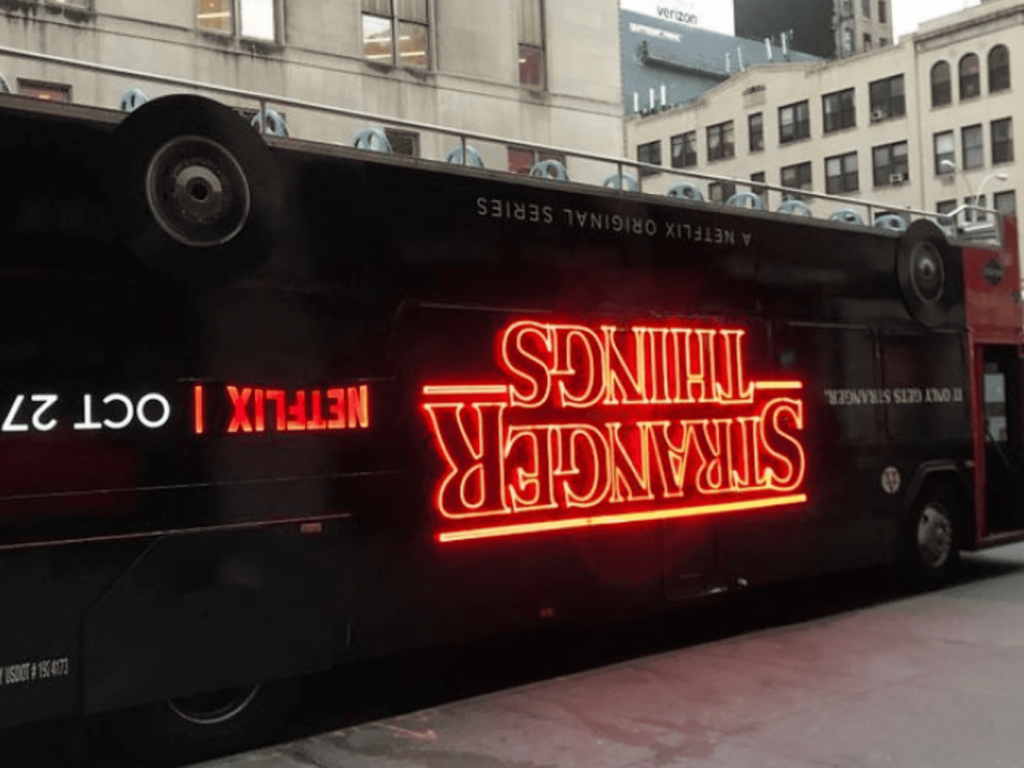
Stranger Things is one of the greatest mystery shows on television. To increase the loyalty of their fanbase, the show crafted an ad that was just as intriguing as their episodes. What looks to be an upside-down bus indicates that this show will have you on your toes, questioning everything.
This ad also indicates the importance of logo design. No matter where it’s placed, the Stranger Things font always has an ominous “glowing” effect. When paired with the color red, it becomes eye candy.
1. Disney’s Aladdin
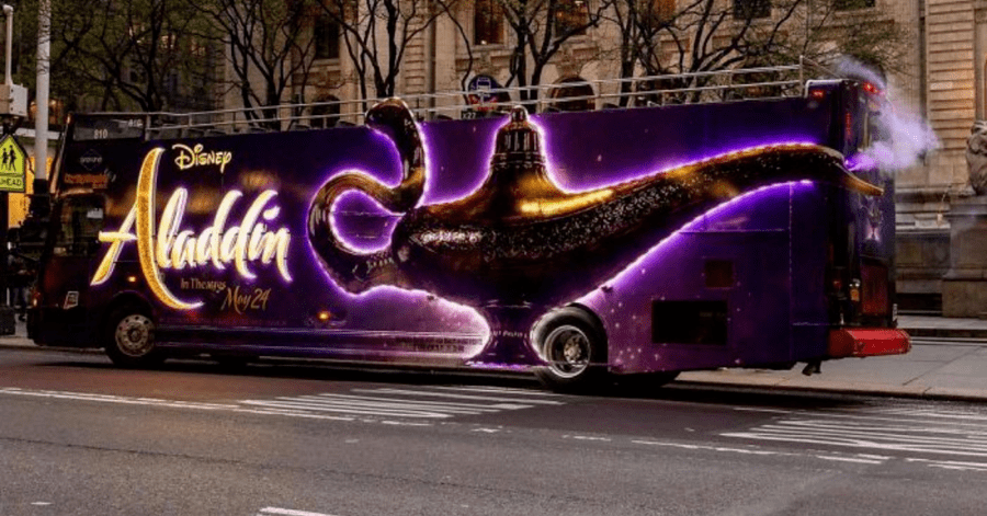
In the mood for something magical? Then look no further than this ad for the Aladdin live-action movie. Due to being a use corporation, Disney uses brand recognition to get ahead. This is why the title is half as huge as the lamp itself. Disney is also aware that by slapping their logo on every ad, they gain more traction for their other products.
Aside from that, the ad makes fantastic use of the bus’ functions. The lamp is placed intelligently; looking as though the smoke is coming out of it. The complimentary colors, purple and yellow, are paired with multiple light sources. This makes the ad visible at all times of the day.


