
Whilst waiting for the bus, we’ve all stared at the nearest advertisement in boredom. Occasionally it’ll be interesting or some kind of artist impression. Though most ads are just plain boring.
So, what if you’re an advertiser wanting to know how to create effective bus stop ads? With so many people waiting for the bus every single day, there’s no denying that it’s one of the most efficient ways to reach the public. For your business to get noticed by hundreds or even thousands of people, you must learn from the experts.
Here are 13 bus stop ads to make your audience’s wait worthwhile.
13. Zing. Pop. Boom.
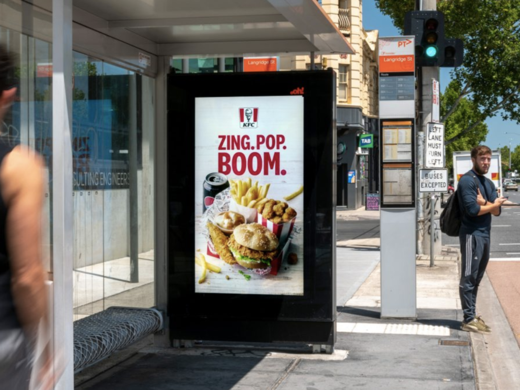
Advertising any kind of food it’s going to be tricky. There’s only so much you can do with just high-quality and detailed photographs. That’s why catchphrases are so important in the restaurant industry. KFC uses a simple set of words to stimulate the sound of cooking. And after everything is complete, your platter is expected to look like it this; lying out on the table for you and ready to eat.
12. Smash Speciesism

Now, I hate to ruin your appetite, but here’s a rather heart-wrenching bus stop ad. This advertisement is ridiculously powerful in both its imagery and call to action. It displays the realities of where your food comes from. It also presents a solution; a call to stop seeing animals as less than humans.
[in_content_ads gallery=”logos” logo=”on” title=”Need graphic design help?” subtitle=”Try Penji’s Unlimited Graphic Design and get all your branding, digital, print, and UXUI designs done in one place.” btntext=”Learn More” btnlink=”https://penji.co”]
11. Simple, But Unique.
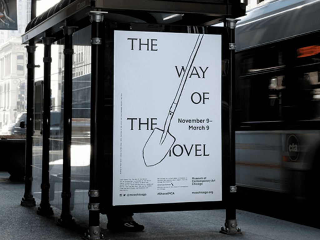
Here’s a bus stop ad for an exclusive art exhibit. Unlike other ads that try to get your attention with bright colors and bold font styles, this advertisement does none of that. Instead, the advertisement portrays something that looks almost like a sketch. Something that gets people staring at the format and structure. As a result, this bus stop ad stands out amongst the sea billboards ad transit ads.
10. iPhone 5c
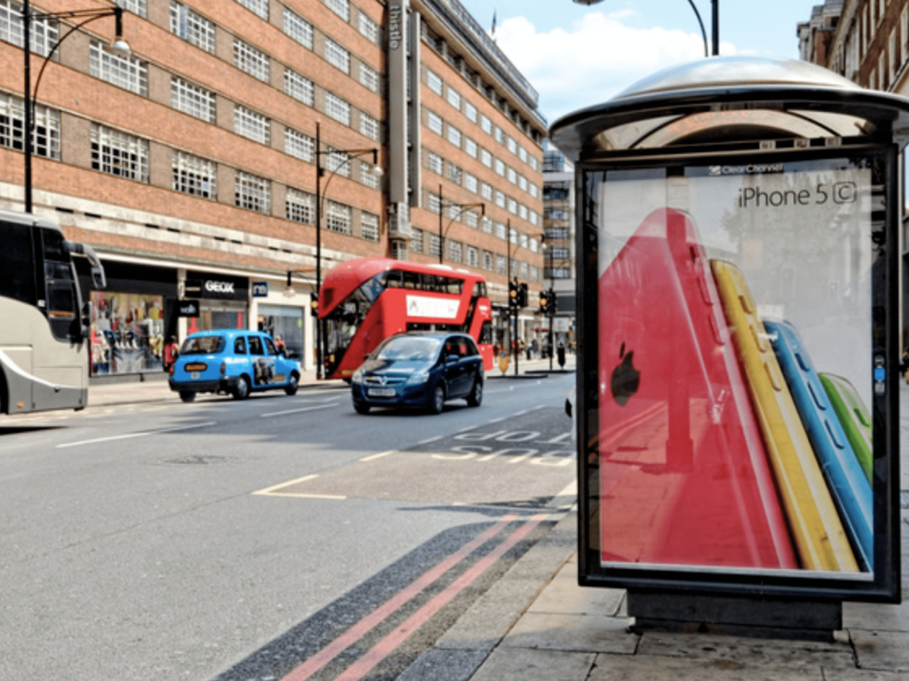
Apple uses four colors; red blue yellow and green, to simulate the look of a rainbow. The colors pop out at you from afar, as the company shows off are Sleek new devices.
9. Grow. Play. Learn.
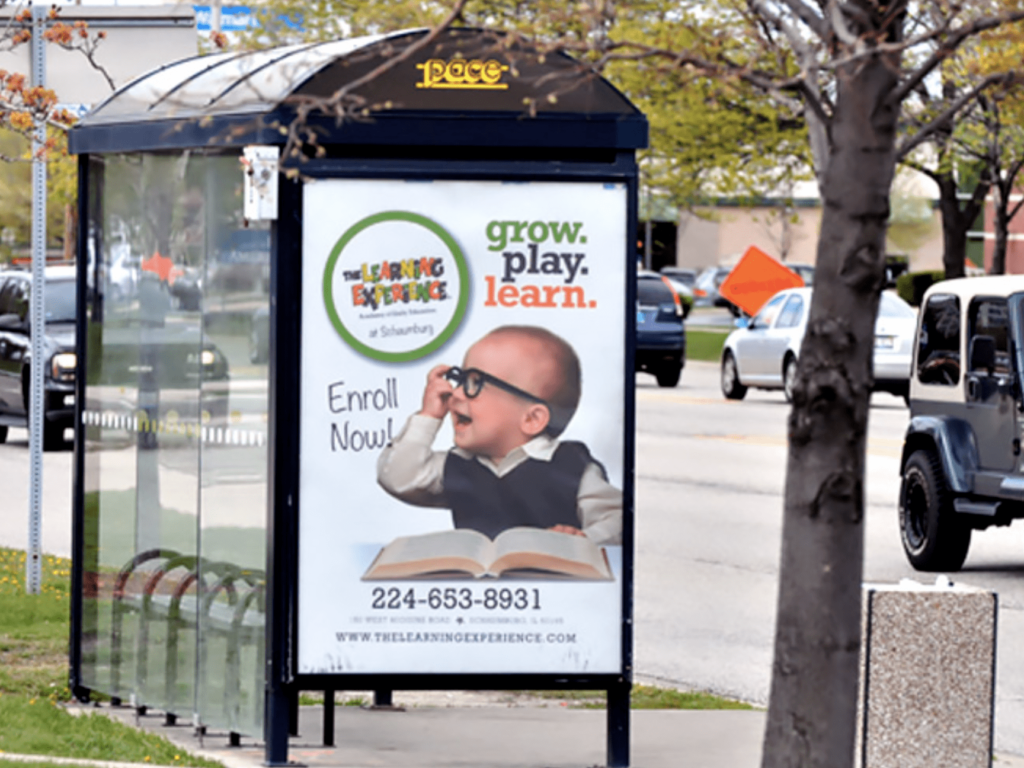
Here’s an educational advertisement that markets itself very apparent. I want you to notice how the bus stop ad uses color. We all know of the primary colors; red, blue, and yellow. Each of these colors has a corresponding opposite, known as secondary colors. These are green, orange, and purple. As you can tell from this picture, secondary colors make the perfect unlikely pairing. The sheer amount of colors give this ad a childish vibe, while also being easy on the eyes.
8. Did Someone Say Free Coffee?
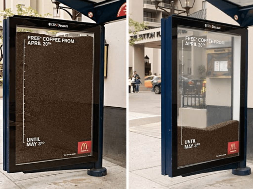
This is a bus stop ad that updates itself what’s the passing days. Although it requires a lot of upkeep, it is very unique and its presentation. People who visit this stop regularly will find their eyes easily drawn to this changing coffee display.
7. Salvation Army
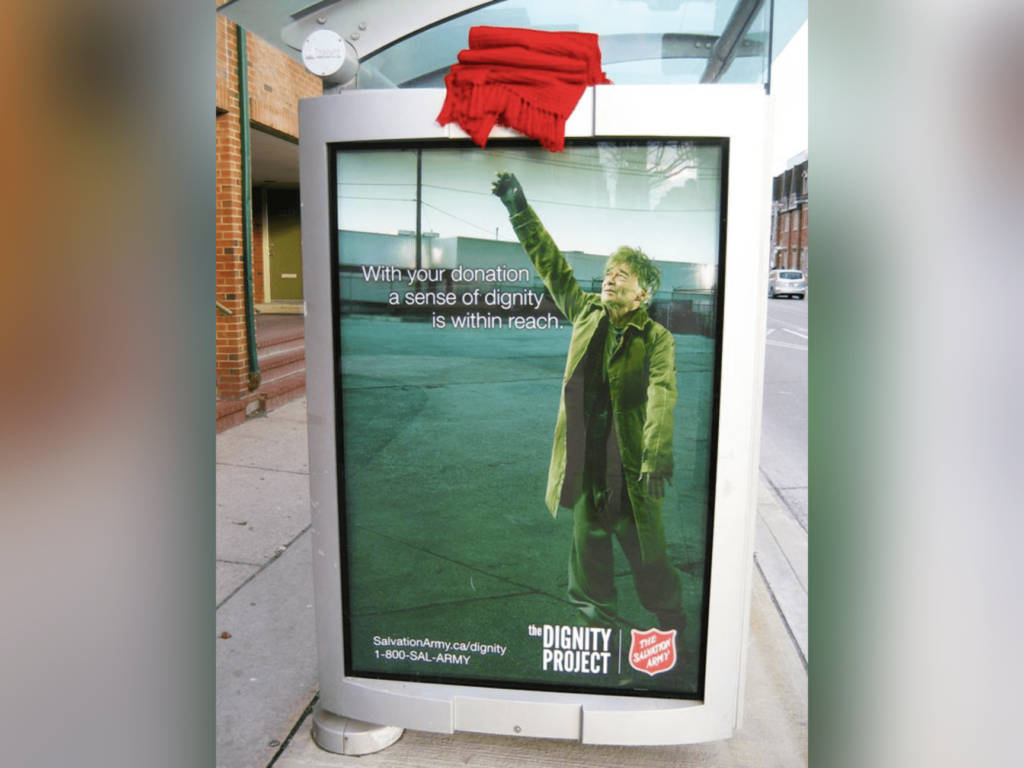
I’m not a big fan of the Salvation Army, for many reasons. But I will say; this advertisement hits the mark. Starting with the most notable part the scarf placed at the top is an engaging touch. The image of a homeless person reaching for it is almost heart-shattering. It makes you feel these emotions by placing him alone inside an empty parking lot, dedicating a lot of space to his surroundings. This bus stop ad paints a scene. A scene that instantly makes viewers want to help.
6. Ikea
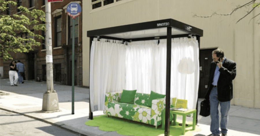
Seriously, who wouldn’t want to lounge on a couch while waiting for their ride? Ikea advertisements always seem to knock it out of the ballpark, and this is no exception. This bus stop ad transports you into a well-decorated, homey environment. By the time your bus arrives, you’ll be wishing that furniture could come with you.
5. Fisch Franke
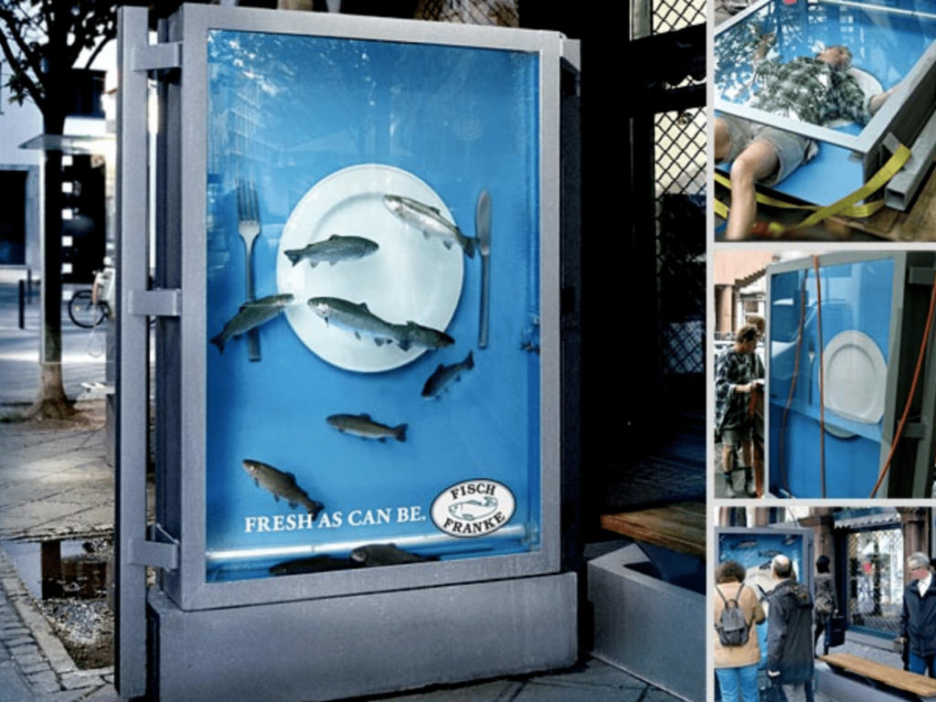
This bus stop ad is creatively made to simulate a fish tank. It also provides the imagery of a nice meal. The imagery alone is enough to make people think of fresh seafood. The caption at the bottom only drives home the message. It’s letting you know that their fish comes straight out of fresh water.
4. Windex
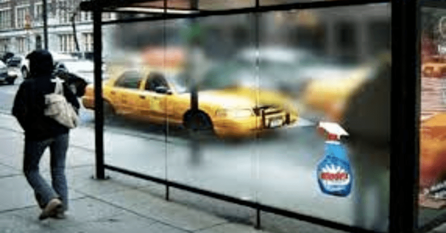
There’s no way you wouldn’t stop to look at this on the street. Although we’ve all cleaned our fair share of foggy window panes, coming across this would be very unexpected.
Windex succeeds at shocking its viewers with this ad, while also displaying its message quite overtly. When using Windex, you can clear up any surface. What a creative way to use the outdoor environment to your advantage.
3. Look At All These Chairs!
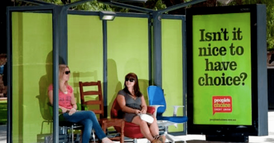
I must say; never have I been so excited to witness a group of chairs. The unexpected placement of this furniture already is this bus stop a leg up above the Rest. But then it reels home its message, by acknowledging do we have a choice. That’s what this company is all about; giving their customers many choices when using their service. It’s a very smart analogy. Above all else, seconds people a place to rest while waiting for the bus.
2. An Exhilarating Beverage
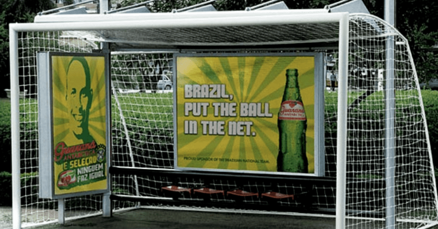
An entire shelter made put you in the middle of a soccer game. Just looking at this gives me flashbacks to my old middle school days. You just have to appreciate the creativity put into this. Not only does it grab your attention, but it also sends a clear message. Drinking this beverage will make you feel the excitement of playing your favorite sport.
1. This Amusement Park Ad
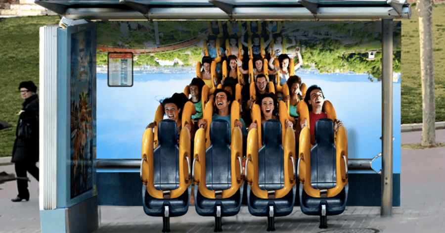
I don’t care how old you are; you can’t convince me but you wouldn’t jump with excitement upon seeing the spa stop ad. There’s no way; I mean, look at it. It’s a group of roller coaster seats out in the open.
Who wouldn’t be amazed? The best bus stop not only serves another function but also provides an experience. This experience is the one of imagining an escape from real life. An escape where you can have fun and go on a roller coaster. It’ll put anyone in the mood for escaping their mundane life, explaining to an amusement park for a day. Perfect advertising.


