

Advertising is one tricky business. Even with all the strategizing and planning, you’ll never truly know if you’re going to hit the mark or not. Sometimes, ads are embarrassingly bad and can actually end up costing businesses more money in the long run.
Here are 11 of the worst bus advertising fails of all time. Let’s see what we can learn from them.
11. Blocking Important Information
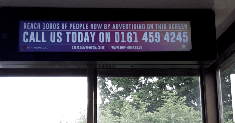
Starting off, we’ve got an instance of bus advertising that looks average at first glance. This picture showcases a media company, urging viewers to buy an ad placement. The problem arises once you realize where it’s located.
An ad located on the bus timetable will block the viewer’s access to bus times. Sure, in this day in age, people can look up the schedules on their phones. However, having to do extra work throughout the day due to an ad is not the best impression. It’ll help them remember your brand name, for sure, though not in a way that’s profitable.
Do me, and all commuters a favor, and don’t use this screen.
[in_content_ads gallery=”logos” logo=”on” title=”Need graphic design help?” subtitle=”Try Penji’s Unlimited Graphic Design and get all your branding, digital, print, and UXUI designs done in one place.” btntext=”Learn More” btnlink=”https://penji.co”]
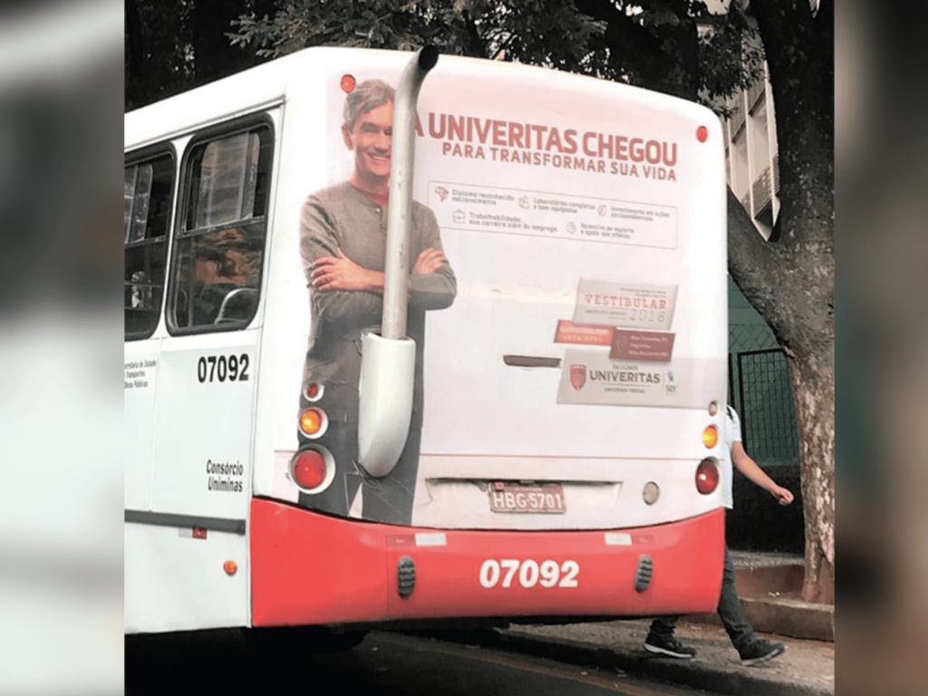
10. Nothing To Write Home About
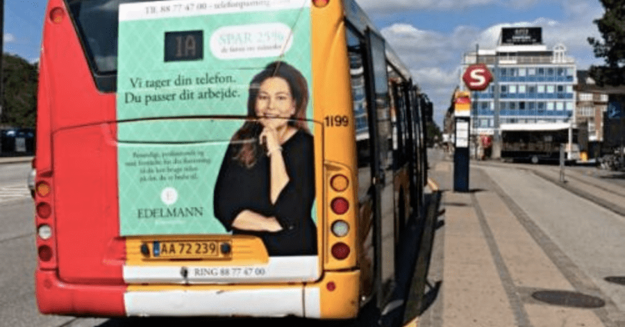
Let’s continue with an ad that’s sure to have you sleeping in no time. First off, let’s talk about the awkward placement. Although it is placed on the back of the bus, this advertisement does not cover the entire space. Why that is, we’ll never know. However, I have a few guesses. Perhaps the advertiser wanted to avoid the consequences of overlapping other bus accessories.
They could have also lazily converted a poster or billboard into a bus advertisement, failing to alter the width and height.
There are someome formatting issues within the ad itself. While everything looks clean and professional, the color scheme makes for a difficult reading experience. I get the intention behind it. Dark green lettering on top of a lighter green background is meant to invoke a sense of calmness.
That calmness doesn’t go far, however, when your viewer has to strain their eyes to decipher it. When it comes to mobile ads, make your lettering truly stand out from the background.
9. Too Much Going On
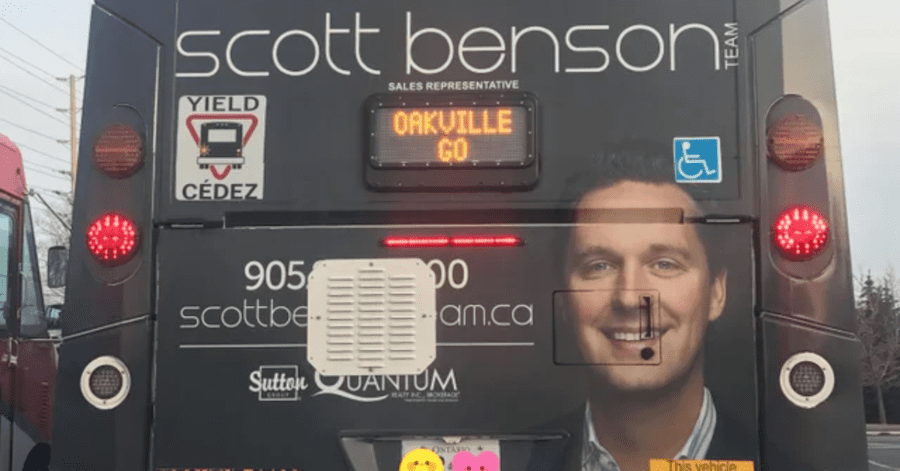
Right away, you can see the clutter. Scott Benson’s message is nearly completely covered by vehicle lights, signs, and small openings. Probably the most egregious issue is that you wouldn’t be able to get the contact number, even if you wanted to. The key information is quite covered. This is unacceptable when it comes to bus advertising. Viewers should have easy access to further information.
8. How To Straighten Teeth
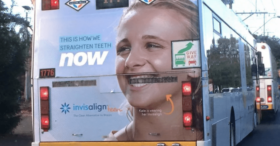
I must say, bus advertising can be a tricky process. It’s hard to decipher the little things that could ruin your entire vision. Here’s another unfortunate example of ad placement. I say unfortunately because it’s clear that Invisalign put a lot of effort into the ad itself.
Sympathy aside, I will admit that the result is humorous. Especially with the caption. This is how you straighten your teeth, Invisalign? Are you sure you’d like to boast about that?
7. I’m Sorry.

Well, I hope they’re apologizing for giving us nightmares.
Seriously, this instance of bus advertising could have been great, if not for the actress’s facial expression and placement. I’m sure she’s very beautiful in real life, but here, she looks like her mouth is an ever-expanding black hole. And don’t even get me started on the lack of nose.
This is why formatting is so important. Always research the buses you plan to advertise on. Every transit company is different; what might work in one location may need some touch-ups in another.
6. Nightmare Fuel
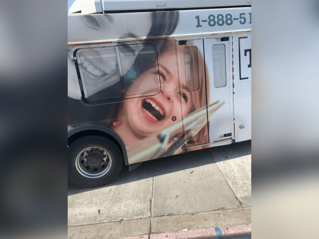
Somebody help this poor little girl.
As hard as bus advertising formats can be, some may feel compelled to treat the bus as a billboard. By this, I mean placing the image right on top of doors and windows, with no Rhyme or Reason. This is the outcome.
Furthermore, the color saturation is abysmal. Well, the girl looks as if she’s bathed in sunlight, and the woman has no color on her. The result is unnatural and honestly looks as if a ghost is possessing the little girl.
5. More Nightmare Fuel
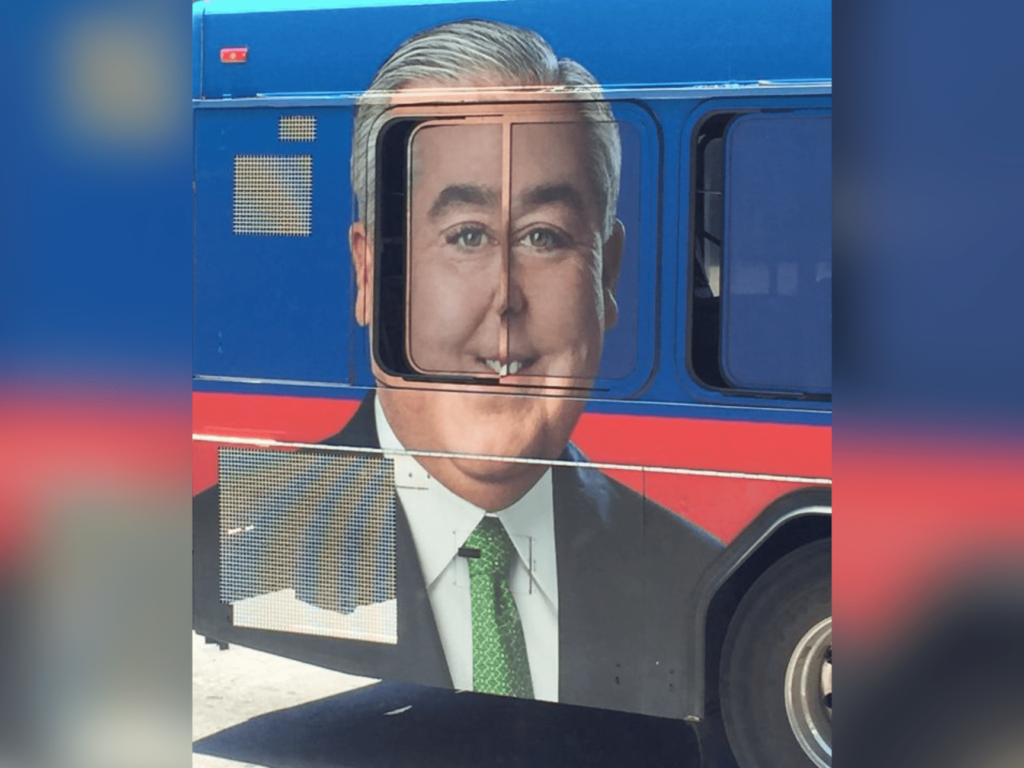
Oh, you thought I was done with the horrifying ads? Think again.
Here’s a good tip for first-time advertisers; trying to avoid putting people’s faces on a bus window. Many vehicles house moving windows. As soon as a passenger needs some fresh air, your professional ad will be turned into a laughing stock.
4. Wow.
I suppose that on a positive note, he does look happy to see us.
I know it’s hard to look away from this ad placement, but some other factors contribute to this poor design. Firstly, there’s a lot of awkward space that isn’t utilized. It’s almost as if the ad was made to fit the back of a public bus.
The color scheme is also not great. Everything looks washed out, making it hard to read. The red and orange letters combined with a light pink background fail to capture the audience’s attention.
3. Honoring Rosa Parks…?
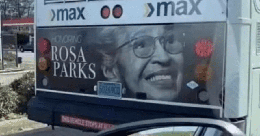
At first glance, this example of bus advertising doesn’t look too bad. This is a poster made to commemorate the legacy of Rosa Parks.
There’s only one problem; this is honoring Rosa Parks, which is on the back of a public bus. Talk about a backhanded compliment. I’m sure the advertiser didn’t mean any harm, but this is why you should get a second or third professional opinion before placing your Transit ads.
2. Mmm… Fabulous!
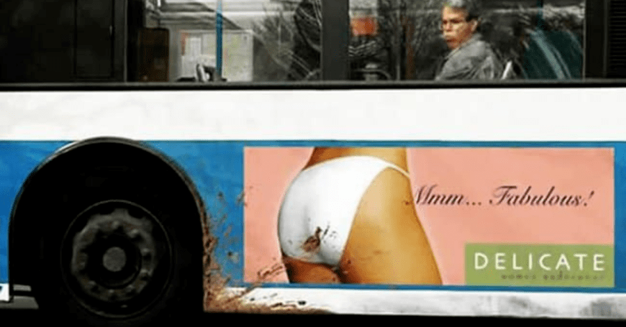
This one goes without explanation. I mean, just look at it.
I hope you see a pattern so far with these bus advertising failures. The bus advertisement’s main pitfall is placement. This instance from Delicate shows us that sometimes it’s not the bus itself that’s in the way. Sometimes, you have to think about the surrounding environment.
This bus may have passed through some mud; which is considered to be a pretty normal bus behavior. Only in this case, the mine is splattered right onto this model’s underwear. It is just the caption a very strange interpretation.
Depending on what your company is selling, you may want to put your ad in a location that’s less likely to get dirty.
1. Bloody Marvellous
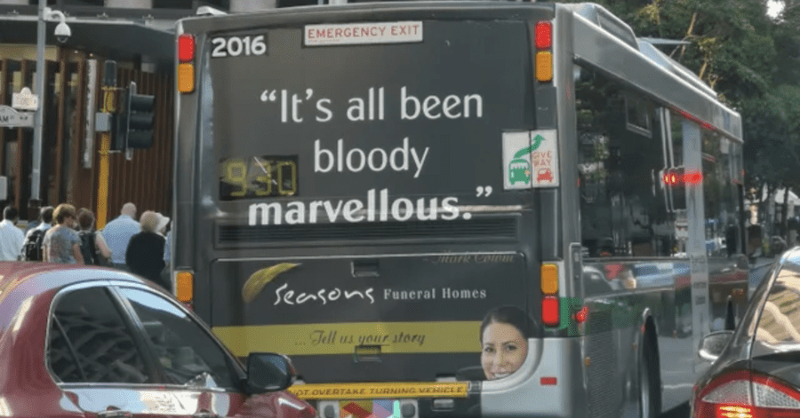
Last, but far from least, we have this tragic form of bus advertising. In case you couldn’t tell from the quote, this is meant to promote funeral homes. Why the company, Seasons, chose Mark Colvin’s final tweet is beyond me.
Don’t get me wrong, it was a good, clever tweet. Though when taken out of context, it seems unrelated to this promotion.
Please realize who your target audience is before you began the design process. With this kind of business, grieving families are looking for a place to have their ceremonies. Saying ” It’s all been bloody marvellous” is a surefire way to make a mockery out of tragic events.
I must say, however; that the head poking out from the corner just completes this mess of a promotion.


