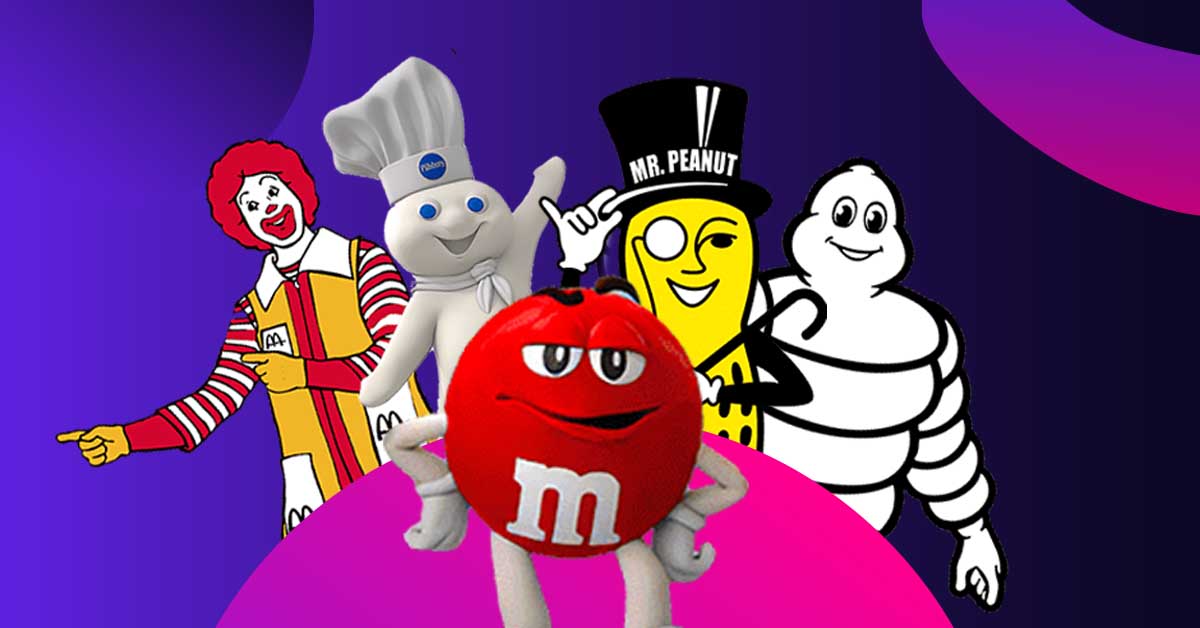
What do Michelin, Planters, and Mcdonald’s all have in common? All 3 of these companies are inextricably bound to their brand mascots. The Michelin Man, Mr. Peanut, and Ronald McDonald have all successfully carried out the primary role of the mascot: represent and reinforce the personality of the brand.
Let’s take a look at the types of brand mascots and some notable successful examples.
Human Characters
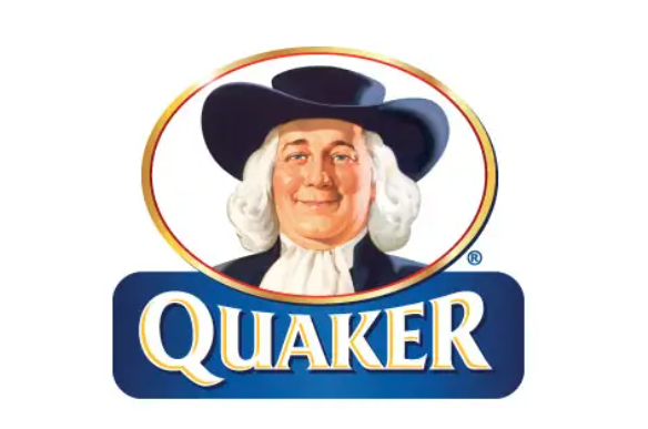
Businesses use mascots to humanize their brand. This is the most commonly used approach to mascots. In fact, research shows that 21% of mascot logos are human characters. This is likely because of the immense relatability of human beings. Brands just find a simpler time connecting with an audience when using a human as their mascot.
[in_content_ads gallery=”logos” logo=”on” title=”Need graphic design help?” subtitle=”Try Penji’s Unlimited Graphic Design and get all your branding, digital, print, and UXUI designs done in one place.” btntext=”Learn More” btnlink=”https://penji.co”]
Humanized Animals
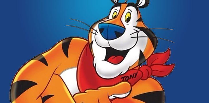
The second most used type of mascot is humanized animals. Animals typically have a metaphorical quality to them. This quality lends itself to branding. Companies will use a certain animal as their mascot in order to associate with that animal’s attributes.
Anthropomorphising refers to the application of human-like qualities to animals, plants, or even non-living objects.
For example, the automobile maker Jaguar uses, wouldn’t you know it, a jaguar as they as their mascot. A powerful, speedy, graceful, and beautiful cat. These are exactly the associations the iconic car vendor wants its target audience to draw when they see the brand’s logo.
Humanized Objects
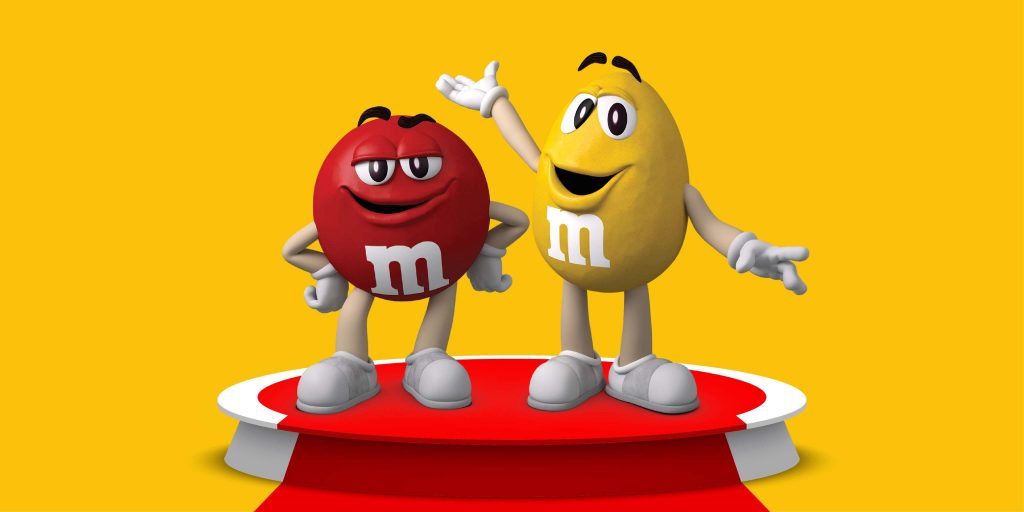
In certain cases, brands won’t rely on a living being at all. Instead, relying on humanized objects. It is a bit more difficult to humanize non-living objects because they tend to not have desired characteristics or archetypes. But this also means that marketers can apply any human trait to the object.
Jolly Green Giant (B&G Foods)
First introduced in 1925, the Green Giant has grown with the times. Originally an animated drawing, the friendly giant has appeared as a full, live-action character as well. He was named after a particularly large variety of pea harvested and sold by the company.
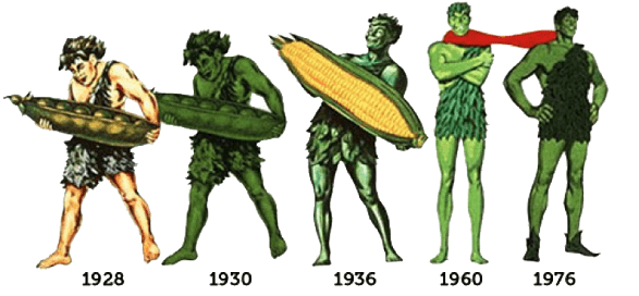
His earliest iterations showcase a more brute, almost cave-like look. But, over time, the Green Giant became a more smiley, friendly character.
Rich Uncle Pennybags (Monopoly)
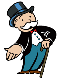
You’ve likely seen this character, and have probably even called him by the wrong name. The character first appeared on Chance and Community Chest cards in U.S. editions of Monopoly in 1936. And at this time, the character had no name. He did not receive a name until 1946 when Parker Brothers produced the game Rich Uncle, where his likeness appeared on the box lid, instructions, and currency.
In 1988, his full name was disclosed as Milburn Pennybags.
In 1999, Rich Uncle Pennybags was renamed Mr. Monopoly. Which feels fitting, and what most people have likely referred to him as since first seeing him.
Tony the Tiger (Kellog’s Frosted Flakes)
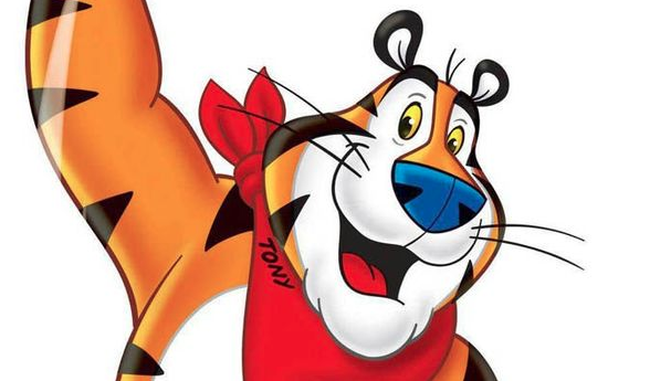
Tony the Tiger has been representing Frosted Flakes since 1952. But he’s also served as the brand mascot for Tony’s Cinnamon Krunchers and Tiger Power.
Tony the Tiger is another instance of a prominent mascot design trend over the last couple of decades. Anthropomorphized animals have become more and more cartoonish, people-like, and friendly.
Kool-Aid Man (Kool-Aid)
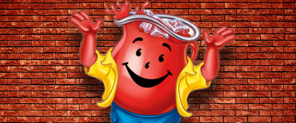
The Kool-Aid Man is something of a fixture. This giant transparent jug of red liquid has been in full service since 1974 and has been so successful that it’s been referenced in a number of television shows and films.
The Kool-Aid Man was conceived as the successor to the lesser-known “Pitcher Man.” He got his own video game, his own comic book, and his own museum display in Hastings, Nebraska.
Mr. Clean (Proctor and Gamble)
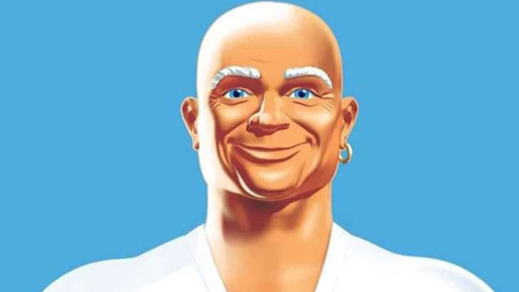
Mr. Clean was introduced as the brand name and brand mascot by Proctor and Gamble in 1958 and has quickly become one of the easiest-recognized mascots in modern history. Upon his initial unveiling in a 1958 television commercial, he was portrayed in live-action scenarios by actor House Peters, Jr.
The character is perhaps most recognizable in his animated form, where he appears as a muscley, smiley, bald-headed man.
Poppin’ Fresh (Pillsbury)
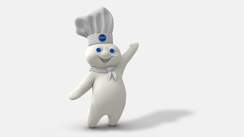
Poppin’ Fresh is one of the most lovable mascots in recent history. Standing in at 8 and 3/4 inches tall, this anthropomorphic dough boy has been the poster child for Pillsbury since 1965.
In the first three years of his debut, the Doughboy had an 87 percent recognition factor among consumers. His popularity has continued through the years: At one point the Doughboy was receiving 200 fan letters a week and Pillsbury received 1,500 requests for autographed photos.
Julio Pringles (Pringles)
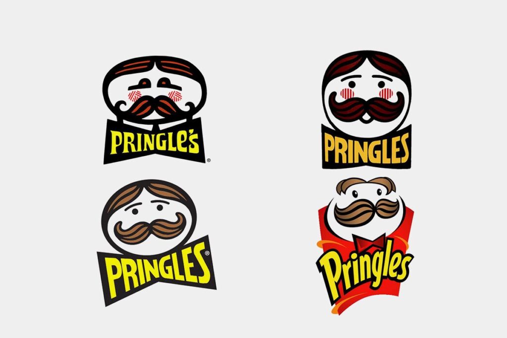
Mr. P’s face has been used on the face of Pringle’s cans since the late 60s. But it has changed quite a bit in that time. These changes can be seen in the image above. While this mascot has been with Pringles since its inception, its full name is a newer development.
Thanks to a Wikipedia hoax in 2006, in which an editor attributed the mascot’s first name as Julius, a number of news outlets began referring to the mascot’s full name as Julius Pringles.
By 2013, the name had spread and Kellogg formally acknowledged Julius Pringles.
Captain Morgan (Captain Morgan)
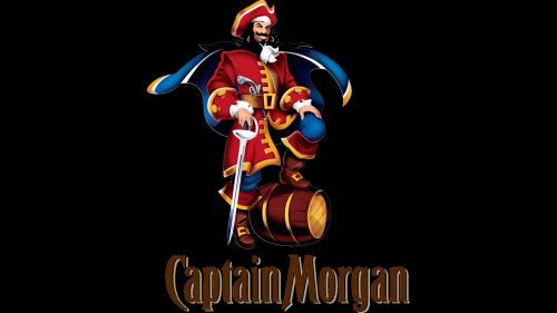
Captain Morgan is one of the most well-known spirit mascots. And it helps that the product is named after him. For 70 years, this pirate’s likeness has served the brand well.
In early Captain Morgan advertisements from the 1950s, illustrations depict him as more of a portly member of royalty than a pirate. In the 1980s and early 1990s, the mascot was reimagined. A more svelt, dashing character emerged. Among the updates was the inclusion of the iconic pose of the captain.
Colonel Sanders (KFC)
Unlike most mascots, Colonel Sanders was actually based on a real person. The man, whose face has brandished the products of beloved Kentucky Fried Chicken, is Harland David Sanders, who was born just outside Henryville, Indiana. Sanders’ likeness is an inextricable part of KFC’s brand.
In 1930, Sanders actually purchased a motel, which is where he began serving his chicken to the public. In 1952, his face was included in an updated logo design. It has been an essential ingredient in branding ever since.
For more tips on branding, visit Penji’s learning center.


