
Every university has a brand, whether we acknowledge or not is dependent on the quality of its brand. Some universities are stronger than others by promoting themselves through different channels. A good brand is personalized and tailored to its audience, but flexible to accommodate any changes.
The brand is consistent enough to where it’s recognizable, no matter the medium. And that is why most schools hire the services of professional graphic designers like Penji. They don’t just create visuals, they can highlight your values and culture, thus making an impact. Now, to get more inspiration, here are 20 examples of excellent school branding:
Moore College of Art and Design
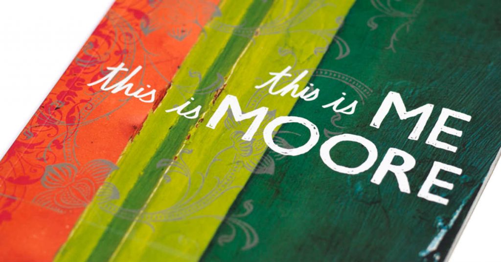
For art schools like Moore College of Art and Design, a good first impression can be everything. The expectation is high to prove its worth for four years and tuition payments. Moore successfully achieves this with ‘This is me’ promotional materials. They strengthen the idea of students first, and why Moore will be there to help students be themselves. The promotional materials use examples of students in its catalog and website as samples of what it’s like to attend Moore. In addition, they also push to empower women as well as a women-only college with images of powerful women as one of the few women-only art schools.
The University of Harford
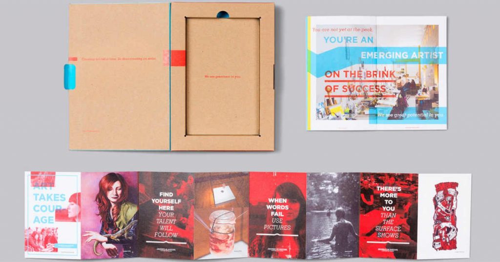
The University of Harford moves to bring students in by branding outside the norm. This is why the packaging for prospective students is distinctive and ties to the brand. It takes the idea of incoming students being unfinished and using the university to finish yourself. The colors are clean and match colors on the university’s website. It’s not over the top, and it doesn’t have to be. The consistency is there to ensure students know what the University of Hartford is, and it’s well-executed. It steps out of normal branding for admissions, which is typically more welcoming and less determining someone as ‘unfinished’.
Aalto University

Aalto University in Finland doesn’t appear like a college at first glance. The clean look and out-of-the-box logo stand out among other colleges, especially when its logo is changing between three variations. The variations aren’t far from each other and similar enough to know it’s the same university. Aalto’s history doesn’t go back very far, but the branding has remained consistent. Each school within Aalto has its own colors, matching illustrations, and styling. On social media, the college continues to push its innovation-first branding. It posts short videos relevant to the college, but also practical for those interested in science. This university is taking modern trends and mixing it with traditional university styles.
University of Texas
The University of Texas uses a Texas Longhorn bull as its mascot. When entering the website, the first image is of a student creating bullhorns with her hand. This gesture is all over its social media and branding. Here we can see how the university uses social media to create an impact, and you can also follow the lead. Just make sure to have the right images that resonate with your school’s branding. The Penji team ensures that your social media images are consistent and interesting.
The college isn’t the first to have a mascot, but it uses its mascot in almost everything. Across its Instagram, it posts students, professors, athletes and even Santa with the bullhorns. Its longhorn imagery is distinct enough to stand out among other universities with similar mascots. It’s a simple gesture the university made their own.
[in_content_ads gallery="branding" logo="off" title="Do your customers know who you are?" subtitle="Create a powerful brand identity with visuals that represent YOU." btntext="Get started" btnlink="https://penji.co/pricing/?affiliate=J2O5AB8RAR3386837"]University of Tennessee

Not many schools lean into one specific color for its brand, specifically one as bold as orange. The University of Tennessee – Knoxville goes into the orange effectively and uses it to promote its history. Since 1889, the college has used some form of orange in its logo. With the orange getting brighter and bolder over time, the school uses the orange to also promote increasing quality in its education and facilities. To the University of Tennessee, orange is a symbol of its spirit, something it successfully brings across in its branding. In addition, it’s a hard-to-miss color, which helps the school’s brand itself as unique and aspiring.
Laramie County Community College
For a community college, it can be hard to create a brand without the resources four-year universities have available. For Laramie County Community College, this isn’t a problem. It establishes itself as the first step to a four-year university. The branding around it uses similar strategies to larger four years. This includes writing in the college’s voice, consistent designs across multiple platforms, and ease of access to all related content. In addition, they understand that their students may want to go to university after graduation. So, they have to act like a four-year college in terms of branding and strategy.
MIT

Massachusetts Institute of Technology is one of the most well-known universities in the country, and its branding a large part of it. The school was created to support industrialization in the 1800s, and its goal hasn’t changed. It continues to push STEM as one of the most important parts of society. It comes across this way on multiple channels and promotional material. Even its logo is very particular about placement and changes. Each section must be a specific measurement away from each other. This amount of detail is taught to its students and motivates prospective students to apply.
University of Maryland – University College
The University of Maryland – University College isn’t afraid to stand out based on its name, especially when there’s a meaning behind it. When first presented, it received backlash for its name. However, it successfully branded itself around an untraditional name. People across the country knew what the university was, drawing attention to its website to learn more. Not all branding requires a new design to highlight itself. While it does have clean designs throughout its presence online, it’s the name that sells the university. The name is the brand.
Texas A&M University

Most universities have mascots, but Texas A&M University takes it a step further with the introduction of Reveille the First in 1931, a border collie mascot. Since then, the university has seen ten iterations of Reveille. She’s a staple of the school’s branding, appearing on social media, sports games, and is actively handled by Mascot Company E-2 of the Corps of Cadets. And, she even has her own official section on the university’s website and an active fanbase online. Texas A&M knew Reveille was an opportunity to connect the campus and garner a following.
University of Oregon
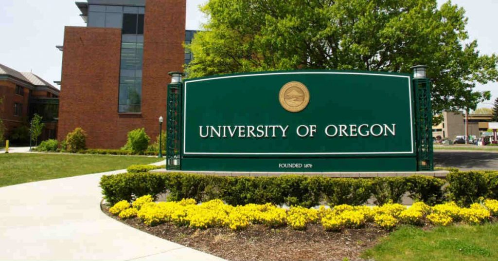
The University of Oregon knows in order to stand out on social media, you have to be ambitious, relatable, and relevant. The university does all three successfully on social media. The college is active on Twitter, posting several times a day and replying to other tweets. This aligns with its overall brand and style guidelines for the university. It focuses on sharing the brand, not creating a brand. It even offers training to ensure everyone who wants to understand the University of Oregon’s brand is able to do so.
Indiana University – Bloomington
Indiana University – Bloomington campus engages its students without breaking any promises. On the main website, it opens up with ‘fulfilling the promise’. Their promise is to help students succeed. The home page spotlights select areas of university life. This continues on its website, One Day. One Day highlights one student and follows them throughout their daily life. Every student has an individual perspective on life at the campus and how Indiana is helping achieve their goal. This introduces potential students to a university that cares for them no matter what.
Boston University

Boston University has a brand that’s more than just its visuals. It uses words and visuals to tie together a complete brand. Many universities already have branding using words, but not all state it as clearly as Boston does. It offers examples of how to communicate with words and images on behalf of the college. If a school doesn’t have a set tone of voice, it doesn’t appear as a cohesive institution. Boston takes their branding from every angle.
Instituto Tecnológico Autónomo de México (Autonomous Technological Institute of Mexico)

For those interested in studying technology, the Autonomous Technological Institute of Mexico offers a welcoming environment with its branding before you enroll. The branding focuses heavily on the technology taught at the university and student engagement. In addition, the university ensures its students know what’s going on at all times, and push interaction online. It has its own website dedicated to interested students, and an event promoting involvement before they decide to enroll. As a brand, the institute goes above and beyond to appear welcoming, both to prospective and current students.
Tulane University
Tulane University’s logo is a shield, but it’s used as more than just a logo. To the school, it’s an opportunity to play with subtlety. Similar to Hartford, it uses parts of its branding to remind students of its look and appeal. The shield is simplified to lines and sections to flow with the design of admissions material. It’s clean and professional, but it’s more than the aesthesis of the college. It’s part of the college’s brand image. Not many break down their own logos or execute this with the same success Tulane currently has.
Oklahoma Christian University
Oklahoma Christian University treats its facilities as a second home for its students. It highlights the religious background of the university without excluding those with different beliefs. Everything is laid out on the front page to access as needed. This includes social media, upcoming events, and the school’s messages. It also features a section titled #HumansOfOc with pictures of people on campus and a quote. This goes beyond students; it features custodians, professors, and staff from the university as well. Its brand is watching over everyone on campus, which appears kind and caring. This can be important to universities looking to bring in students who want to feel like a family.
University of Michigan
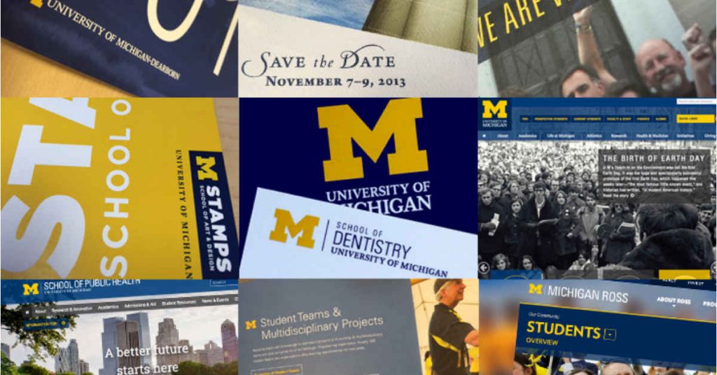
The University of Michigan cares about its students. All universities do, but Michigan doesn’t shy away from uncomfortable topics. On Twitter, the university pinned a tweet showcasing students addressing the healthcare needs of their local community. The school focuses heavily on involvement and engagement, something a style guide can’t create. It’s hashtag #LeadersAndBest, further pushes this school branding. In addition, their main website hosts different stories about building a better community around the university and local towns. They do more than say they’re going to make a change. They instill it in their branding and acts on it.
Reykjavik University

Reykjavik University comes off as a caring, motherly brand through its presence on Instagram and admissions material. Across its branding, they showcase their students, location, and rich history as separate brand ideas. The university is located in Iceland, a country known for its northern lights and aurora lights. Because of this, the location is a major branding perspective used by the university. On their Instagram, you find pictures of current employees/students, scenic photos of the campus and historical facts related to Iceland. It even promotes social media takeovers from its students. It ties everything back to caring about where you are and why you’re important.
Virginia Tech
Virginia Tech’s brand goes beyond what’s written in its brand guidelines. The web page has two videos and an interactive timeline of the school’s goals as a brand. It encourages different styles of interreacting online such as reading, watching videos, or interacting with the content directly. On the brand guidelines, it explains every role as someone involved with Virginia Tech including the general public, donors, and prospective students. Nobody is forgotten through this brand image, something all colleges need to keep in mind.
Occidental College
A college experience is filled with many priceless memories and experiences. At Occidental College based in Los Angeles, the goal is to provide as many as possible. The university gives students the experience of living in a bustling city but also an active education and social life. The university wants to tell stories of their students so they remember them. On social media, students aren’t featured just for their achievements. They let students take creative freedom on what to post and provide the content to Occidental. Their social media is filled with posts on student reflections, looks inside club activities, and first-hand views of athletics. This speaks as a brand because it gives the feeling of community while staying within your own comfort zone. This speaks to all kinds of students who may want to be part of something larger.
University of Wyoming
The University of Wyoming provides a brand that wants to connect you back to the world around you. This university emphasizes the environment around the university in its social media posts and main page. In both instances, the surrounding nature is a feature point. Its tagline, “The World Needs More Cowboys” adds to this with the history of cowboys roaming the Wild West. It wants its students (and brand) to be recognized as a part of something much larger than the university. This puts them in a unique position compared to schools in urban and suburban areas.
Using Penji to Build your School’s Branding
It’s already established that graphic design can help your school with its branding. But the question now is, which is the best team to work with? Of course, you need to choose a provider that gives professional design with the least effort required from you. After all, managing a school is already a big task. Leave this one to us.
Below you will find the three easy steps on how you can request for graphic designs perfect for your school.
Send Your Request Through Our Platform
One of Penji’s selling points is our very own platform. It’s where you can directly send your design requests from the dashboard. Just find the ‘Click New Project’, and type all the necessary information. Add details like color, images to use, inspiration, and everything that could help our designer create a draft.
Just in case the designer has questions, it will be sent through the same application. That means, you do not have to check your email separately. This increases efficiency and effectiveness.
Review and Revise the Initial Draft
While our designers are working on your project, you can focus on your core responsibilities. Just wait for around 24-48 hours to receive the initial draft. This is a case to case basis depending on the scope of work required for your project.
If you think the design needs to be tweaked, you can click the image and type your comments directly. That way, the designer will be able to pinpoint the exact areas for improvement.
Download and Use the Design
And if you are already happy with the design, there is no need to request for the source files. Just download the projects from the same platform and use it wherever you want to.
Working with Penji has allowed different schools and other institutions to get quality images without going overboard with their budget. You might want to check our packages from here.
About the author

Erika Solis
Erika is a Content Writer & Marketing Associate for Penji. She has a background in social media marketing, graphic design and copywriting.
Table of Contents
- Moore College of Art and Design
- The University of Harford
- Aalto University
- University of Texas
- University of Tennessee
- Laramie County Community College
- MIT
- University of Maryland – University College
- Texas A&M University
- University of Oregon
- Indiana University – Bloomington
- Boston University
- Instituto Tecnológico Autónomo de México (Autonomous Technological Institute of Mexico)
- Tulane University
- Oklahoma Christian University
- University of Michigan
- Reykjavik University
- Virginia Tech
- Occidental College
- University of Wyoming
- Using Penji to Build your School’s Branding


