Pharmaceutical packaging has many factors that focus on human-centered design. Every aspect of medicine packaging must cater to the safety and benefit of the consumer. This makes designing for pharma quite different from other forms of packaging.
There are many guidelines in the healthcare industry, especially when it comes to pharma design. So, it comes to no surprise that a designer may have to revise their designs several times before it gets approved in the end. Regulations vary by location but must be followed without mistakes.
The amount of information provided is another factor that affects the design. Depending on the boxes and bottles used as the container for the medication, designers have a limited amount of space they can use to fit everything in.
A high level of creativity is needed in order to meet healthcare industry standards before the product hits the shelves at your local drugstore. Because of this, the designer you choose must be patient, pays high attention to detail, and welcome revisions when needed.
You can guarantee that Penji designers possess all those traits. Penji is an unlimited graphic design service that will produce appropriate and compliant packaging. We cater to all industries, and our designers know how to create visuals suitable for the business. Plus, you won’t have to spend hundreds of dollars hourly. Request all the designs you need aside from packaging. Focus on your company while we take care of your design. Check out the visuals that our designers have created for clients.
For now, here are 10 examples of good pharmaceutical packaging designs that will help inspire you on your next project.
1. Mucinex
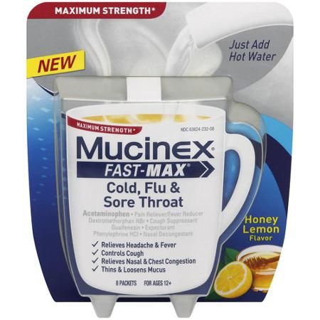
This pharmaceutical packaging design by Mucinex is extremely creative! It shows hot water being poured into a cup of Mucinex Fast-Max. Not only does it tell you exactly what the product does, but it also has pictures that show how to use it.
It’s visually different from other pharmaceutical packaging and stands out against over the counter medicine. Mucinex looks less frightening to try because it looks like tea, which is harmless. The bonus is that it has positive effects like helping with your cold symptoms without having to take a pill.
2. Genexa
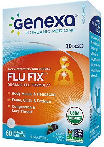
Genexa‘s pharmaceutical packaging design uses a combination of colors to enhance their message and draw emotion from potential customers. Blue is trustworthy, dependable, and responsible.
Orange is commonly used in healthcare. When the colors are used together, it makes the package design pop. The symptoms are clearly listed with an illustration of target areas that are affected by illness.
3. Field Apothecary
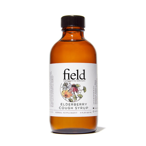
This cough syrup by Field Apothecary has a different approach to pharma label design. The label exudes a holistic feel, giving the impression that the company is friendly and harmless.
Drawings of flowers front and center force the buyer to give it a second look. Overall, the label is modern, not very intimidating, and provides all the information a user would need to know how to take the cough syrup.
4. Zarbee’s All Natural Cough Syrup
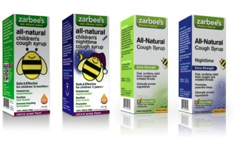
Zarbee’s children’s cough syrup features cute illustrations of bumblebees to encourage kids to take it without fear. Because the bee is yellow, it gives off a positive emotion.
The bee mascot is a great representation of their brand “Zarbee’s” and is memorable for parents and children next time they’re at the store looking for medication.
[in_content_ads gallery="packaging-labels" logo="off" title="Become one of the world’s most recognizable brands" subtitle="Custom-designed packaging will take your brand to the next level. Don’t miss out." btntext="I want this!" btnlink="https://penji.co/pricing/?affiliate=J2O5AB8RAR3386837"]5. Little Noses by Little Remedies
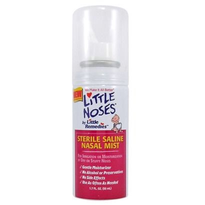
From the name and font choice, you can tell that Little Noses by Little Remedies is for children and babies. The language used is cute and almost “baby talk”. The illustration of a baby is another clear indicator that it is meant for young children.
What’s great about this pharma packaging design is that it speaks to the parents about exactly what it’s used for without being too corporate. The colors are friendly and approachable.
6. Clear Blue
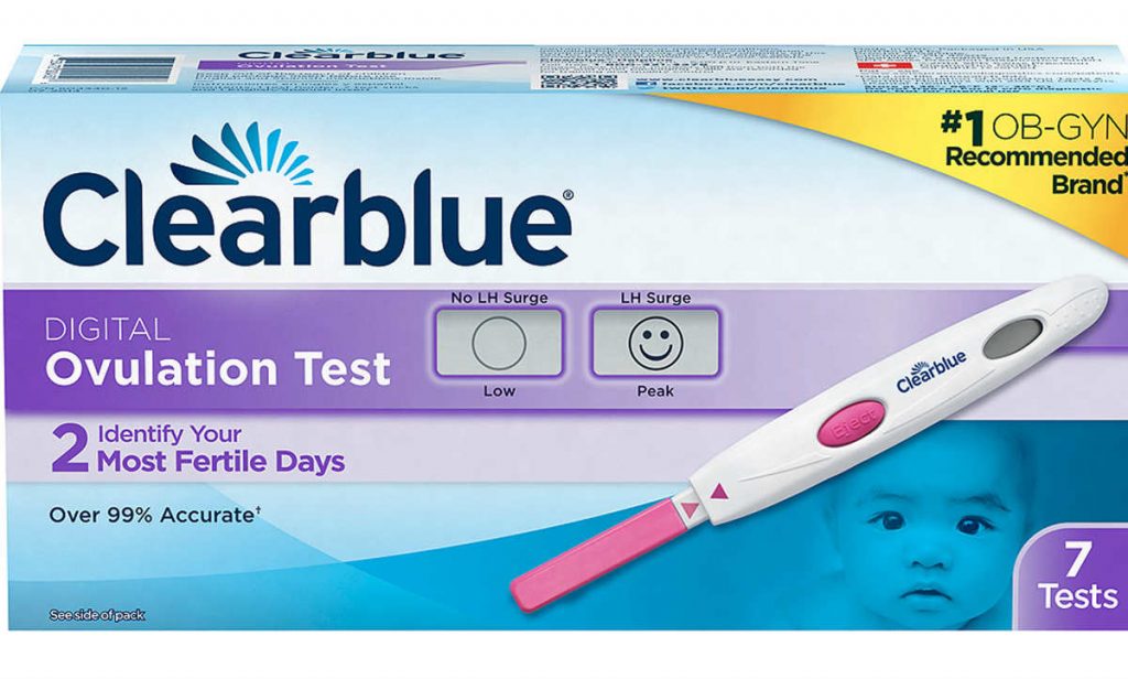
The color blue has multiple purposes when used for this packaging design from Clear Blue. Not only is the word blue in its name, but the color blue also makes it feel trustworthy. When it comes to pregnancy tests, trust is extremely important. Women taking the test need to know that the results are true. And in the case of pregnancy, any indication of accuracy is beneficial for the brand.
7. Help Remedies
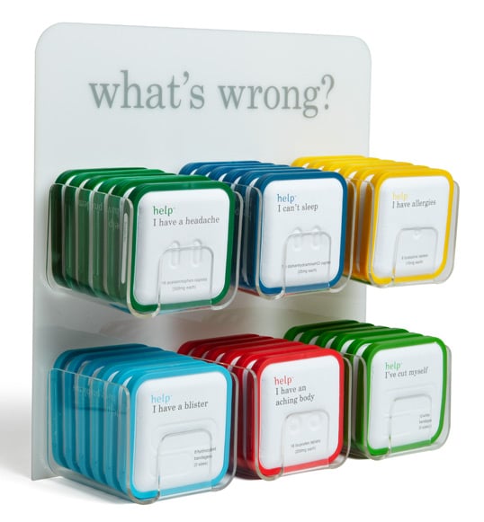
Help Remedies is one of the best examples of modern pharmaceutical packaging design. The package is clean with just one pop of color. The copy is witty and simple. It’s easy to find the medication that you need at the moment.
“Our packaging is made of molded paper pulp and a bioplastic made primarily of corn. We use these materials because they are interesting to look at, and they are compostable—which means one day, they might become part of a large tree. Maybe you can cut down that tree and make it into a speedboat.” – Richard from Help Remedies
8. Aleve
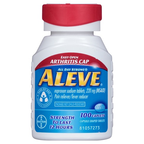
Aleve came out with a medicine bottle design that focuses on its customers. This is a great example of knowing who your customers are and successfully serving them according to what they need.
With Aleve’s arthritis cap, users will no longer need to struggle in pain to take their medication. The cap is red so it’s easy to spot and differentiate from the other packages at the store in their medicine cabinets.
9. Tylenol
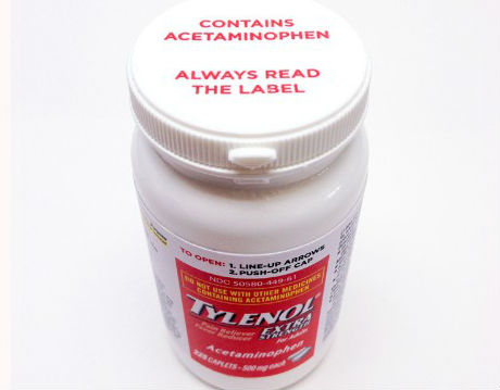
Safety is one of the most important parts of taking medication. Tylenol takes this seriously. The directions and warnings are on the label, however, you’ll also find a warning on the cap.
This is just another reminder to be responsible when taking acetaminophen. The side effects when taking medication should always be clear. In this case, Tylenol took an extra step to make sure their users are being safe.
10. Advil
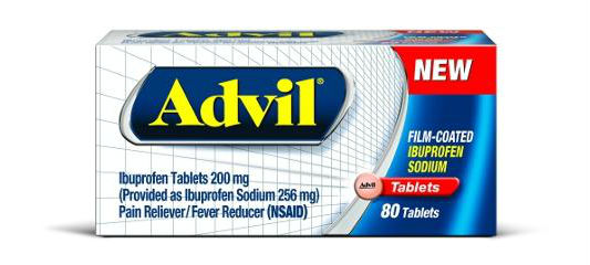
Advil produced ibuprofen tablets that act fast. The medication features a fast-dissolving technology—along with a unique, specially formulated ultra-thin coating that allows for it to dissolve and work quickly.
The pharma packaging design shows speed while still maintaining the classic Advil elements. The white box separates itself from its line of products so it is easy to spot in a shelf packed with medication. The white grid on the box adds depth and is angled in a slant that directs your eye to the Advil tablet. Overall, the design is modern, advanced and stands out on a shelf in stores.
As you can see from the examples above, design matters in packaging. Your product shouldn’t only look good on shelves, but it should also connect with your target audience. Let Penji create designs that will comply with regulations and would capture your audience’s attention. Learn how Penji can help you when you request a design.
How to Request for Medically Compliant and Well-Designed Packaging?
Follow the four easy steps in requesting a packaging design.
1. Create a project
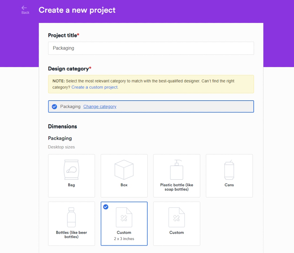
Login to your Penji account. Once you’ve done so, you’ll be redirected to your dashboard. On your dashboard, you’ll see a “Create a Project” button.
From there, please choose Packaging.
2. Fill in Details of your Project
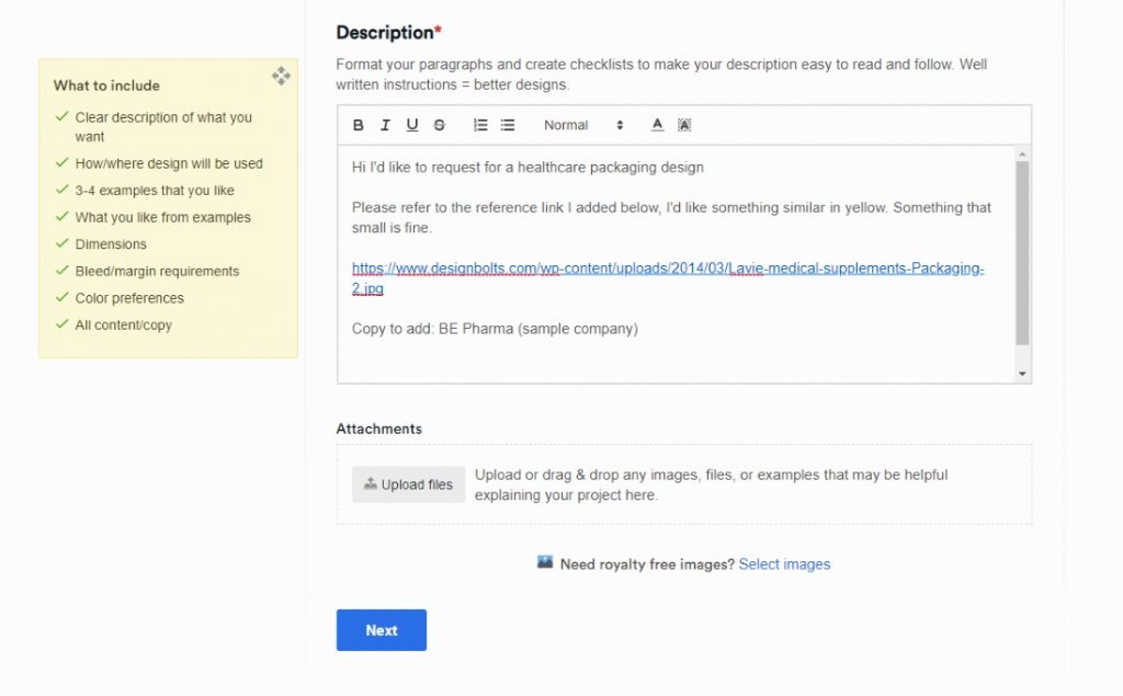
A form will load where you’ll input all the details of your project. The Title and Description fields are required, add details before you create the project.
On the description field, make sure to post the specifics about your pharma packaging design. This way, the final design you receive follows medical regulations.
3. Review the Design
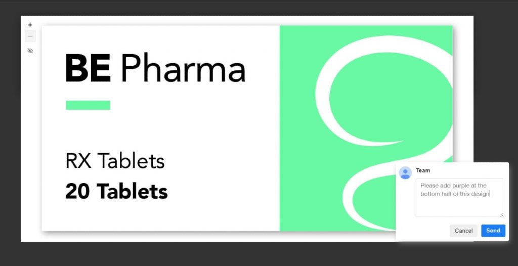
You’ll receive the first draft of your design within 24 to 48 hours. From there, you’ll evaluate if the design matches your preferences and meets guidelines.
You can go two ways from here.
Number one, if you’re happy with the design you received, you can download it immediately.
Number two, you may have it revised. If you’re subscribed to any Penji plan, you’re entitled to unlimited revisions. Be specific with your corrections also. This way, your designer will know what exact revision they need to work on.
4. Download and Mark as Complete
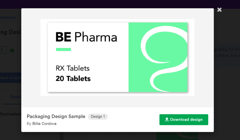
Once the designer has amended your revisions and you’re 100% satisfied with it, you can download it. This way, you can use the designs immediately.
Plus, don’t forget to mark the project complete. This way, a designer can work on a new project.
Remember, with any Penji plan, you have unlimited graphic design requests, so fire away!
Make Your Subscription Worthwhile with Penji
Sure, you might only need packaging design, but what about your other marketing and advertising materials to promote your medical products? Penji can provide you with all those and more even on a Pro plan. But if you want to make the most out of your subscription, go for a Team plan for only $499/mo.
If you decide to sign up for any Penji plan, you have a 15-day free trial to test out the platform. For more information about the platform, watch a demo, and see what makes us special from other unlimited graphic design services.
About the author

Jie Kuang
Jie is a Marketing Manager and Content Writer for Penji. She has a background in design, technology, and innovation strategy.


