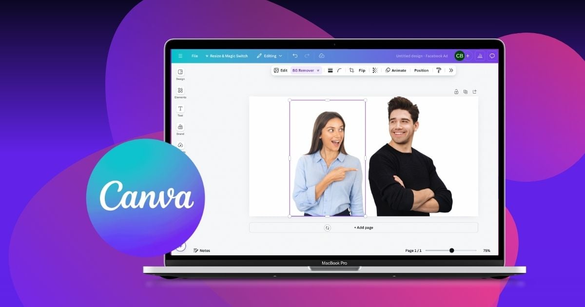
Creating eye-catching designs in Canvaoften involves more than just placing elements on a blank canvas. To truly make your graphics stand out, you need to know how to combine two elements in Canva effectively.
Whether you’re a seasoned designer or a complete novice, mastering this skill can significantly enhance your design game.
Table of Contents
- Why do You Need to Combine Canva Elements?
- First Method: Grouping Elements
- Second Method: Layering Elements
- Third Method: Aligning Elements
- Combining Elements: Practical Tips and Tricks
Why do You Need to Combine Canva Elements?
Before we discuss how to combine two elements in Canva, let’s start with the basics first: what are Canva elements?
In Canva, elements are the building blocks of your design. They include various visual assets that you can add to your projects to enhance their look and express your message better. These can include:
- Shapes and Icons
- Photos
- Text
- Typography
- Lines and Borders
- Stickers and Animations
- Backgrounds
- Frames and Grids
Knowing how to combine two elements in Canva can help transform your projects from simple to refined. Here are five key reasons why you might want to combine elements in Canva:
- Create Cohesive Designs: By merging elements, you ensure that your design elements work harmoniously together, creating a unified look. Doing so can help maintain consistency across all your visual content, more so when working on complex projects like a brand infographic.
- Enhance Visual Appeal: Having elements combined allows you to experiment with different layouts, colors, and styles, leading to more polished designs. This can be useful for brand illustrations, where the goal is to make your brand’s visuals as attractive and engaging as possible.
- Improve Workflow Efficiency: When you group or merge elements, you can move, resize, and edit them as a single unit, saving time and effort. This factor is crucial for those seeking professional-grade graphic design services for branding.
- Ensure Precise Alignment and Spacing: Combining elements helps you maintain precise alignment and spacing, which is critical to pro-looking designs. This is vital when creating complex layouts, ensuring everything is perfectly placed without manual adjustments.
Method 1: Grouping Elements
Grouping elements is the most basic approach you can consider when learning how to combine two elements in Canva. Here are the simple steps to do this:
1. Select Elements
First, click on the first element you want to group, then hold down the Shift key and click on the additional elements you wish to include.
2. Group Command
Then, once all desired elements are selected, right-click on any of the selected components and choose “Group” from the context menu, or use the shortcut Ctrl + G (Windows) or Command + G (Mac).
3. Toolbar Option
Alternatively, when multiple elements are selected, you can use the Group option on the top toolbar.
Benefits of Grouping
Here are some of the reasons why you may want to use the grouping elements approach compared to other methods of combining elements:
- Simplified Movements. Grouping allows you to move multiple elements together as one unit, particularly useful in complex designs.
- Consistent Resizing. In addition, you can resize grouped elements to maintain proportionality and alignment without adjusting each component individually.
Method 2: Layering Elements
Layering elements in Canva goes beyond grouping elements. It also allows you to create depth and organize your design by stacking elements in a specific order. Here’s a step-by-step guide on how to layer elements:
1. Select Elements
First, click on the element you want to move to a different layer.
2. Access the Position Tool
After clicking the element, click the “Position” button on the top toolbar. Doing so will then open the layer adjustment options.
3. Adjust Layer Order
Click “Bring Forward” to move the element one layer up, or click “Send Backward” to move the element one layer down. You can also click “Bring to Front” to move the element to the topmost layer and click “Send to Back” to move the element to the bottom-most layer.
Benefits of Layering
Here are some of the reasons why you would want to use the layering method when combining elements:
- Depth and Dimension. Layering creates a sense of depth, making your design more visually appealing and dynamic.
- Organized Composition. Aside from adding depth, proper layering also helps organize elements. This, in turn, ensures that essential elements stand out while background elements provide context.
Method 3: Aligning Elements
Aligning elements ensures tour design is clean, professional, and visually balanced. Here’s a step-by-step guide on how to align elements in Canva:
1. Select Elements
First, click and drag to select multiple elements, or hold the Shift key and click on each component you want to align.
2. Access the Alignment Tool
Next, click the “Position” button on the top toolbar to open the alignment options.
3. Choose Alignment Options
Here are the options you have under the “Align to page” feature:
- Left Align: Align elements to the left.
- Center Align: Center the elements horizontally.
- Right Align: Align elements to the right.
- Top Align: Align elements to the top.
- Middle Align: Center the elements vertically.
- Bottom Align: Align elements to the bottom.
Benefits of Aligning
Here are the reasons to align your combined elements in Canva:
- Professional Appearance. First, proper alignment gives your design a polished and professional look.
- Visual Harmony. Also, aligning ensures that all elements are evenly spaced and positioned, creating visual harmony and balance.
- Efficient Design Process. Last but not least, using alignment tools speeds up the design process by eliminating the need for manual adjustments.
Combining Elements: Practical Tips and Tricks
Here are a few practical tips to help you effectively combine elements in Canva:
- Maintain Proportion and Eyeline Coordination
When combining two elements, such as a person and a pet, ensure they are proportionate. This means the relative sizes should make sense (e.g., the pet should not appear more significant than the person unless intended).
Also, if the elements interact, align their eyelines to make the interaction look natural. This attention to detail enhances the realism and coherence of your design.
- Experiment with Transparency and Blending Modes
Adjusting the transparency of elements and experimenting with blending modes can help merge elements seamlessly. This technique is excellent for creating layered effects and ensuring that the combined elements are part of a cohesive design rather than disparate pieces.
- Turn to the Pros for Expert Designs
If you need a highly polished design, consider outsourcing your project to professional design services like Penji. We can combine elements creatively and professionally, saving you time, energy, and effort. This is a great option for businesses that require top-notch designs for branding, marketing, or other purposes.
View a demo today and learn how Penji can provide quality mobile app design at a monthly flat rate.
About the author

Carla Deña
Carla is a journalist and content writer who produces stories for both digital and legacy media. She is passionate about creativity, innovation, and helping small businesses explore solutions that drive growth and social impact.


