

More than 100 years after opening its doors, the Bauhaus School is still affecting design around the world. Everything from architecture to painting and furniture-making can trace its contemporary forms back to the artists working at this German institute in the early-to-mid 20th Century.
Perhaps no medium has been graced by the influence of the Bauhaus more than typography. Today, we will pay homage to the institution with 9 Bauhaus fonts sure to deliver a totally modern vibe.
What is the Bauhaus School?

Formed by German architect, Walter Gropius, who combined two schools—the Weimar Academy of Arts and the Weimar School of Arts and Crafts—into one, the Bauhaus School sought to end the divide between art and craftsmanship.
This gap was bridged by directing efforts toward mass production. As a result, there was a push for functionality to be intertwined with aesthetics, asking form to follow function.
Teachers at the Bauhaus school included painter and draftsman Paul Klee; painter and art theorist Wassily Kandinsky; graphic artist Lyonel Feininger; sculptor Oskar Schlemmer; interior designer Marcel Breuer; typographer Herbert Bayer; sculptor Gerhard Marcks; and weaver Georg Muche.
Check these artists out for more 20th Century gems of various creative mediums.

Bauhaus artworks of all mediums could be succinctly characterized by stark, geometric styles with harsh austereness. As a result, these works tend to be unadorned, brutal, or minimal.
Typefaces created in the Bauhaus style are no exception. Bauhaus fonts will often utilize clean, unmodulated strokes. There will be an emphasis on brightness, allowing the negative space of the page to spew between the letterforms. This contrasted the conventions of its day, with most German printed material using dense blackletter typefaces.
A few of these were used by the school while it was still active, but many are the result inspired creation in the years since. But all of the Bauhaus fonts pack a modern punch and are sure to carry on the school’s legacy.
[in_content_ads gallery=”logos” logo=”on” title=”Need graphic design help?” subtitle=”Try Penji’s Unlimited Graphic Design and get all your branding, digital, print, and UXUI designs done in one place.” btntext=”Learn More” btnlink=”https://penji.co”]
Which fonts did the Bauhaus use?
It might be surprising to know that early Bauhaus documents didn’t rely on the classic utilitarian sans serifs to deliver their message. In fact, the first issue of the Bauhaus— pictured below— didn’t include sans serifs at all. But as the institution developed, its ideals manifested in the form of typography. Additionally, these typographic developments would go on to become one of the most ubiquitous contributions to the art world the Bauhaus ever made.
Included here are some of those classic Bauhaus fonts, as well as more contemporary typefaces that draw influence from the Bauhaus.

Universal

In his early years, Herbert Bayer was involved with the Bauhaus school. His work has since become synonymous with Modernism. His design of Universal is among his greatest contributions to the art movement.
Ohio-Shrift
The original Bauhaus manifesto in 1919 used Ohio-Shrift, an elegant serif font. Pabst Oldstyle is the closest digital alternative and can be found for download on Adobe Fonts. This Bauhaus font was inspired by lettering made by Frederic Goudy for Pabst Brewing Company.
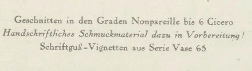
Breite Halbfette Grotesk
Designed by Schelter & Giesecke, this typeface is the wide, semibold cut of Grotesk.
Which fonts were inspired by the Bauhaus School?
Avenir
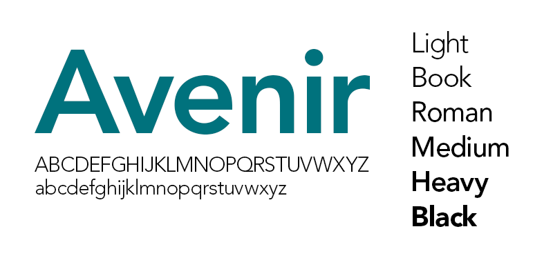
Avenir is a pretty common font these days. However, the designer behind the work, Adrian Frutiger, certainly felt it to be his best. It’s simple, low-contrast, and immensely legible.
PTL Superla

PTL Superla was designed by Ole Schäfer and Karl-Heinz Lange in 2009 and published by primetype.
FB Nobel
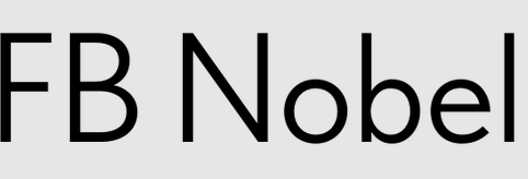
FB Nobel is a revival of Nobel, originally designed S.H. de Roos in 1929. It offers personal variations on the strict geometric characters typically associated with the Bauhaus.
Berthold Block

This typeface was published in 1908. It was originally issued in 6 styles, which offered variety in width and weight. It has been regarded as a bold companion to Berliner Grotesk. With minimal contrast between thick and thin strokes, Berthold Block provides an impactful, albeit stark, sans serif to achieve that classic Bauhaus look.
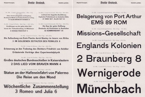
Venus
There are a few variants of Venus. But as it relates to Bauhaus sensibilities, you’re going to want the medium-wide and condensed styles. Venus makes for a great headline typeface, as seen in the image above.
Get unlimited graphic design styles in one click
Typography is an important part of any design project, and getting it done by a graphic designer can be a great way to ensure that your brand looks its best. Graphic designers have the expertise and knowledge to make sure that the text you use is legible, readable, and aesthetically pleasing.
If you’re ready to outsource all your graphic design tasks for a fraction of the cost of hiring a full-time designer, Penji is at your service. Learn more about what you can get from a subscription to Penji.


