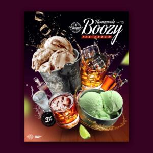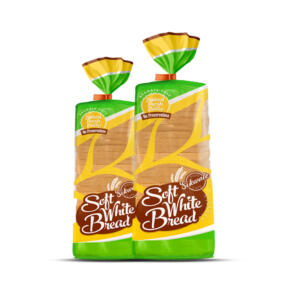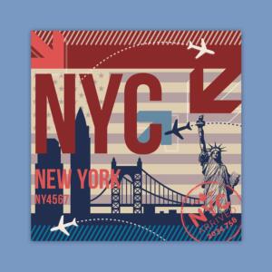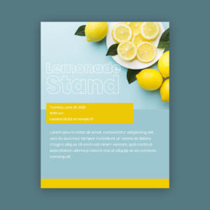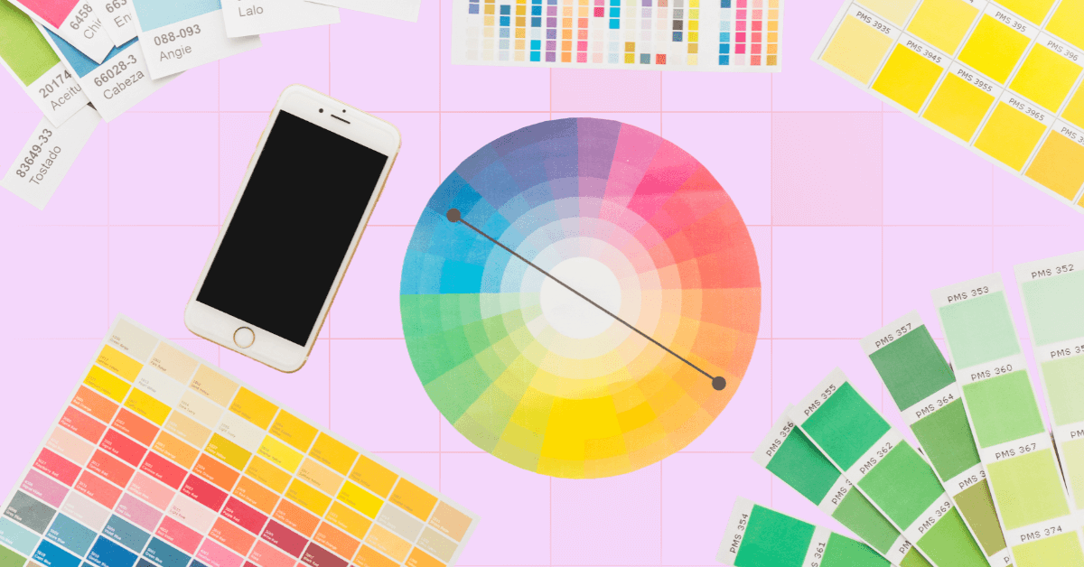
You probably learned about the color wheel back in elementary school. Now that you’re into branding, this Art 101 concept will help you choose the right colors to represent your company. The colors you choose can show if your brand is friendly, professional, exciting, or trustworthy. They help customers remember you and decide if they want to connect with you. Picking the right colors isn’t just about looks; it’s about sending the right message. So, how will I choose the right brand color palette?
We’ll help you choose the perfect brand color and achieve a cohesive brand identity. Let’s get started!
The Color Wheel
A color wheel is a simple circular representation of colors. It depicts the relationships between primary, secondary, and tertiary colors and their respective hues, tints, tones, and shades.
Sir Isaac Newton invented the first color wheel in the 17th century based on prism experiments. White light is actually composed of a variety of distinct colors, and this is the widely considered notion that red, yellow, and blue are the primary colors.
However, there were debates on what constitutes primary colors. Newton’s laboratory experiments with pigments led him to identify red, green, and blue as primary colors. On the contrary, the German writer Johann Wolfgang von Goethe considers yellow and blue primary colors based on perception and experience.
Understanding Color Psychology
Before we look at how colors work together, it’s important to understand color psychology how colors make people feel and act. Colors can send messages without using words. This is why brands pick their colors carefully:
- Red – Shows passion, excitement, and energy. It grabs attention fast. (Used by Coca-Cola, YouTube)
- Blue – Feels calm, safe, and professional. Often used by banks, hospitals, and tech companies. (Used by PayPal, Facebook)
- Yellow – Bright and cheerful. It gives a friendly and happy vibe. (Used by McDonald’s, IKEA)
- Green – Reminds people of nature, health, and growth. Great for eco-friendly or health brands. (Used by Starbucks, Whole Foods)
- Purple – Feels creative, rich, and fancy. (Used by Cadbury, Hallmark)
- Orange – Full of fun and excitement. It feels playful and energetic. (Used by Fanta, Nickelodeon)
- Black & White – Black looks strong and elegant. White feels clean and simple. Many luxury and modern brands use them. (Used by Chanel, Apple)
Think about how you want people to feel when they see your brand. Do you want them to feel excited, calm, or inspired? Choosing the right colors will help you send the right message.
Understanding Color Harmony
You might be wondering why the color wheel matters. How can this traditional color theory help modern designers and entrepreneurs create great brands?
The answer is simple. The color wheel provides the foundation for creating a visually appealing color palette. You don’t have to guess which color will blend well together. Instead, you can choose from pre-established color harmonies based on the color wheel.
Here are the seven most popular color harmonies to inspire you in building a color palette for your brand.
1. Analogous
Analogous color palettes consist of adjacent colors on the color wheel. These palettes typically have three or so colors, all belonging to the family of warm or cool colors.
Analogous color palettes are a safe choice for brands because they are easy to create and less likely to result in color blunders.
2. Monochromatic
Monochromatic color schemes use just a single color, with variations created by adding white or black. They are usually tagged as minimalist and luxurious. Since monochromatic palettes lack variation, they can be difficult to apply in more robust cases like a website.
3. Complementary
These are the pairs of colors that sit directly opposite each other on the color wheel. Many brands prefer complementary colors because they are inherently well-balanced and have a built-in sense of dynamism.
Complementary palettes tend to include one cool color and one warm color, which is why they work well in portraying a calming or energetic vibe.
4. Triad
Triad or triadic color palettes are created by taking three equidistant colors from the color wheel. Think of it as overlaying an equilateral triangle over the color wheel and then rotating it in any direction.
Triadic palettes pack a punch, but the colors must be implemented strategically so they do not compete. Using one color as the dominant color and the other as lighter accents is a good idea.
5. Split Complementary
Split complementary color schemes also use three colors but they are not equidistant from one another. Instead, you’ll select your base color and then choose the two colors adjacent to its direct complement (opposite on the color wheel).
Because the hues are closer together, split complementary palettes are more accessible to implement than triadic palettes while still offering the benefit of three distinct colors.
6. Tetradic
Another way of using color harmony is the tetradic color scheme, or rectangle, based on four colors forming a rectangle on the color wheel.
It is also called the double-complementary color scheme because it uses the complements of the first two colors chosen. So, it consists of two pairs of complementary colors spaced evenly around the color wheel. This color harmony type provides a vibrant palette of contrasting colors.
7. Square
The square color scheme uses four colors that are equidistant from each other on the color wheel. These colors create a strong contrast but can be challenging to balance. That is why it is preferable to use one dominant color.
Square color schemes are commonly used in web design because they are vibrant and playful.
Case Studies: Successful Brand Color Schemes
This section will explore some of the most successful real-life applications of the brand color wheel. Experiment with different color schemes and see how you can apply these insights to your own branding strategy.
Monochromatic Color Scheme: Starbucks
Starbucks’s logo is a perfect example of a monochromatic color scheme. Starbucks uses a shade of green that’s hard to associate with any other company because of how well the coffee company has positioned itself and its logo.
Green color shades create a fresh look and convey growth and prosperity. They connect your brand with nature, making it a perfect color scheme for food, beverage brands, and lifestyle brands. This is where brand design services can help you choose and implement the right colors to build a strong and recognizable identity.
Triadic Colors: Tide
Tide’s vibrant color palette, dominated by orange, yellow, and blue, creates a dynamic and energetic brand image. Yellow complements the dominant orange, aligning with cleanliness and adding a cheerful element to the brand.
The second complementary color is blue, which contrasts with orange. Blue represents reliability and trustworthiness. This color communicates the brand’s promise to their customers that their laundry will be clean and bright.
Slack: Modern Primary Colors
Slack’s logo uses four core colors such as red, yellow, green, and blue. The modern brand uses the shades of primary colors to express a straightforward identity. Logo color scheme like this shows how you can customize primary colors by adjusting the tone to match your brand personality.
Online Tools for Creating Your Brand Color Wheel
There are lots of online tools available to help you build your brand color wheel:
Coolors
Coolors lets you browse, create, enhance, save, and export palettes. This is one of our go-to tools. We love having our collection of palettes to pull from, from which we can easily copy the values in hex, RGB, HSV, and more. There are several export options, including code, SVG, image, and CSS.
Adobe Color
Adobe Color is available online, in mobile and iOS versions, and is one of the easiest Adobe tools to use because it’s built into the apps and connects with your Adobe CC library. In addition, the trends page is perfect for experimenting with color in games, graphics design, fashion, and other creative industries.
Canva
If you’re using Canva, there is a color wheel that integrates with other Canva tools. Plus, you can export color palettes for use in other tools. Canva includes explanations for each type of palette and how you can use them. This feature can be helpful for those offering graphic design services, as well as for both professionals and beginners.
Conclusion
Understanding the principles of color harmony and the brand color wheel can help you create an effective and memorable brand identity. If you want to make the most out of this guide, Penji is ready to assist you in implementing your chosen brand colors. Our graphic design services and brand design services include expert designers who can help you choose the best brand color scheme that captures your unique personality. From logo design to prints and website design, we will work closely with you to ensure your brand stands out.
Watch the demo video now to get started!
About the author

Rowena Zaballa
With a background as a former government employee specializing in urban planning, Rowena transitioned into the world of blogging and SEO content writing. As a passionate storyteller, she uses her expertise to craft engaging and informative content for various audiences.

