Running a blog that seamlessly blends aesthetics with functionality is easier said than done. You might think you have the perfect blog setup, but more importantly, what does your reader think? From layout and navigation to visuals and branding, each component plays a crucial role in shaping your blog’s identity.

Our design team has worked with countless businesses to reinvent their websites, blogs, and social media presence. Blog design can go further than you think, impacting your brand’s memorability, status, and even revenue.
Let’s explore 10 examples of blog design done right, along with essential tips to make use of your digital home.
Understanding Great Blog Design
First impressions are everything, and blog design is crucial for establishing credibility. Whether you’re a new entrepreneur or a veteran company, your blog’s design sets the stage for an impactful user experience – or not.
Key Elements of Blog Design
The key elements that define exceptional blog design are:
- A Visually Appealing Layout: Opt for clean, intuitive designs with ample white space and clear typography for better readability
- Strategic Navigation: Include user-friendly navigation bars and social media buttons to streamline access to your content
- Compelling Content Structure: Organize your content into visually digestible formats
- Consistent Branding: Infuse your blog with consistent branding elements, such as colors, fonts, and imagery
- SEO Optimization: Implement SEO-friendly practices, including meta tags, keywords, and quality content to enhance visibility
Examples of Stellar Blog Design
1. Rise Science: Bold & Practical
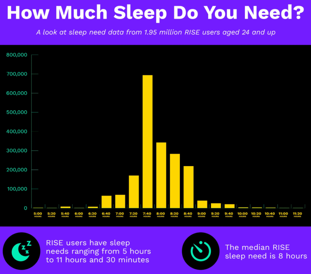
Rise’s sleep blog is a goldmine for health enthusiasts and biohackers who want to perfect their circadian rhythm. It’s design is dark and with bright lines and shades inspired by the sunrise/sunset.

Rise’s infographics provide answers to the most common sleep and energy questions guiding users through a learning experience in each blog. No doubt you’ll leave a little more enlightened about how to sleep and manage your energy better, prompting you to return for more practical insights later.

2. Hubspot: Professional & Articulate

Hubspot’s blog is professional, but it’s also artsy and visually engaging. They pay attention to little details like crisp thumbnails, cleanly divided sections, Q&A snippets, and infographics to make you feel you’re getting bang for your buck. By the end of a Hubspot blog, you feel like you really learned something or you were inspired with new ideas – this is the quality piece so many blogs are missing.

3. Openhouse: Interactive & Modern

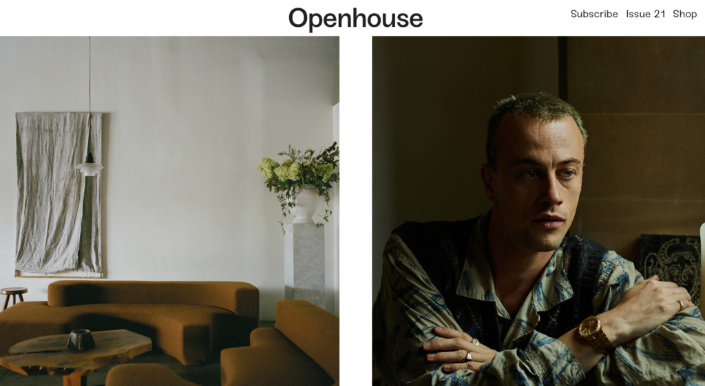
Openhouse Magazine’s blog strikes the perfect balance between eye-catching and conservative. It relies heavily on interior design photographs and white space to create a striking visual contrast. Smooth scrolling features and mouseover fades make you feel like you’re strolling through a posh art gallery in digital form.

How to Level Up Your Blog
1. Make it easy to share
Encourage your readers to share on social media with easily shareable elements in blog posts. One of the most common ways to do this is pulling out compelling quotes and having a retweet button for Twitter. Another way is to share your blog posts as email newsletters and include share links at the bottom (email providers like Mailchimp make it easy to drag and drop this element into your email).
2. Build your email list
Don’t miss an opportunity to grab email subscribers via your blog. Integrate opt-in forms or banners with an enticing offer to sign up for your emails. Offering readers the option to subscribe allows you to nurture relationships beyond the confines of your blog.
3. Embed video content
It’s a good time to start embedding videos from your YouTube channel. Even if you’re not much of a video creator, consider producing quick, informative clips that complement your written content. Not only does this diversify your content, but it also boosts your SEO efforts, as search engines increasingly prioritize video content in search results.
4. Go all out with your visuals
While some may dismiss blogs as outdated, the truth is that they’re still a top medium for diseminating information to audiences. Don’t let blog pessemists discourage you from prioritixing blog design. Photographs, on-brand illustrations, captivating featured images, infographics with bitesized info – all of these create an immersive reading experience that makes readers happy to return.
5. Curate related posts
Combat high bounce rates and keep visitors engaged on your site by incorporating a “related posts” section at the bottom of each blog. By suggesting additional content that aligns with readers’ interests, you provide them with more opportunities to explore your brand and discover your offerings. This not only enhances the user experience but also signals to Google that your blog is worth promoting in SERPs.
By implementing these tips, you can elevate your blog from a mere content mill to a dynamic learning hub.
How to Choose a Blog Name?
Choosing a blog name that fits your identity or branding can be a challenge. If you’re still stuck deciding on what name’s right for your brand, don’t worry! Here are a few tips to get you started on finalizing what name your blog should have.
1. Use a Blog Name Generator
If you want a quick and easy solution to get a name for your blog, a blog name generator should give you ideas. Wix, Namify.tech, and Ryrob.com offer blog name examples to help you launch your blog in no time! Sometimes, a blog name generator doesn’t do the trick. And that’s okay! You have other options to consider!
2. Browse Other Blogs
Sometimes, the best way to find ideas is by looking at what’s already existent. Many get inspiration from what’s already available and tailor it to their interests. However, ensure that you’re not copying the blog name from a competitor, which could lead to copyright issues. If you can, put your own spin to make it your own!
3. Use Your Name
If all else fails, your name can serve as your blog name. It’s a great exercise on building your personal brand. Plus, having your name as the blog name will create an association on what topics you write about. For instance, Gary Vaynerchuk used his name to launch his blog. Since then, he’s become a well-known personality in business!
However, if you’re not fond of using your name, you can use a pseudonym! This way, you keep an air of mystery on your name. Plus, you can craft a personality based on the pseudonym!
4. Know Your Niche
Many bloggers base their blog name on a niche. In fact, most bloggers identify a niche first before creating their blogs. This helps them become an authority on a specific topic. That’s why when creating your blog name, you should know what your niche is. For instance, if you want to specialize in plant care, you can use The Girl with the Green Thumb. It doesn’t have to be as quirky as my idea. However, you can brainstorm some ideas and choose which one works best.
5. Get Inspired by Another Language
You don’t have to be a linguist to decide your blog name. Your blog’s name can be a word or translated from another language. For instance, you can use Amore, if you want to use ‘love’ as part of your blog name. However, when using a word from another language, ensure that it respects the culture and language. Plus, it’s not a crass word that would generate ridicule from speakers unless that’s your intention.
Let Penji Handle Your Blog Design
Get all your design needs met in one subscription. From blog designs to business cards, landing pages, ad designs, print designs, and more, we’ve got you covered. Enjoy unlimited graphics with a flexible plan that allows you to pause anytime, switch designers, and request unlimited revisions.
With Penji’s attentive design team, you’ll get every on-brand design you need for a fraction of the cost of hiring one in-house designer. Watch a quick demo to see how easy it is to order all the graphics you want!
About the author

Brianna Johnson
Brianna is a professional writer of 10+ years who specializes in branding, marketing, and technology content.


