Statista reports that revenue in the alcoholic beverages market amounts to US $283.8 billion in 2023 and is expected to increase by 5.55% annually. If your business belongs in this sector, you must build a strong brand identity and top-notch design elements to attract more customers. Forget the boring packaging because there’s always an exciting approach to alcohol packaging design. Read on for the ten most sensational also packaging design examples.
1. Chivas Regal 12-Year-Old Blended Scotch Whiskey
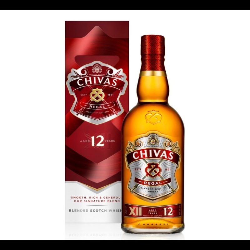
On September 2021, Chivas Regal announced the new packaging and bottle design of its 12 Year Old blended Scotch whisky. It is updated to capture the attention of the style-conscious generation. Chivas made a complete makeover with a vibrant burgundy, replacing the old silver and gold tones as the main color scheme. Meanwhile, the intricate detailed, and textured finish remains the same.
2. Jack Daniel’s Limited Edition Sinatra Select
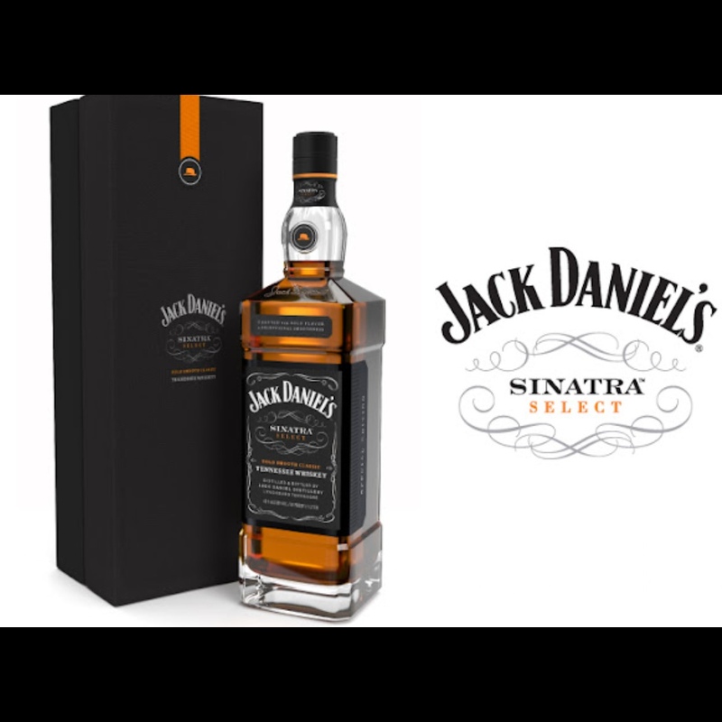
This packaging is made especially for Jack Daniel’s Sinatra Select. Created in honor of American singer Frank Sinatra, this limited edition Tennessee Whiskey is housed in minimalist black box packaging with an orange-colored detail. If you’re looking for timeless, minimalist alcohol packaging, this one suits you best!
3. Absolut Vodka
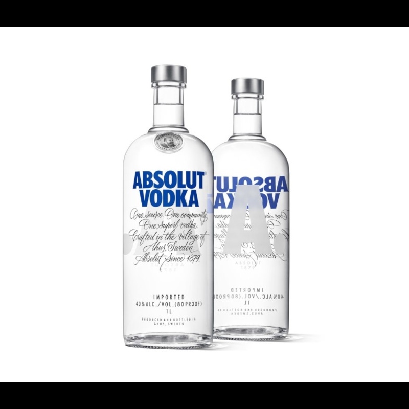
Absolut Vodka’s packaging is one of the top alcoholic brands. The company’s iconic bottle design was first introduced in 1979 and has remained relatively unchanged. The bottle’s sleek, minimalist design has made it a staple in the spirits industry. So, if you’re looking for unique packaging for your alcoholic drink, Absolut Vodka is the best inspiration.
4. Hendrick’s Gin
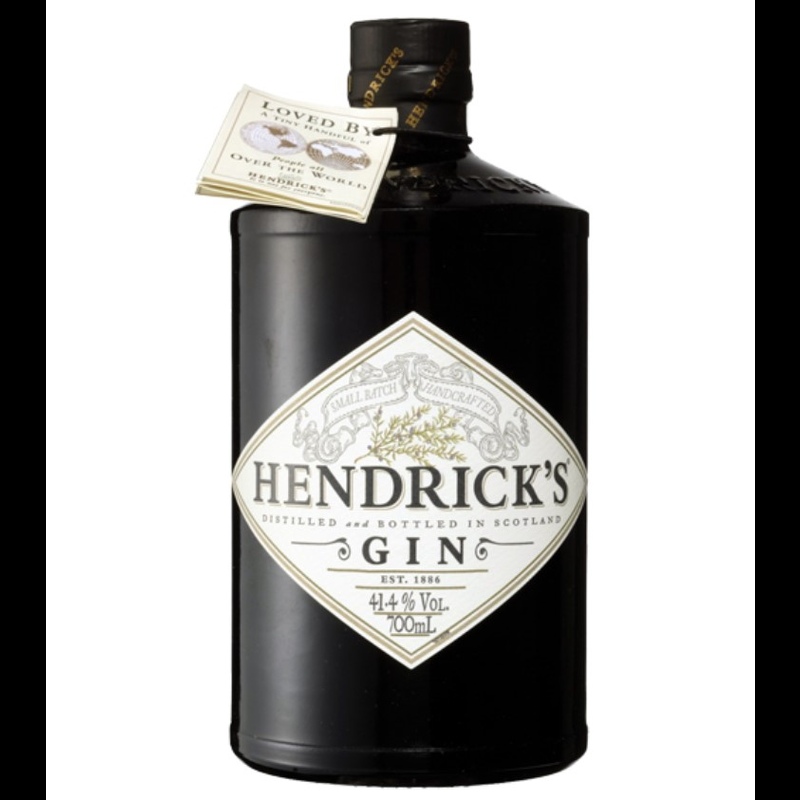
Hendrick’s Gin is known for its distinct apothecary-style bottle design. It features a cork top and label reminiscent of Victorian-era typography. Plus, a product information tag is placed at the neck of the bottle. Likewise, the white and gold label perfectly matches the matte black bottle.
5. Veuve Clicquot
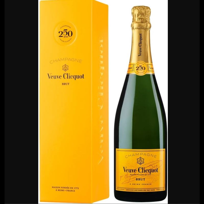
Veuve Clicquot’s champagne packaging has a signature yellow label and a bright yellow box. The box has a minimalist design, making the design elegant and luxurious. When designing packaging for any product, you must consider a timeless design that will make a positive mark on your customers.
6. Grey Goose Vodka
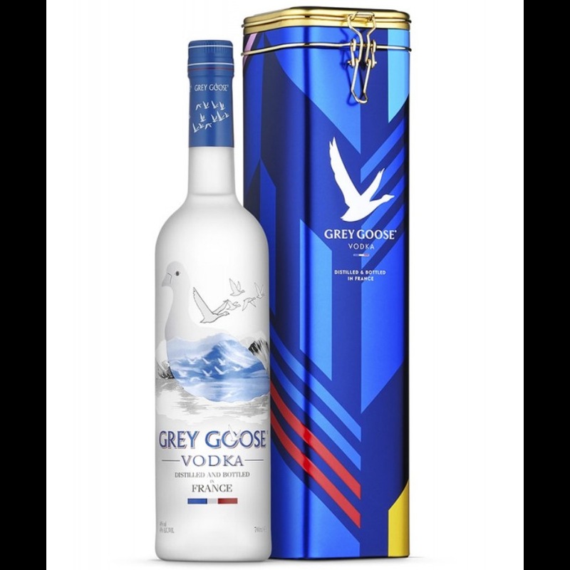
Grey Goose Vodka’s bottle design is simple and elegant, with a frosted glass finish and a sleek, minimalist label. The blue tin box features the brand name, logo, and text that reads “distilled and bottled in France.” People who want reusable packaging designs will choose this packaging design.
7. Don Julio Tequila
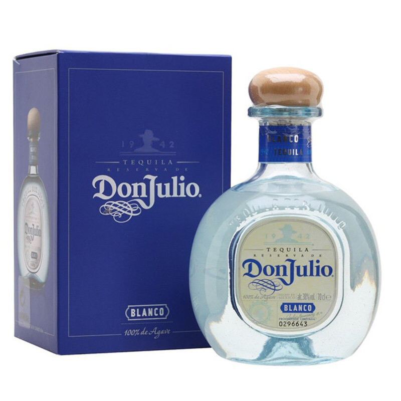
Don Julio Tequila’s bottle design features a distinctive that resembles a perfume bottle. The sleek, modern design has won numerous awards for its unique look. The winning elements of this alcohol packaging design are the creative fonts and vibrant blue box packaging that matches the bottle’s details.
8. Jagermeister
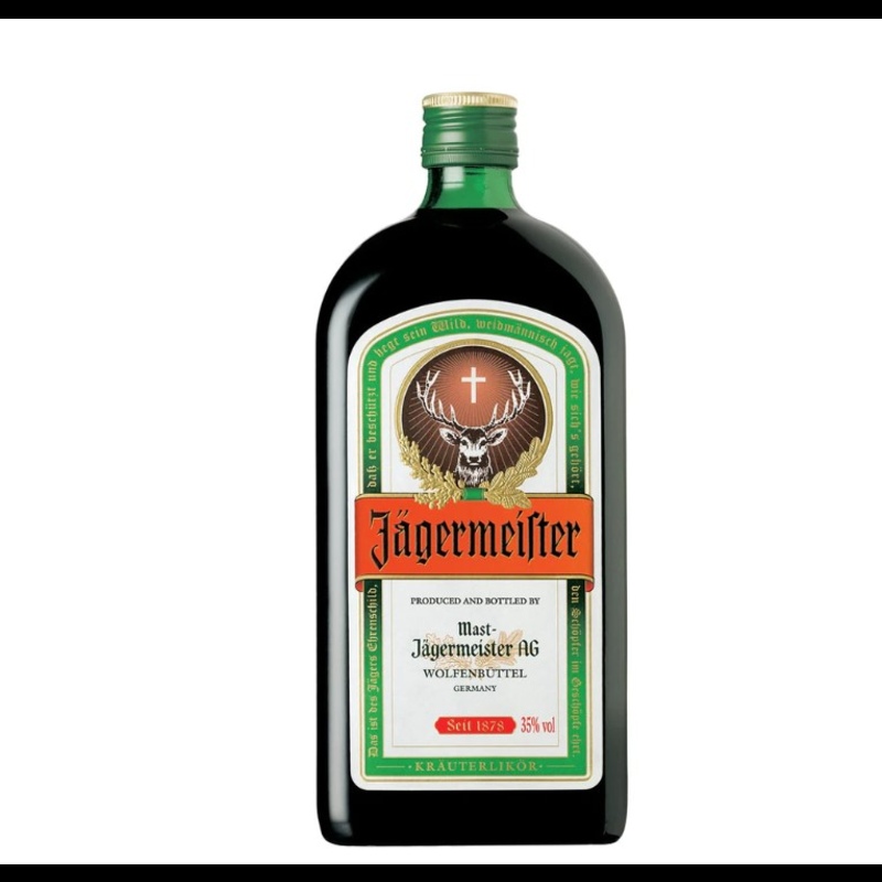
Jagermeister’s bottle design features a distinctive, embossed logo and a dark green glass bottle with a minimalist label. This herbal liquor’s packaging is unique and hard to copy, which prevents the consumer from getting counterfeit products.
9. 1800 Tequila
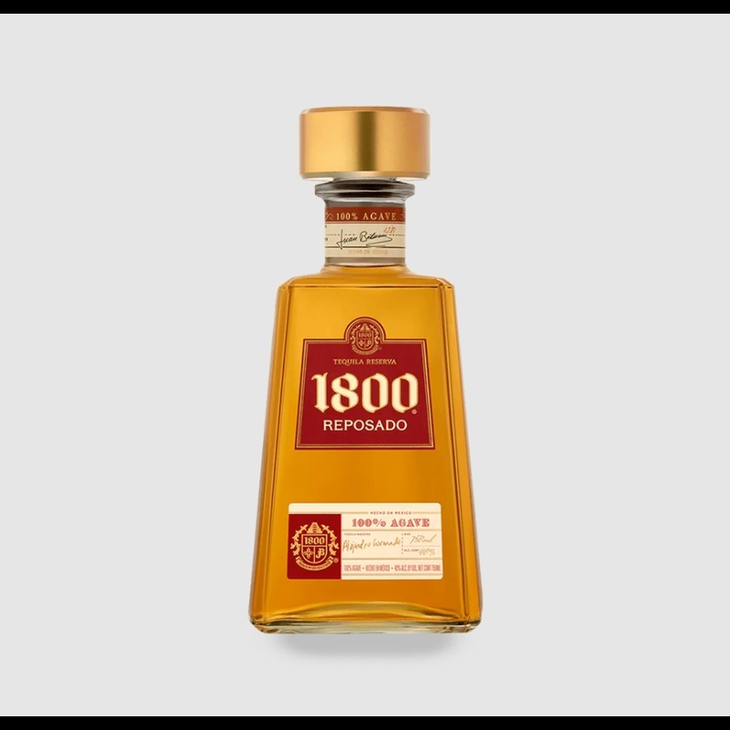
From herbal liquor, let’s move to Tequila. As you can see, 1800 Tequila’s bottle design features a distinctive trapezoidal shape and a bright red label. Plus, information about the product is written on the neck of the bottle. So if you want to design the packaging for your brand, you must draw inspiration from the unique features of 1800 Tequila.
10. Belvedere Vodka
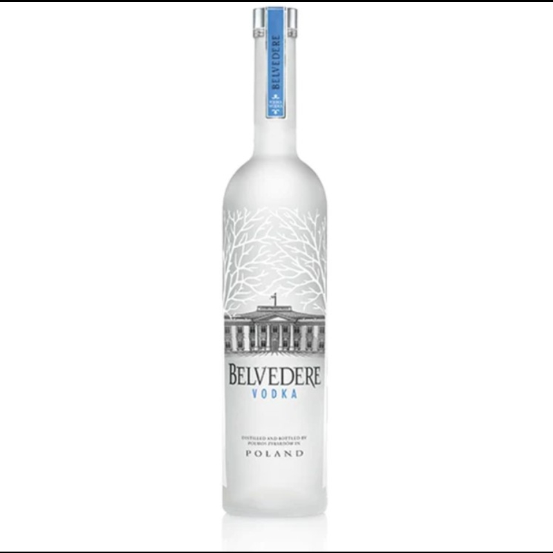
And for the final alcohol packaging design on the list is Belvedere Vodka’s bottle design. The bottle itself is elegant and sophisticated, featuring a metallic silver label that wraps around the neck of the bottle, bearing the Belvedere logo in large, bold letters. The bottle is topped with a sleek metallic cap, adding a touch of sophistication to the overall design.
How to Create the Right Packaging Graphics?
Below are five best practices that lead to packaging designs that consumers notice on shelves, turning them into loyal buyers.
1. Put your consumers at the center of your package design.
Your consumers need to understand what your product is all about instantly. Good branding provides momentary education, and the best place to educate your prospective consumers is on your product’s packaging.
Your package design should not be about your brand. It should serve the consumer. When buying a product, consumers care about what’s in it and how it will help them solve their problems. In short, your branding and messaging need to be clear, well-defined, and benefits-oriented.
2. Build and communicate your differential qualities.
When brainstorming your package design, ask yourself these questions to define your unique differentiator. This point of difference is vital for success in today’s oversaturated market, with brands competing globally. Think about what makes your brand and your particular product unique. Then, narrow down to the most important ones that eventually lead you to a straightforward packaging design.
3. Communicate with consumers through storytelling and shareable content.
The emotional connection with the audience is becoming essential e as Millennials and Gen Z-ers now make up the more significant share of the total consumer. These demographic groups are particularly fond of storytelling. They also follow brands that align with their values and consider ethical stands when making a purchasing decision
4. Make your package design future-proof.
You might observe that we have mentioned the term “timeless” several times already. It is because making your package design future-proof is a way to keep your investments stable and lucrative.
5. Be bold with your copywriting.
The copy, messaging, and text are crucial components contributing to consumer perception of a product. Follow the recent trend in package design that leans towards more casual, creative copywriting to inform and elevate the brand’s personality.
Conclusion
Take note that the best alcohol packaging designs are those that catch the consumer’s eye and resonate with the brand’s identity and values. Also, the packaging design can often be a consumer’s first impression of a brand. And if you’re ready to design your own, look no further because Penji can help you in that area. Our expert graphic designers are always ready to start a project with you. Visit this link to learn how Penji unlimited design service works.
About the author

Rowena Zaballa
With a background as a former government employee specializing in urban planning, Rowena transitioned into the world of blogging and SEO content writing. As a passionate storyteller, she uses her expertise to craft engaging and informative content for various audiences.
Table of Contents
- 1. Chivas Regal 12-Year-Old Blended Scotch Whiskey
- 2. Jack Daniel’s Limited Edition Sinatra Select
- 3. Absolut Vodka
- 4. Hendrick’s Gin
- 5. Veuve Clicquot
- 6. Grey Goose Vodka
- 7. Don Julio Tequila
- 8. Jagermeister
- 9. 1800 Tequila
- 10. Belvedere Vodka
- How to Create the Right Packaging Graphics?
- 1. Put your consumers at the center of your package design.
- 2. Build and communicate your differential qualities.
- 3. Communicate with consumers through storytelling and shareable content.
- 4. Make your package design future-proof.
- 5. Be bold with your copywriting.
- Conclusion


