
If you’re reading the title and wondering “How could a real estate billboard be impactful?” then you’re not alone. When thinking of the average real estate billboard, you probably can’t envision anything at all. And if you do, it’s probably the least impactful thing you could imagine.
Real estate is one of those subject matters that are very hard to find joy in. However, real estate is also a very important part of modern society. So, it’s crucial to get real estate billboards right. If you’re in this business and want to learn how to market yourself in a way that excites people, then read on. Here, I’ll list nine real estate billboards that make a true impact.
9. Jeff Cook Real Estate
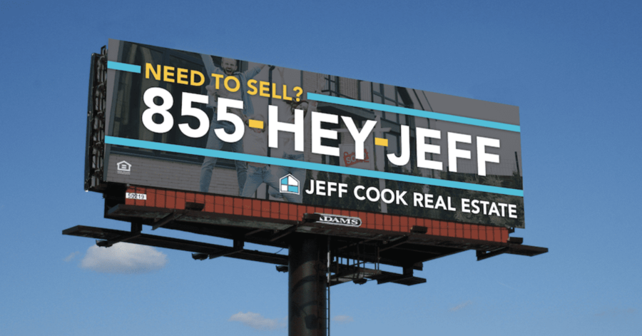
Sometimes you just got to get straight to the point, and that’s exactly what this ad does for viewers. It starts with a question in yellow lettering to get your attention. After that, it gives you an immediate call to action by displaying a phone number in large text. To generate brand awareness, they add their company name and logo at the very bottom.
8. Real Estate Features
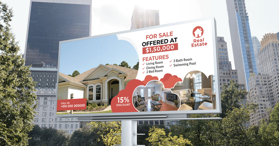
This real estate billboard provides a show with amazing colors and shapes. The tactical thing about this advertisement is that it doesn’t need a cutout to create a unique shape. Instead, it uses cloud-like imagery for each photograph, disrupting the white background with the vibrant house design.
Many advertisers wonder how to put a bunch of important information on their billboards without making it feel cluttered. The answer to this is complicated. In all honesty, it’s important to focus on something else. Instead of cramming as much information as possible into your ad, you should focus on telling a particular story. This advertisement tells the story of a nice house that has great interior and exterior design. Therefore it lists the house’s features while giving us creative and colorful imagery.
[in_content_ads gallery=”logos” logo=”on” title=”Need graphic design help?” subtitle=”Try Penji’s Unlimited Graphic Design and get all your branding, digital, print, and UXUI designs done in one place.” btntext=”Learn More” btnlink=”https://penji.co”]
7. Great Angles
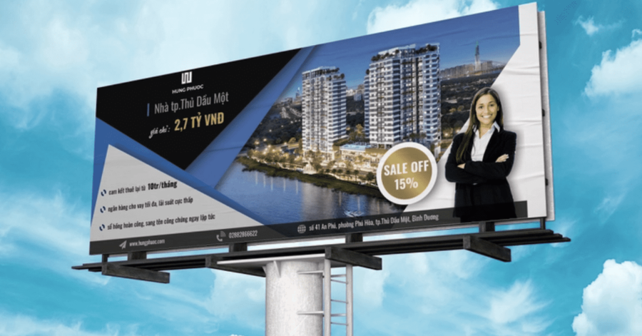
Here is another real estate billboard that plays a lot with shape. As you can see, there are a lot of sharp angles there are at least two triangles, as well as sharp rectangular shapes. You may be wondering why this is important. Well, shape plays a huge role in what our eyes are attracted to. If this was just a regular billboard with a picture on one side, then it would look quite boring. The dynamic structure allows it to stand out from other real estate billboards.
6. Prime Crest
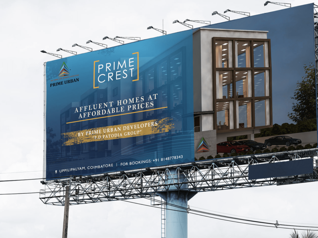
Now, this billboard doesn’t have dynamic shapes. What it does have is a large high-quality gorgeous building. Prime Crest lets the picture do most of the talking. Of course, there is a space for all of the necessary information. However, notice that this section is slightly opaque. This is what you as an Advertiser can do to display another section without taking away from the overall image. With the right typography, it could also look very professional.
5. Rental Made Easy!
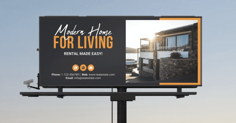
This advertisement would be pretty boring if it weren’t for the typography, the formatting, and the background design. This is why you should consider hiring a graphic designer to create the perfect real estate building. They can make even the plainest concepts come to life with just a few minor tweaks.
4. SOLD.
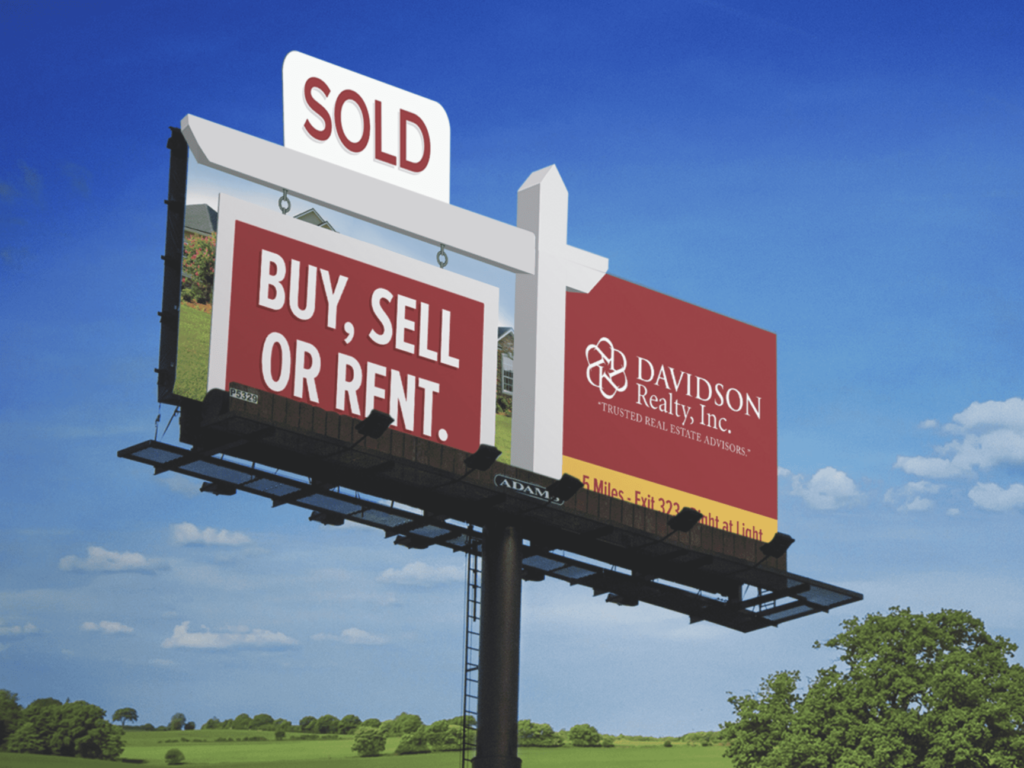
What’s most important about a real estate billboard is that it gets straight to the point. This billboard right here provides a creative throwback to the “sold” signs seen on outdoor lawns. This is the thing that catches people’s eyes at first glance.
To keep a person hooked, however, you must provide something of immediate value. This advertisement reads; “Buy, Sell, or Rent.” in huge letters. We immediately know what their company does, and how it can benefit the viewer. Finally, on the right-hand side, it gives you all the little details. This advertisement Davidson Realty Incorporated. It tells you where their headquarters are located, and gives us a slogan to increase brand recognition.
3. We Buy Ugly Houses
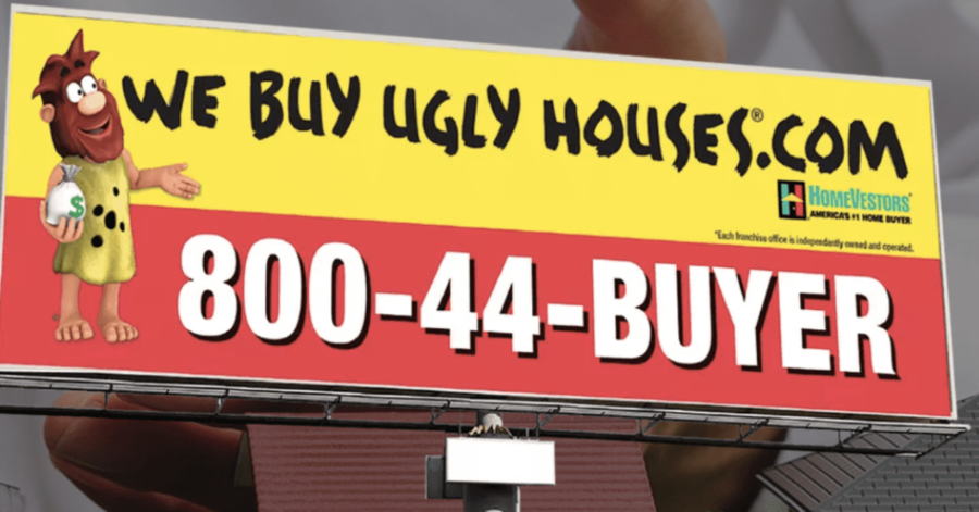
If you’ve been out on the road at all you have most definitely seen these real estate billboards. We Buy Ugly Houses. Once again, it is simple and to the point; there’s no question about what this company does.
The slogan “We Buy Ugly Houses.” is such a memorable phrase. The statement is shocking at first glance, because, well who would want to buy an ugly house? Of course, many real estate workers will buy old worn-out to renovate them. It also touches on a niche market; people who need to sell their house, who are not confident in the state of their property.
I also want to note the use of a mascot, since this is the first ad we’ve seen on this list to use one. Mascots are used to easily connect with the audience and tell a story. This is why if the mascot is a human being, they are often anthropomorphic. The audience wants to relate to your mascot in a way so that they can attribute that relatability to the overall brand. This is another reason why I think these real estate billboards are so successful.
2. Amber R. Johnston
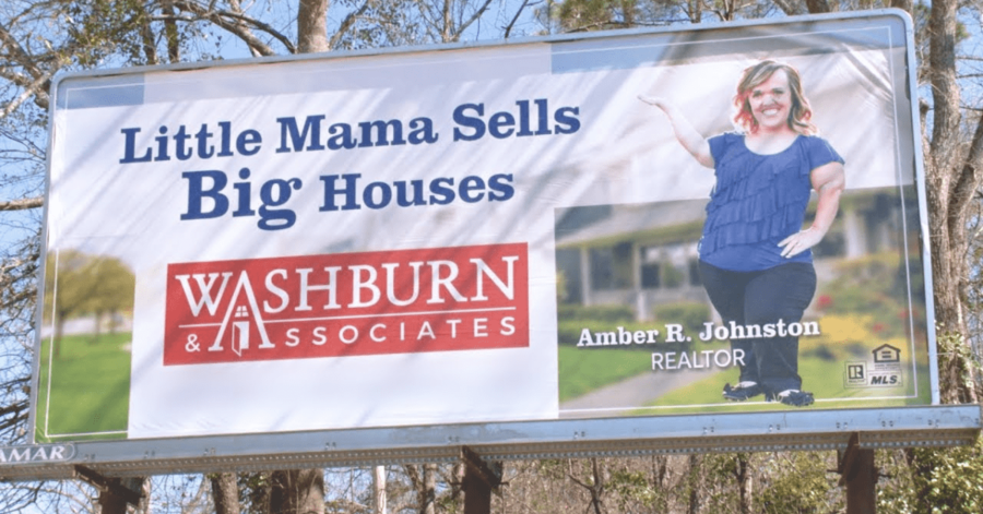
Here’s another straight-to-the-point real estate billboard that incorporates a fun sense of humor. Amber R Johnston please up sure small stature in juxtaposition to her occupation. This gives people an immediate laugh while driving on the road. It also incorporates a memorable message that will stick with the viewer in case they need a house in the future.
1. Edina Realty
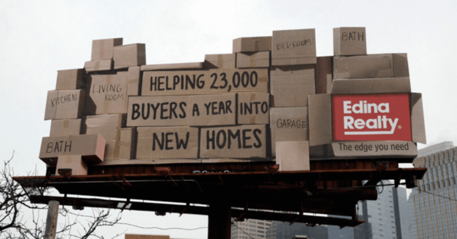
In case you didn’t think real estate billboards could get experimental, here’s an ad for Edina Realty. Guerrilla marketing strategies are always the way to go if you want to get quick and easy attention. This billboard incorporates cut-outs along with super detailed imagery. It tricks the brain into believing it’s looking at a real pile of boxes on top. I was honestly surprised when realizing most of this is a flat image.
Furthermore, this real estate billboard has a very sweet message. Instead of selling or buying houses from the average customer, this brand is focused on something more personal. They help people get into their new homes. They’re not just a business, they are here to offer a helping hand.


