Creating a logo can be a tedious process. Aside from choosing suitable symbols and color palettes, the choice of font is crucial in establishing a professional brand image. And with a ton of text styles available, finding the best fonts for logos can be a tricky task.
Here at Penji, many of our clients leave the logo-designing task to our professional graphic designers. After all, they know just how important a logo is in building a stable brand reputation. So, if you want the best branding asset that would resonate with your audience, get a logo design from Penji.
And if you want to be a part of the designing process, check out the most famous logos we compiled and their corresponding fonts.
Popular Logos and Their Fonts
Here are some of the fonts used in the most famous logos. Take note, though, that some of these logos are only based on the fonts. In addition to that, some of the logos use a modified version of the fonts.
Futura
FedEx
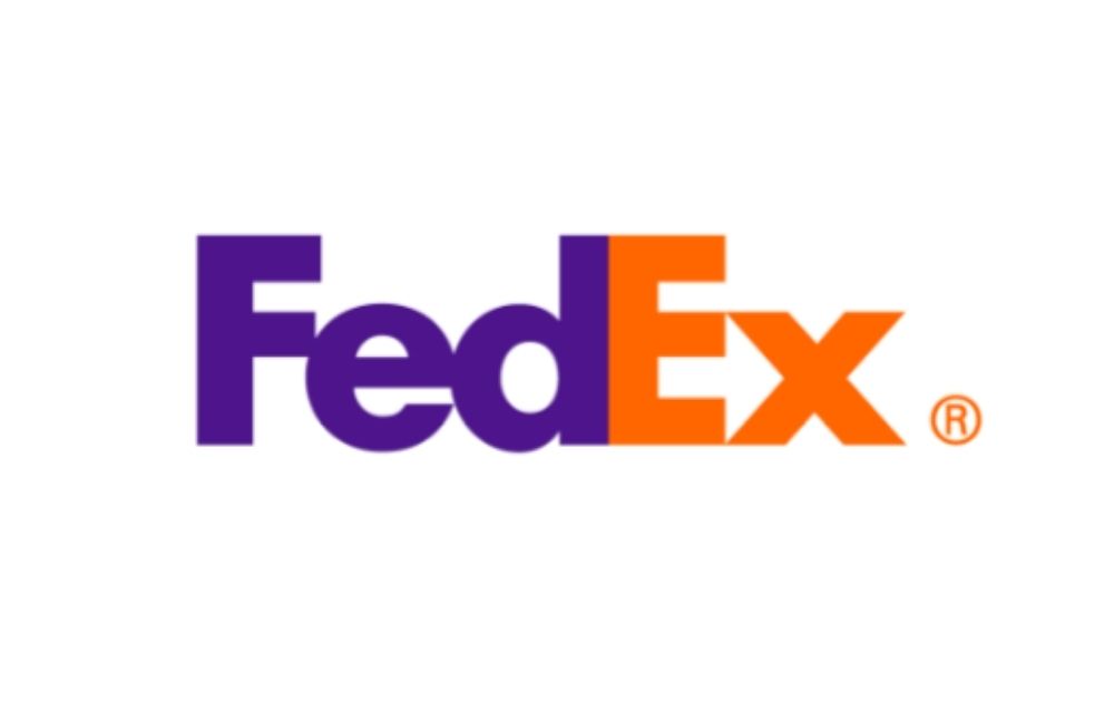
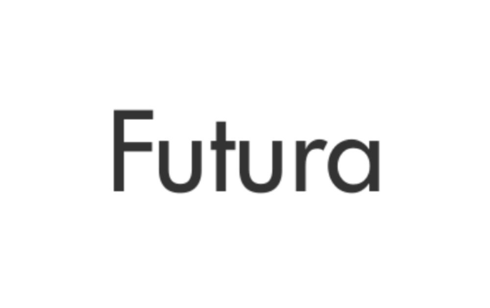
The first on our list of the best fonts for logos is Futura. FedEx uses this font with modifications. As seen on the logo, the kerning was adjusted so that each letter touches the one beside it. If you’re not familiar with font terms, kerning pertains to the adjustment of space between each character.
Louis Vuitton
Who would’ve thought that a courier service and a luxury brand are using the same font? Yup, Futura is also the closest font to the one used by Louis Vuitton in their logo. Compared to FedEx, Louis Vuitton’s logo text is much lighter. As a result, it looks classy and delicate, which fits the brand identity.
Red Bull
Also, on the Futura logo group is this Red Bull. The world-famous energy drink brand uses a strong version of the font but not as wide as that of FedEx. Some features have also been modified, including the added space between the base and curved lines of letters R and B.
PayPal
The logo for this online payments brand also uses the same font. Unlike the previous ones, however, PayPal’s logo features a slightly slanted version of the font. That, coupled with the two-toned blue palette, adds interest to the logo’s overall look.
Nike
Just like PayPal, Nike uses a slanted or italicized version of the font. However, the two logos can’t look more different from one another. For one, the sportswear brand uses capitalized letters and more compact tracking or the overall spacing in between the letters. In addition to that, Nike also uses sharper edges compared to PayPal’s rounder ones.
Myriad
Shopify
If you’re looking for free download creative fonts for logo design, don’t overlook Myriad. This sans serif font is the closest one to the one used by Shopify. As seen from the logo, the font is memorable enough to leave an impression but simple enough to give way to the shopping bag symbol beside it.
Visa
Visa is another logo that uses this font style. As seen on the logo, the slightly-slanted text has a modified letter V. Instead of the regular clean letters, the edge of the first letter is slightly extended outward. The gentle blue gradient provides added appeal to the logo.
Walmart
Walmart is another brand with a logo that uses Myriad as a font style. Unlike the first two logos, this one doesn’t use an italicized version of the font. In fact, the straight orientation makes the logo look very simple, with one possible kerning modification between the letters W and A.
LinkedIn also uses one of the best fonts for logos free of charge. This logo uses a slightly heavier version of the font, thus making it look strong and stable. In addition to that, the rounded blue square that houses “in” offers a much-needed break from an otherwise monotonous design.
Adobe
Adobe also uses this font on their logo. Compared to earlier examples, however, Adobe features a thinner version with wider tracking in between the letters. The slimmer text complements the chunky A symbol placed before the brand name. As a result, the logo looks balanced.
Trade Gothic
Bershka
Next on our list of best fonts for logos is Trade Gothic. The version used for the logo of the clothing company is light, paired with generous tracking. That said, this style is reminiscent of how Louis Vuitton used Futura, with the exception of the capitalization style.
YouTube
YouTube also uses Trade Gothic but with a much stronger style compared to Bershka. However, the style looks like a narrower version, with slim tracking that makes the brand name look solid. In addition to that, the simplicity of the text complements the red play button symbol that appears before it.
Product Sans
Alphabet
Included in our best fonts for logos collection is Google Product Sans. With this example, we can see how conglomerates use font styles to unify their brand identity without needing to use exactly the same logos for each company. The first example of this font is the logo for Alphabet, the parent company of Google, and other former subsidiaries of the company.
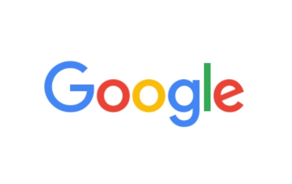
Next on the list under Product Sans is Google. Though the logo uses a font akin to that of its parent company, it doesn’t look like an exact copy. For one, the multi-colored style of Google makes for a unique brand look. Also, the color saturation differs for both, with Alphabet’s red being a deep scarlet and Google’s red having a lighter tone.
Google Maps
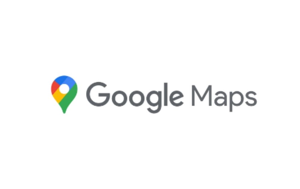
Also using the same style of modern logo fonts is Google Maps. Just like Google, the logo for this mapping platform and consumer app uses the same font for the word “Google” but a lighter style for the word Maps. Also, the logo features a simple gray color, with the branding palette appearing only in the map pin symbol.
Proxima Nova
Mashable
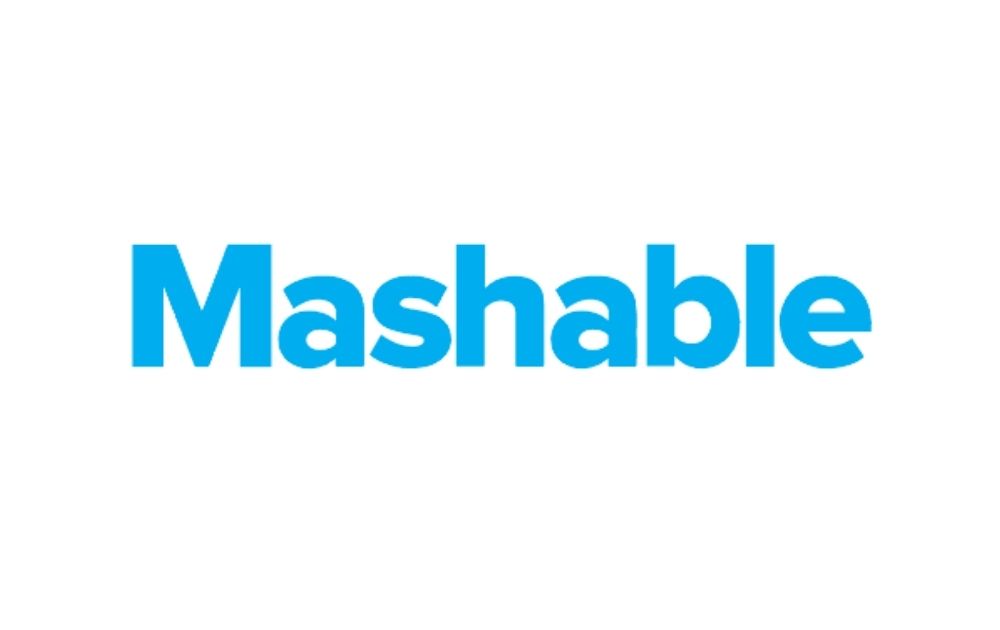
Proxima Nova is another font style used by various brands in their logo, such as Mashable. If you’re looking for a professional logo font-free download, though, you might want to stay away from this font. But even though the font itself isn’t for free, you can find several alternatives that look akin to it but don’t cost anything.
Product Hunt
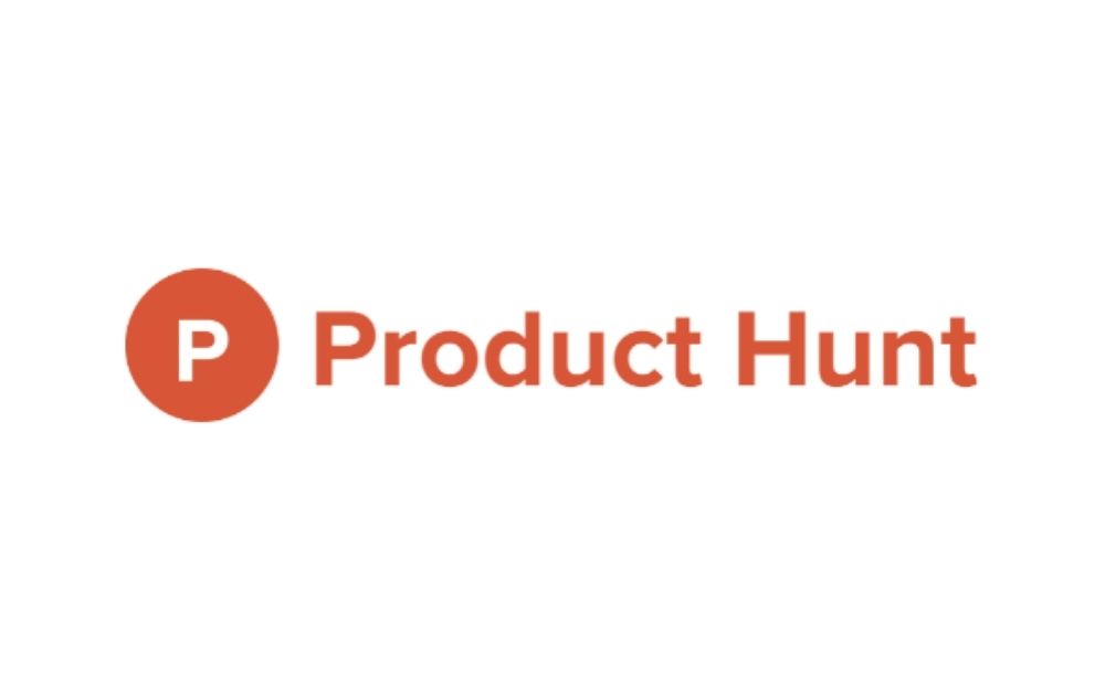
Product Hunt uses a logo font close to Proxima Nova. Unlike Mashable, the American product-sharing and discovery website uses a lighter version of the font. In addition to that, it also has a looser tracking style compared to the first example.
Turkish Airlines
The national flag carrier airline of Turkey has this font to thank for its solid logo. The airline uses a strong version of the font with a good amount of tracking and leading to keep the logo looking neat and solid. The use of capitalized letters also offers an added layer of stability to the design.
Helvetica®
Target
Helvetica is another good font style to use for logos. However, it’s best that you know from the get-go that his font isn’t for free. That said, you need to purchase it before it can appear on the best Photoshop fonts for logos installed on your device. Target is one of the brands that use this font on its logo.
Panasonic
This Japanese electronics firm also uses the same font for its logo. Unlike Target, however, Panasonic uses a title case on its font, making for a professional-looking visual. The tracking for this logo is pretty close, thus making the logo appear compact.
NBA
This font is also the closest to the one used for the ever-famous logo of the National Basketball League. Compared to other logos, however, the NBA logo uses a narrow version, making for a dense visual that puts emphasis on the blue, white, and red image of a basketball player preceding the letters.
CAT
NBA and Caterpillar Inc. both have three-letter logos using the same font family, but they can’t look any more different from one another. Caterpillar uses a much thicker version of the font and modifies it to accommodate the eye-catching yellow triangle. The yellow, black, and white logo makes the image look tough and rugged, fitting for a firm focused on engines and machinery.
American Apparel
If there’s a logo that shows how a minimalist wordmark can make a brand look strong yet elegant, it’s this visual from American Apparel. The logo uses the same font family and a monochrome palette that looks simple yet classy.
Nestle
The same simplicity works well for Nestle’s logo. As the logo features an illustration of a bird’s nest, the sans serif font works well for this visual. That said, this logo looks a bit different from other logos using the same font because of how it modified the N to include a horizontal line that extends above or through all the succeeding letters.
BMW
BMW’s new logo has earned polarized views ever since it was launched in 2020. According to the brand, however, the revamp is geared toward positioning the firm in the digital age. Though some say that the logo’s flat appearance paints a modern logo gone wrong, the font style sure makes the brand look contemporary.
TED
As a platform that takes inspirational ideas to a wide audience reach, TED’s logo is just as unique and impactful as the brand. That said, the logo uses the same font family but adopts a thicker, bolder typeface. As a result, the logo looks as poignant and gripping as most of the talks it delivers.
Nutella
Who would’ve thought that TED and Nutella use the same font family? For sure, the resemblance is not immediately obvious as TED uses capitalized letters while the sweetened hazelnut cocoa spread uses small letters. Nutella pairs the simple sans serif font with a quirky color style – the letter “N” in black and the rest of the letters in bright red.
ITC Avant Garde
Calvin Klein
Next on the list of fonts is ITC Avant Garde. One famous brand that uses this font is Calvin Klein, which uses a thin, elegant style. You might have noticed that Calvin Klein employs the same minimalist approach employed by other clothing brands on this list, such as Louis Vuitton and Bershka.
Groupon
Groupon is another brand that uses ITC Avant Garde. Compared to the former example, this brand uses a thicker style for its letters. However, since the logo uses a lime green font, the block-letter logo still looks friendly – a good visual for an e-commerce store.
Adidas
ITC Avant Garde also appears in the logo of Adidas. Unlike the other examples, though, this logo uses tight tracking, making the small-letter word look dense and strong.
The Lowdown
The text style is undoubtedly an important part of a logo. Given the examples above, here are some key takeaways entrepreneurs must learn:
- Simplicity is the best policy. If you’re already using intricate symbols or patterns, keep your font style as simple as possible.
- Clarify your brand identity first. Without being clear about who you are and what you stand for, it would be harder to narrow down your font choices to options that reflect your identity.
- Leave the design to a pro. If you’re not a pro designer, your brand logo is not the best project to mess up with!
If you need help crafting your logo, leave the design heavy-lifting to us here at Penji. We offer unlimited graphic design at a flat monthly rate, which means you can have all the designs you want while staying within your budget.
Because we have the top 2 percent of designers, you’re leaving your logo in good hands. Get unlimited designs now and enjoy 15% off the first month of any plan. You can try any of our packages risk-free for 15 days, so there’s nothing to lose and everything to gain.
Good news! If you need just one logo for your brand, we offer one-off designs too. Visit our new Marketplace now!
About the author

Carla Deña
Carla is a journalist and content writer who produces stories for both digital and legacy media. She is passionate about creativity, innovation, and helping small businesses explore solutions that drive growth and social impact.

