If you’ve watched Shark Tank or have been to pitch competitions, then this article was made specifically with you in mind. Over the weekend, I attended a Waterfront Venture event called Camden Catalyst. After closely analyzing 100 pitch decks, it’s noticeable that each represents who you are as a person. Although you’re not aware, as you create your pitch deck, you add certain elements that reflect your personality.
According to DocSend’s study, a venture capitalist spends an average of 3 minutes and 44 seconds on a deck. It means most of the pitch will consist of getting your point across in words and slides themselves. Moreover, if you prioritize graphic design on your deck, it will grab your audience’s attention from start to finish. If you want your pitch deck to be on-point with your branding, subscribe to Penji for professional designs.
How To Create The Perfect Pitch Deck
1. Introduction with cover photo of who you are and what you’re asking for
2. Cover Photo
3. Elevator Pitch
4. The problem you are solving
5. Solution
6. Mission Statement
7. Market size and opportunity
8. Market validation
9. Business model
10 Demo and/or Screen Shots of your app
11&12. Traction and validation (both monthly and yearly)
13. Graphs
14. Competition
15. Team
16. The ask
17. Use of Funds
18. Future of your company
19. End
[in_content_ads gallery="pitch-decks" logo="off" title="Create winning presentations" subtitle="Make a lasting impression with custom designed pitch decks and WIN that proposal." btntext="Pick a plan" btnlink="https://penji.co/pricing/?affiliate=J2O5AB8RAR3386837"]Introduction Slide (Slide 1)
First impressions go a long way. This is to be said for life, but even more so during a pitch competition. Explaining or even talking about your business is the easy part, but making sure people understand what it is that you do is the difficult part. The first slide show have your logo, contact information, and tagline. (If you have one). Make sure that this slide is vibrant and fully explains your business. People need to be able to read this slide and have a general understanding of what you do, without listening to your pitch.
Cover Photo (Slide 2)

On your second slide, you should provide a bit of a summary of who you are and what you want out of this conversation. For example, a brief layout could be the following:
– Name
– Your brief background of who you are (This shows credibility and your ability to solve your problem)
– The brief mention of your ask (How much you are asking for or need for your business to succeed)
Elevator pitch (Slide 3)
Think about this question when you write your third slide: “What do you say to people when you explain your business at a networking event?” Whatever the answer is here, this is what should be written on this slide. You don’t need anything revolutionary, but the elevatoror pitch slide should consist of an easy way to explain your business to people who may never heard of you.
The problem (Slide 4)
To say that this very much so could be the most important slide on your deck is an under statement. On this slide of your pitch deck, you need to be able to explain the problem and the pain points to those you’re pitching to. When you’re pitching in a competition, there is a strong chance you may be explaining your product or service to someone who may not know your business or industry. Making sure that the problem you are solving is clear and makes sense.
We recommend making this slide look dramatic. If you’re a vibrant brand, this slide should be dark and dreary. The more emotional the problem is, the better your pain or problem will be understood.
Your solution (Slide 5)

Contrary to your problem slide, this slide needs to be the cleanest and most obvious. Now, the most obvious answer on a solution slide would be just your logo. We wouldn’t recommend that. However, the solution should be a set of bullet points explaining the solution to every problem you identified on slide 4.
Mission Statement (Slide 6)
This slide is a recap slide. This slide should be relatively short and sweet. State your mission and your reason as to why. This slide is after your validation slide, so you need to recap your last slide by stating your mission. At Penji, we strive to be a community conscious design platform that delivers an incredible service while providing learning and job opportunities for students in underprivileged communities. (Link internal page https://penji.co/aboutus)
Market Size and Opportunity (Slide 7)
Rule of thumb on this slide, do not, and I repeat DO NOT, talk about how you are going to capture 1% of the market place. You will lose, 100% of the time. Instead, talk about your niche and the core demographic of who you are trying to go after.
Be so specific, your audience can picture that particular individual in their head, while you’re talking on stage. The VC or angel listening to your pitch already knows that you believe you can take down all of your competitors and capture the market, but you need to be realistic as well.
Market Validation (Slide 8)
This slide should explain how you can up with your idea. Was it on a random Friday while driving your car? Did you take a trip to Vietnam? Have you interviewed hundreds and. Thousands of your closest friends to determine if your product is needed? This is where that information should go.You need to let your audience know that your startup is more than just an idea.
Business model (Slide 9)
Again, keep this slide simple. How are you making money? Are you a subscription service, app, crowdfunding website? Whatever it is, you need to tell the audience how you make money!
Demo and/or Screen Shots of your app (Slide 10)
You have now been talking for about five minutes. It’s time to wow them with your product. Show the audience visuals and be proud of them. We recommend having visuals within your pitch and if you do not, we obviously recommend our services. However, if you do not have a visual representation of your product, it may not be of in your best interest to jump on stage.
From our experience of pitching, listening, and even judging competitions, we have found it extremely difficult to gain traction if the audience cannot see whatever it is that you are trying to build.
Traction and validation (Slide 11&12)
We recommend adding two slides to validate your idea to the masses. This will consist of a monthly and yearly traction. This slide should have your overall numbers. For example, your current customers or user base, monthly active users, amount of people that go to your website, and etc…
With your yearly validation, you may want to give projections, if you have not been in existence for a year. Loose projects are fair, but if you decide to throw these numbers within your presentation, they must be backed and met with data.
Track everything and be able to speak to them if asked or requested for. (Emails, calls, ads, time, heat maps, literally… all of it. Don’t be lazy.)
Graphs (Slide 13)

Most of your presentation may be word intensive, in this case, do your best to show your audience how you stack up against the competition.
Another idea is to show your progression and your growth. This may be better for organizations that have already received funding, looking to get additional rounds.
Competition (Slide 14)
Be careful with this slide. You do not want to make your competition look bad. Be respectful and make sure that you don’t automatically place yourself as the best. You will naturally think you are the best, but the short answer is that you may not be. Be real and honest with yourself. Mention your competition and let your audience briefly know what they have accomplished and how you can capture a portion of their customer base or how you decide to take down your competition using unique marketing strategies.
Team (Slide 15)
If done correctly, you may now be looking at the seven minute more of your pitch deck presentation. Great job! You’re almost there. The audience is just about “checked out” and about to lose their attention. What do you do now? Time to introduce your team. Show faces and as many as you can. Tell the audience why you are able to accomplish and do the things that you have mentioned.
Show the audience your founding team, potential employees, and also people who have backed or supported you. If you. Have nether of these, it may be difficult to win the audience over, but do your best to have a set of advisors that have over seen your work. Make sure they are credible and even ask for a letter of validation and intent. It will help build confidence within the audience.
The Ask (Slide 16)
This is where you reiterate the ask. You have already established how much money you need in the beginning, but here is where you will be able to explain where these funds would go. A brief disclaimer is in discussing your ask is to not bring up how you are going to pay yourself.
Leaders eat last and now isn’t your time to sit at the table.
Use of Funds (Slide 17)
If your ask is relatively high, we recommend creating and using another graph to further explain where all of your funds will be allocated. This slide needs to be clear and the audience needs to know how you decide to distribute the funds respectfully. A huge problem that early stage startups have is allocating a portion of the budget for yourself. And although getting paid is important, try to find ways to make yourself cash flow positive first. Prove to your team and pitching audience that you can do this and your systems are proven.
Future of the company Slide 18)
This is the “teaser for more” slide. You have proven to the audience that you are the chosen one to fix any and all problems, now you should discuss your future plans and goals. We recommend designing this slide in terms of how most corporations talk and that’s release dates in Quarters. For example, the launch of your new product will be Q1 and your 100th customer will be acquired by Q2. This terminology will show your audience that you are seasoned and understand the market.
End (Slide 19)
Thank the audience and have your contact readily available. You did a great job. Congrats.
Additional Sliders for your pitch deck

You have officially completed your pitch! Great work. We felt the need to go into overtime and add a few additional slides that you may want to add. These are by no means necessary, but it could give the audience a better idea of how your startup works.
Partnerships
It’s best to showcase any significant customer or partner that has validated your business. Include them if they have a big name. Don’t be shy to show off your hard work.
Also, some businesses have strategic partnerships that are critical to their success. It can be in the form of IP licensing from a notable university or a vital distribution partner. Whatever it is, if your business relies on the partnership for success, show them off!
Testimonials
If you have satisfied customers, this is your time to show them off. Be sure to include all the most prominent names on your slide. By doing this, you’ll appear more trustworthy to your audience. It also gives credibility to your previous slides that highlight your product or service.
Exit Strategy
If you’re raising funds from investors, you need to show a concrete plan on how you’ll give them a return. To do this, create an “exit strategy slide” that will outline potential acquirers after your business manages to grow and be successful. So going public and presenting an IPO is a practical option for “high-growth” startups. Meanwhile, other companies are more likely to be bought by more prominent key players in your market.
Sample Illustrations

Aside from graph slides, you might want to consider adding visual representations after a text-intensive slide. By giving a glimpse of a visual representation, there’s a high possibility for audiences to retain that information. According to Venngage, slide decks with high visual elements receive high engagement from the audiences.
In designing or picking illustrations for your pitch deck, be sure it’s in line with your branding. As much as possible, you need to avoid inconsistencies. Also, consider an illustration that’s relatable for all ages. We don’t want it to appear too millennial or too stiff.
Other Relevant Documentation
Your pitch deck should be as short as possible. You don’t want to give an information overload to your potential customers and investors. Remember, only add vital documentation needed to encourage an investment decision.
Aside from your pitch deck, don’t forget to bring additional documents with detailed information that you can provide upon request. Although we call it “additional,” it’s essential to extend your branding to the document you’ll provide. It can also help you ensure to avoid adding too much information to your slides.
Tips to make your pitch successful
– Keep all slides simple
– Less text the better
– Add colorful imagery
– Stay on brand
– Explain numbers in creative graphs
– Make it conversation
– Tell a story
– Make your ask obvious
– Add confidential copyright information to make your deck look legit
– Find fun visual representations (be careful, don’t want to make it too millennial)
– Have a demo ready just to be safe in your pocket or computer
– Testimonials from customers and other investors can show validation. Especially if you have a few popular names as connections
– Consistent branding (Obviously)
Last but not least, make sure that the graphics show relevance and branding by hiring the experts. Watch a demo of how Penji can help you bag those investors and partnerships.
Pitch Deck Don’ts
– Long paragraphs (Boring)
– Poor branding and clip art used
– White outlines of jpeg images
– Pixelated images
Advice From Entrepreneurs From Around The World
- Tim Berry, Founder of Palo Alto Software and bplans.com. This is a summarization of his answer: “First you need to differentiate between the pitch deck you leave behind for its information value – which has more words – and the pitch desk you use when you are there talk, which should be much more pictures than words, ideally just a title and a compelling photograph. Don’t confuse the two: A pitch to be read must be very different from a pitch that supports a live presentation with you talking. Different media, different styles.” Says Berry.
- Brett Fox, CEO of Touchstone Semiconductor mentions: “Tell them what you’re going to say. Say it. And then say it again.” That’s your pitch deck. That’s all you need to know. Let’s go through each of these three parts: Part One: Tell them what you’re going to say. Part Two: Say it. Part Three: Say it again.
3. Guy Kawasaki, Chief Evangelist of Canva, coined the famous 10/20/30 rule. It’s used in almost every pitch deck how-to article on the internet. The rule is renowned for its “laser focus.” According to him, the recipe for the perfect presentation is the following:
- Ten slides
- 20 minutes
- Use fonts no smaller than 30 points
4. Kai Xin Koh, Co-founder of HighSpark, says it’s “best to avoid pitch deck templates”. You need to focus on the key components that are commonly missing in a pitch. Here are a few that you need to include, according to HighSpark’s co-founder:
- Roadmap
- Why Now
- Financials
- Business Model
- Traction
- Competition
The most common mistake in creating a pitch deck is too much focus on the market’s problem. As a result, presenters end up losing valuable time. In the worst-case scenario, your audience will lose focus. It would help if you dedicated the first slides to “hook” the audience. Next, you need to focus on what investors actually care about:
- Profitability
- Scalability
- Sustainability
Penji’s Hassle-Free Design Platform
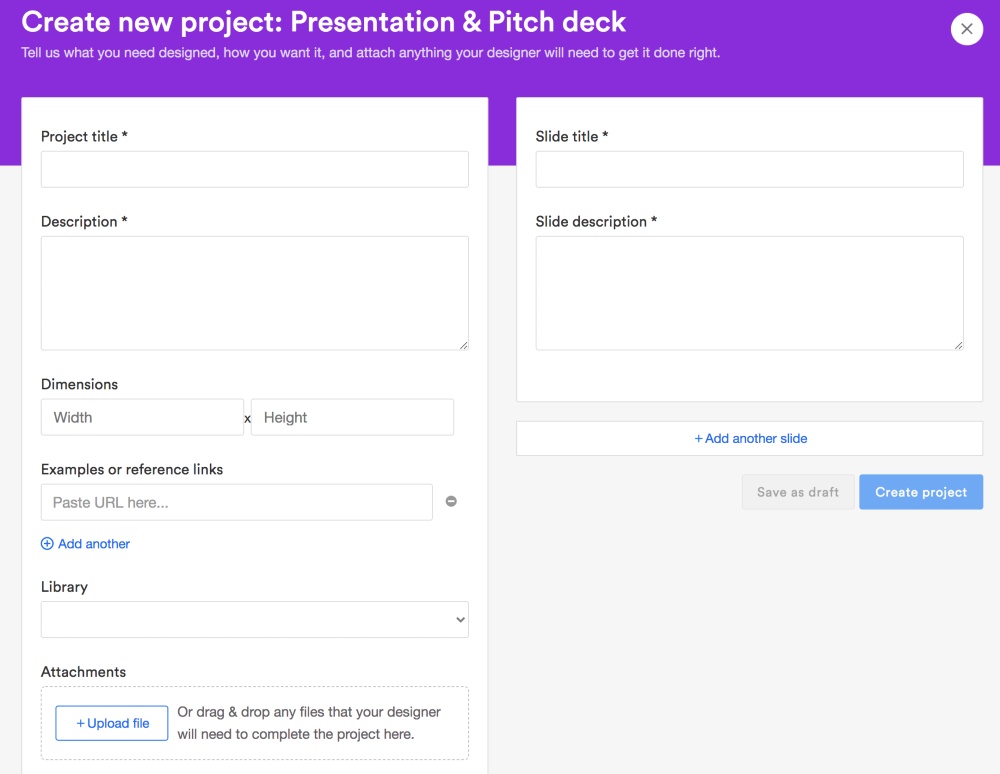
It’s extremely easy to request designs from Penji. All it takes is three steps:
1. Create

To submit a design request, log into Penji’s platform, and choose from the extensive design types. Otherwise, create a customized one. Fill in the form with all the needed design details. Make sure to give as many details as necessary. You will be assigned to the best designer who will submit the first draft after 24 to 48 hours.
2. Review

Review the first draft and revise it, if necessary. Don’t worry about asking for revisions as Penji lets you have all the revisions you want for free. Click on the design and type in the changes you want.
3. Download

Once you’re 100 percent satisfied with the design, download the source file straight from the Penji platform. You also have all rights and licenses for all designs created for you.
When creating pitch decks, graphics are indeed an essential element to captivate your audience. And because creating graphic designs will take time and effort, Penji can take the burden off your shoulders. Try Penji’s services for 15 days and choose one of the affordable plans that fit your business needs.
About the author

Johnathan Grzybowski
Johnathan Grzybowski, is the Chief Marketing Officer and co-founder of Penji. His content covers marketing, scaling your business, sales, and lead generation.
Table of Contents
- Introduction Slide (Slide 1)
- Cover Photo (Slide 2)
- Elevator pitch (Slide 3)
- The problem (Slide 4)
- Your solution (Slide 5)
- Mission Statement (Slide 6)
- Market Size and Opportunity (Slide 7)
- Market Validation (Slide 8)
- Business model (Slide 9)
- Demo and/or Screen Shots of your app (Slide 10)
- Traction and validation (Slide 11&12)
- Graphs (Slide 13)
- Competition (Slide 14)
- Team (Slide 15)
- The Ask (Slide 16)
- Use of Funds (Slide 17)
- Future of the company Slide 18)
- End (Slide 19)
- Tips to make your pitch successful
- Pitch Deck Don’ts
- Penji’s Hassle-Free Design Platform


