![Every Successful Coffee Shops Have These 5 Things In Common [2022]](https://penji.co/wp-content/uploads/2019/05/Coffee-shop-graphic-design-cover.jpg)
Coffee is one of the most widely consumed drinks in the world. It’s not surprising to see a new coffee shop pop up in your neighborhood sometimes. With a relaxed atmosphere and a wide variety of drinks, many stores are thriving with returning customers.
This isn’t an accident. These locations have figured out their selling points and turned their whole stores into an experience. If you look at chains like Starbucks, and more recently McCafé, they have more in common than you might think.
The main aspect these chains have in common is a phenomenal graphic design. They take into account every aspect of the customer experience through design alone. Here’s why graphic design is necessary for any coffee shop.
Don’t have time to design all the branding, marketing materials, flyers, and merch for your coffee shop? Delegate those time-consuming design tasks to a vetted Penji designer and get drafts back within 24 hrs.
- Submit unlimited design projects
- Unlimited revisions
- Fast turnaround
- One flat monthly rate
- No complicated hiring, HR, or unresponsive freelancers to deal with
Schedule a demo today and see why thousands of small businesses depend on Penji for their everyday graphic design needs.
Your Atmosphere
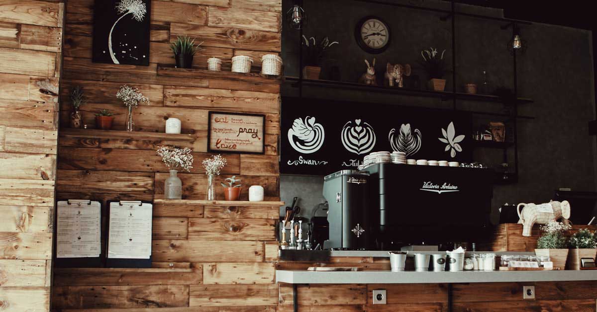
For any business with a physical location, the atmosphere is more important than you might realize. You could have the best food selection, marketing, and employees, but if your customers are uncomfortable sitting in your shop, nothing else matters.
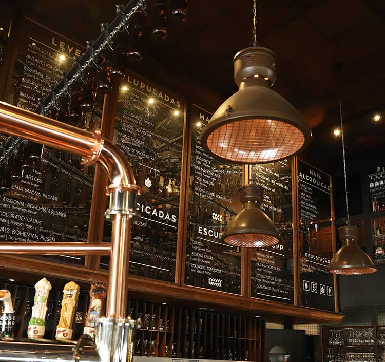
Industrial atmosphere design
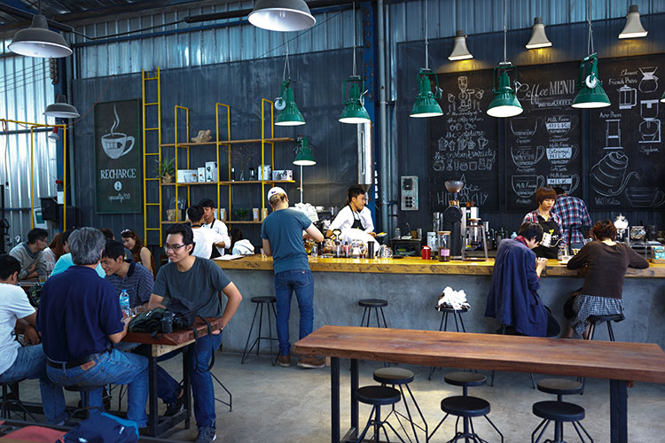
Spring social atmosphere design
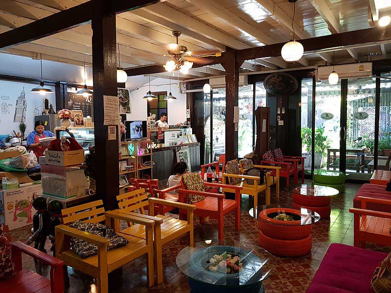
Cozy atmosphere design
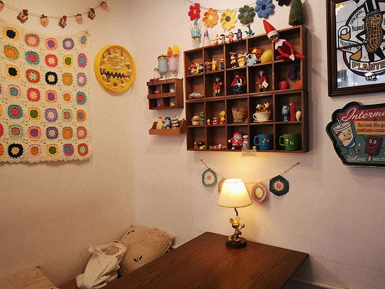
People will return to your shop just because of how comfortable they are in the shop. Graphic design plays a huge role in determining the vibe of your location. When you’re determining the atmosphere, there are a few things you can design to improve the experience:
1. Wall Art
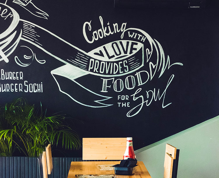
When you walk into a coffee shop and there’s a line, your eyes might wander to what’s around you. More often than not, your customers are looking at the walls for something to keep them occupied for a few seconds. If the walls are white and barren, there’s nothing to keep them preoccupied or interested.
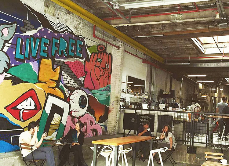
It might not matter if they’re on the line already, but odds are they aren’t coming back after they buy their drink. Your wall art doesn’t have to be complicated or from a renowned artist to fit into your atmosphere. It should catch their attention long enough to know there’s something interesting in the shop.
2. Menu Style
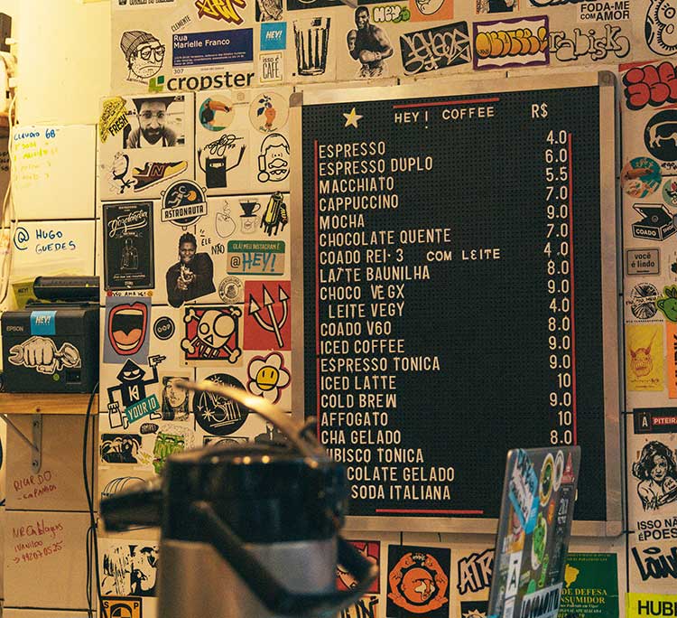
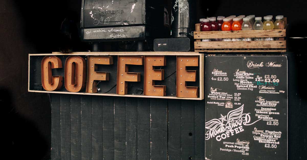
When your consumers aren’t looking at the walls, they’re starting to think about what they want to order. Your menu should be well designed and clear for anyone to understand. After all, everyone who walks into your shop will be looking at this to pick what they’re ordering.
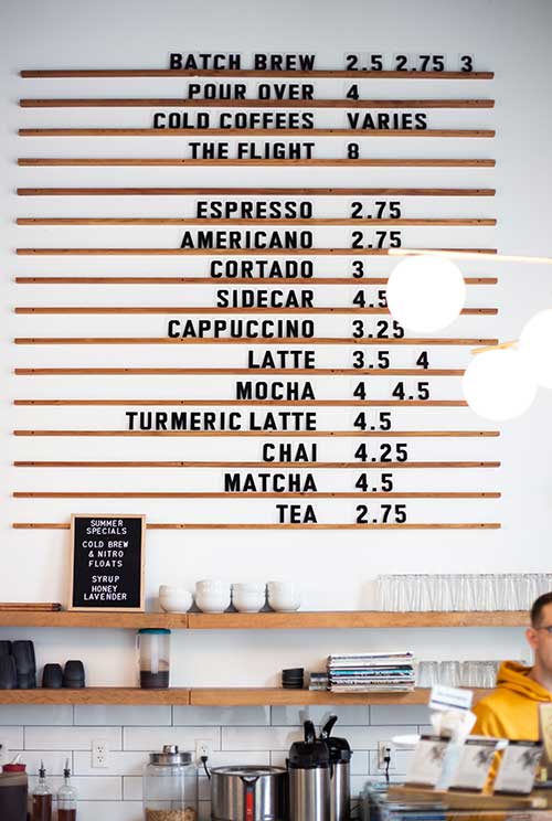
If your text is too small or if there aren’t any visuals to aid it, then it’s harder for your customers to pick what they want. This makes the line take longer, which can deter people from returning in the future.
3. Cup Design
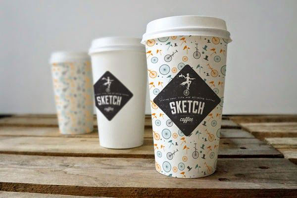
Once the order is taken and their order is called, what does their cup look like? There two types of cups: the ones used while staying at the shop and the ones taken to go. They have the same purpose but look completely different from each other.
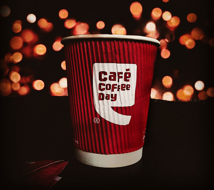
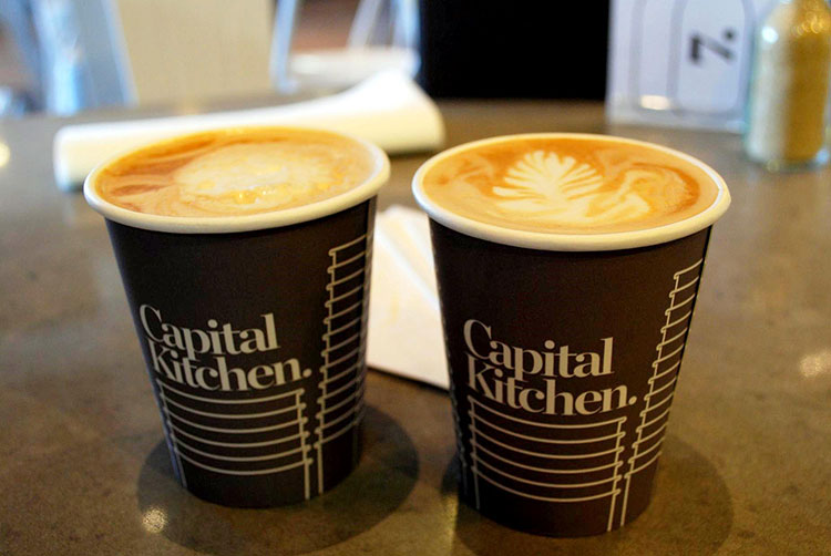
Cups that stay in the shop should fit in with the aesthetic you created already. Otherwise, it will throw off your consumer. For to-go cups, your logo has to be on the cup. It’s great for branding purposes but it also does more than the typical white cup with the white lid.
The Starbucks logo is so recognizable now that having it on the cup already gives you an idea of what a person is like.
4. Strong Visuals in Advertisements
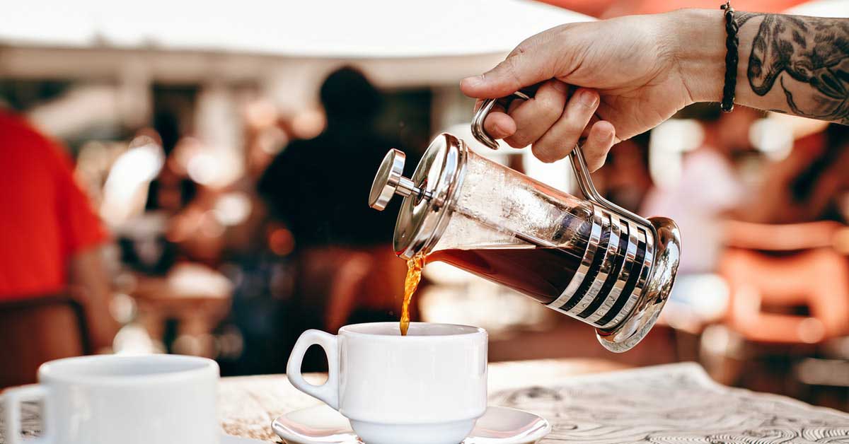
In general, it’s difficult to market food when you can’t taste it. That’s why many markets depend on visuals and sound to describe their food. Coffee is no exception to this. You want to focus on the aesthetics behind the drink and what its purpose is in your consumer’s life.
For many, the caffeinated drink is what they need to move during the day. If they see an advertisement for a coffee cup with a few words slapped onto it, it’s not that appealing. For chains like Wawa, it works because they’re established and they typically promote a discount with it. If you’re only looking for new customers without a discount, cups are not enough.
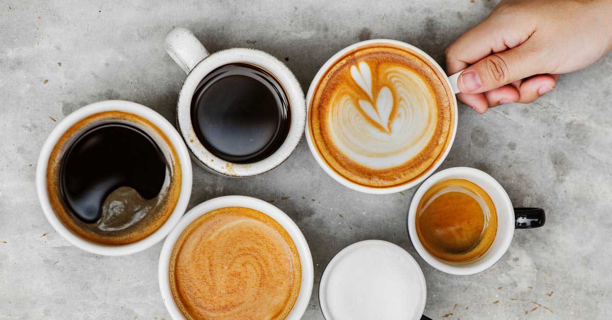
Instead, look at the design of the coffee. It’s common to show the cup from a top angle because you’re able to see the swirls inside. It’s overused, but it works because it looks like it tastes good. You have the attention of the consumer and as long as your text matches the same feel and style, you have a solid advertisement.
However, don’t depend on this simple style to sell your coffee. It’s important to keep coming up with original ideas on how to make your drinks look as good as they taste.
5. Good First Impression
When people commit to coffee, they’re most likely dedicated to that chain in the long run. It becomes a part of people’s everyday routine to go to the same place for their morning coffee. You should strive to become that place for your customers.
When someone comes to your shop for the first time, there are multiple design aspects to keep in mind. Most of them were already addressed, but it’s crucial to have all aspects together. They should also have the same or similar styles to them.
This means if you have a modern look for your menu and a traditional style for your cups, it’s a conflicting atmosphere not everyone will appreciate. It also leaves the impression you’re unorganized because you couldn’t pick a style. Stick with a look you’re okay with your customers associating you with and the rest will fall into place.
A Saturated Market
Coffee has been around for hundreds of years and can be found in most food places. Odds are if there’s food, you can buy coffee there as well. It’s a saturated market, so you need to do your best to stand out in it. Thankfully, there are ways to make yourself look unique.
The first thing you should do is look at what your competition is doing. Take note of everything they’re doing to make sure you don’t do it. You don’t want to get confused with another coffee shop because your designs are too similar.
Instead, use original ideas to break the mold and get creative. If you need a foundation to go off from, think of what your most unique selling point is. For a coffee shop, you might have a new brew other shops don’t have yet or a new muffin flavor you’re excited to promote.
About the author

Erika Solis
Erika is a Content Writer & Marketing Associate for Penji. She has a background in social media marketing, graphic design and copywriting.


