As you may know, healthcare is a tough industry because of strict regulations that are constantly changing. It makes anything new and creative difficult to launch into the public. However, UX design should not be compromised because of those guidelines. The number one priority should always be the patient. They should be able to move smoothly throughout the buying or scheduling process. If there are glitches along the way, it needs to be fixed immediately.
Whether you have a product, digital media, or software, there are ways you can improve the user’s experience to help with their needs and ensure brand loyalty. This is where you can use Penji’s services. We design the best healthcare UX for a fraction of the cost. However, if you want to understand the fundamentals, here are 8 tips that will help with healthcare UX design.
1. Patient Care

An increasing amount of technology results in an unexpected side effect in the healthcare industry. New devices mean there is less focus on the fine details of what a patient needs. Because of this, there should be an emphasis on UX.
To properly care for a patient, the involvement of tech should make the process easier. The user’s experience should be efficient.
Many times, what a patient really needs is clinical support. They want to feel that they are being taken care of from beginning to end. So, whether they are simply looking for information or perhaps making an appointment to see a healthcare specialist, patients should feel that they got what they needed in the best way possible.
2. Reliability and Accuracy
For an industry like healthcare, patients are heavily reliant on the information that they receive is 100% accurate. Making sure that the process is smooth means more than just gaining or losing customers. It can be as drastic as a life or death situation.
Applying good UX design can help differentiate your website, app, or technology from other sources. It makes you a reliable area of expertise and keeps users coming back.
Your digital presence should be updated with the most recent information. If you have a website that hasn’t been updated in 5 years, it’s hard to build trust. Or if you have outdated information that leads users in the wrong direction, not only will they have a difficult time, your brand will also be tarnished.
3. Understand Pain Points

The best way to find pain points is to ask. Is there an area of opportunity? Start off with basic conversation and learn the roles of everyone that works within the company. From the receptionist to the doctor, learning what their position entails is valuable for designers when creating a process for the patient.
Work with the users to really dig into the process. If there’s anyone that knows what can be improved, it would be the user. You’ll learn who to target, what they’re trying to achieve, the steps they are taking to get there, and which steps need to be refined.
4. Prototype and Test
If you’re building a healthcare website, take the time to test it before launching it to the public. It’ll give you the opportunity to fix any bugs on the site and work on last minute changes. There will always be several rounds of revisions to really get it right.
If you are building a product or software, prototype it before its release. Allow users to test it out and collect their feedback on what can be tweaked, made better, or maybe you need to start over from the beginning. The feedback you receive in this phase will enable you to create the best product possible.
Present your results to partners and users to ensure that your website, product, or software meets the criteria for their healthcare needs.
5. Making Data Understandable
Unless your patients work in healthcare, they may not understand all the terms that are common in the industry. Because of this, you’ll have to translate data in a way that your potential patients will understand. Simplify your copy as much as you can to help users relate to your brand.
Users want to have insight into their well-being. Instead of presenting a long series of numbers, organize your data so that users can find exactly what they are looking for at a glance. Prioritize information that you believe they are looking for.
6. Trusting Environment

If you have a product that requires the user to trust you wholeheartedly, you must build an environment and brand that helps you achieve those results.
For example, if a patient is sick and is in need of over the counter medication, they may do some research online before swallowing any kind of pill. So, use this opportunity to write honest copy.
Users are in search of healthcare only when they are in dire need of it. As a result, they are in an extremely vulnerable state of mind. Make sure your branding and presence is a safe space for users to be in so they don’t feel threatened.
7. Reduce Decision Fatigue
When a user has too many options, it makes it more difficult to make a decision. In healthcare websites, you’ll be tempted to cram in as much information as possible. But, this may be confusing for the user.
A common mistake is having too many menus. If a visitor is on your website and it takes more than 3 steps to find what they need, they will most likely give up and move onto a different site. Refine your menu so that it makes sense for first-time visitors so that they will want to come back in the future.
8. Personal Touch
With the increasing amount of technology at our fingertips, it can be difficult to include a personal touch to a user’s experience.
Certain things that make your process easier may be making your user’s life a bit more difficult. An example of this is incorporating AI into the customer service interaction. Although it’s become quite common to be greeted by a prerecorded voice that gives you several options on how to complete your request, many users still yearn for that person to person interaction. As a result, they press “0” hoping to reach an operator.
So before you replace a person completely, try to find a tech solution that still involves a human-centered experience.
Use Penji for Your Healthcare UX
Whether you are working on an app or a website for the healthcare industry, you must do so with caution. This is far more different from eCommerce or a gaming app. Remember, we are talking about health and life. And so it would be best to leave the designing part to experts. Why don’t you check out our services at Penji? We have the best offerings and we provide them for an affordable fixed fee every month. Here’s how you can get designs from our team.
Request for a Design
When you are done signing up in one of our design plans, you can now have access to our platform. Don’t worry, it’s easy to understand and you’d be able to learn how to navigate through it without help.
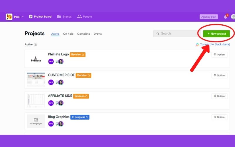
From the dashboard, look for the New Project button. It’s located at the top right corner of your screen and impossible to miss. Click that and you will be directed to a new page. From there, you can already specify your design request. If you are building an app or a website, the options will be available for you.
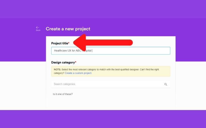
We encourage you to write as much detail as you can about your request. That way, our designers will be able to determine how to start the project. Just in case our designers have questions, they will send you a message through that app, and in that same project thread.
Check your account from time to time to see any progress. Or, you can look at your email and see notifications.
Wait for the Initial Draft and Ask for Revisions
Our designer will submit the first draft within 24 – 48 hours. You should also consider the complexities of your request. If these are simple, then generally the submission will be faster.
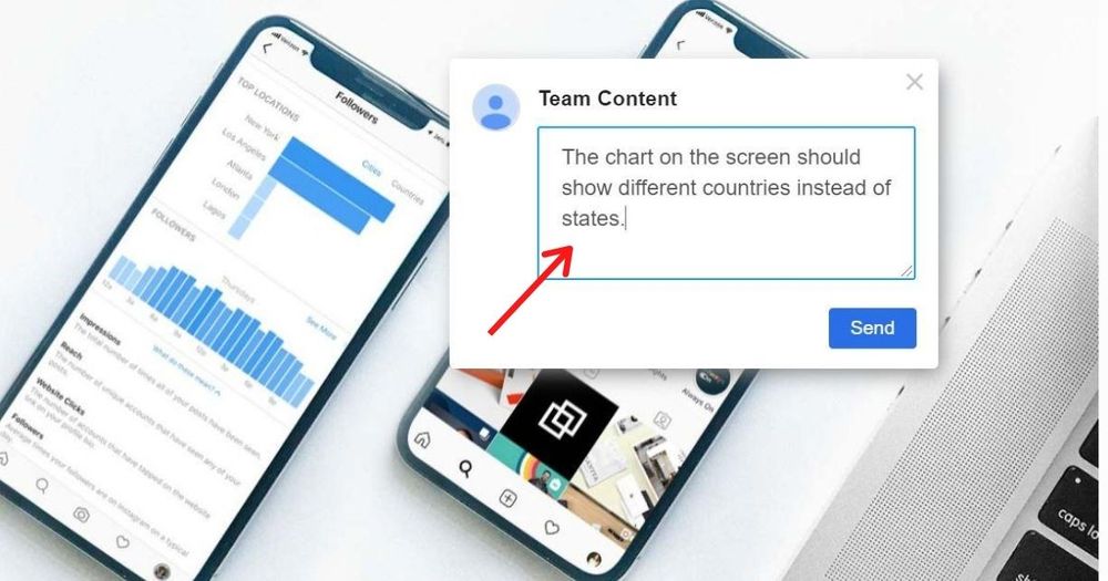
Once you have the initial draft, you can now look at the details. To do so, click the image so you can enlarge it. Click on areas where you want revisions and a comment box will pop up. This is where you can type your feedback directly. It makes it easier for your designer to pinpoint the parts to be revised. Send it back right away.
Our designer will work on your project until you are 100% satisfied. However, if you think the designer is not able to meet your standards, you can always ask for a replacement.
Download the Files
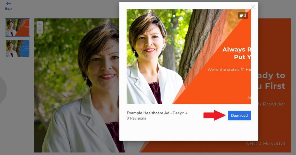
This is the last step of the process. When you are happy with the output, you can download all the source files from the project thread. You will see the download icon every single time that a revision is submitted. That way, you can just get the files whenever you want. If nothing needs revision, there’s no need to send a message to your designer. Just click it and you are good to go.
Working with Penji is the best decision you’d make for your business. Check it out, sign up, and enjoy unlimited graphic design for an affordable rate every month.
About the author

Jie Kuang
Jie is a Marketing Manager and Content Writer for Penji. She has a background in design, technology, and innovation strategy.


