

TL;DR: Don’t let design mistakes hurt your brand. Simple errors such as poor fonts, cluttered layouts, and inconsistent branding can erode customer trust and credibility. Fix these issues to make sure your designs look professional and meet your business goals.
Visual communication drives modern business. When you present a polished, professional brand, customers notice.They can also tell when your visuals look rushed or don’t match up. The colors, fonts, and layouts you choose all say something about how good and trustworthy your business is.
A lot of businesses find it hard to meet tight deadlines and budgets while still meeting high visual standards. A lot of people rush through their work and make mistakes that are easy to see when they are under a lot of stress. A graphic design subscription is a good idea because it lets you work with trustworthy professionals who can help you avoid making these costly mistakes. A dedicated team makes sure that every asset you publish is checked by an expert.
Knowing what the most common visual mistakes are can help you protect your brand’s reputation and keep your audience interested. Let’s take a closer look at these mistakes and how to keep them from ruining your marketing.
What are the Most Common Mistakes People Make When They Design Graphics?

Graphic design mistakes are problems with visual communication that make a design less effective, clear, or professional. This can lead to less engagement and a brand that doesn’t fit with what the design says.
These mistakes usually happen when making visual content. They show up as bad typography, inconsistent branding, or messy layouts. In the end, these mistakes make people think less of your brand and make your marketing campaigns less effective.
You need to be aware of these problems in your daily work in order to fix them. The next section explores the mistakes that ruin your graphic design.
Poor Typography
Typography is more than just choosing a font. It requires ensuring readability, structure, and consistency across all your materials.
Using too many fonts or selecting illegible typefaces instantly confuses your reader. When you mix five different fonts on a single flyer, the design looks amateurish and disorganized. Professional designs typically use no more than two to three fonts.
Choose two or three fonts that fit your brand perfectly and stick with them. You can find high-quality fonts on sites like Adobe Fonts, which has a huge library of professional fonts. Make sure your text is easy to read by keeping the weights of your fonts the same and making sure the contrast is high enough. After you’ve chosen your typography, you should look at how your brand as a whole looks.
Branding that isn’t Consistent
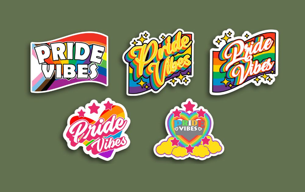
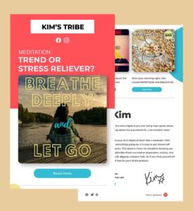
Consistent branding helps people trust and remember your brand. Customers should be able to tell right away that your logo or marketing materials are yours.
Using different logos, shifting color palettes, or applying random styles across different platforms weakens your brand trust. According to Lucidpress, consistent branding increases brand recognition by 45%. If your Instagram looks entirely different from your website, you lose that recognition.
Create a strict style guide that outlines your exact logo usage, core color palettes, and typography rules. If managing this internal consistency feels overwhelming, utilizing professional graphic design services helps ensure your branding remains cohesive across every single project. A unified brand naturally leads to designs that are clean and focused.
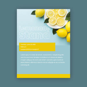
Cluttered Layouts

A cluttered design overwhelms viewers and immediately dilutes your core message.
When you overload your graphics with too many elements, text blocks, and competing images, the viewer doesn’t know where to look. Instead of reading your call to action, they simply click away. Adobe reports that 94% of users reject websites with poor design.
Use white space strategically. Let your elements breathe and put your most important messages first. Canva and other tools offer great starting templates with clean layouts for people who don’t design, which helps you keep your hierarchy in order. Of course, a clean layout will only work if you choose colors that go well with it.
Bad Choices of Color
Colors can make people feel a certain way and have a big effect on how customers see things.
When colors clash or don’t have enough contrast, it can be hard to see and feel what you’re trying to say in your marketing. For instance, text in neon green on a yellow background is hard to read and hurts your eyes.
Use basic color theory to make palettes that are balanced. You can use tools like Coolors, an easy-to-use app for making color schemes that work well together, to try out different combinations before you finish your designs. Getting your colors right is also very important for making your designs easy for everyone to use.
Not Paying Attention to Accessibility
Accessible design makes sure that everyone can use it, even people who can’t see well.
Using text that is hard to read or has low contrast actively leaves out a lot of your audience. This makes it harder for you to reach more people and can even cause problems with compliance. Forrester’s research showed that websites that are easy to use get 32% more people to interact with them. Professional designs maintain a contrast ratio of at least 4.5:1 for standard text.
Follow the Web Content Accessibility Guidelines (WCAG) to ensure inclusive design. You can test your assets using accessibility tools like Stark to guarantee everyone can comfortably consume your content. Understanding how to fix these errors is crucial, but you also need to know why they happen in the first place.
Why Do These Design Mistakes Happen?
Most mistakes in vision are not planned. They come from a few common problems with how things work:
- Not Enough Knowledge: A lot of businesses just don’t have the design skills in-house.
- Time Constraints: When there isn’t much time, designs are rushed and full of mistakes.
- Over-Reliance on Trends: Following trends without thinking about your brand’s identity can lead to campaigns that don’t make sense.
These internal constraints dictate how your final product looks. Depending on your specific field, these mistakes carry different consequences.
How Do These Mistakes Impact Specific Industries?
Visual errors affect different sectors in unique ways.
- E-Commerce: Poor product image quality or inconsistent branding directly reduces your daily conversions.
- Healthcare: Accessibility is absolutely critical here. Failing to meet contrast standards prevents patients from finding essential care information.
- Education: Cluttered layouts confuse learners, drastically reducing information retention and course completion rates.
To overcome these industry-specific challenges, many teams are changing how they source their creative work.
How Do In-House Teams Compare to Unlimited Services?
Managing design in-house often drains resources. High salaries, software costs, and training slow down your output. Your team size limits how scalable your project can be, and how quickly it can be done depends a lot on how much work they have to do right now.
This is why a lot of modern agencies use design as a service. With this model, you can hire professional designers without having to pay for full-time employees.
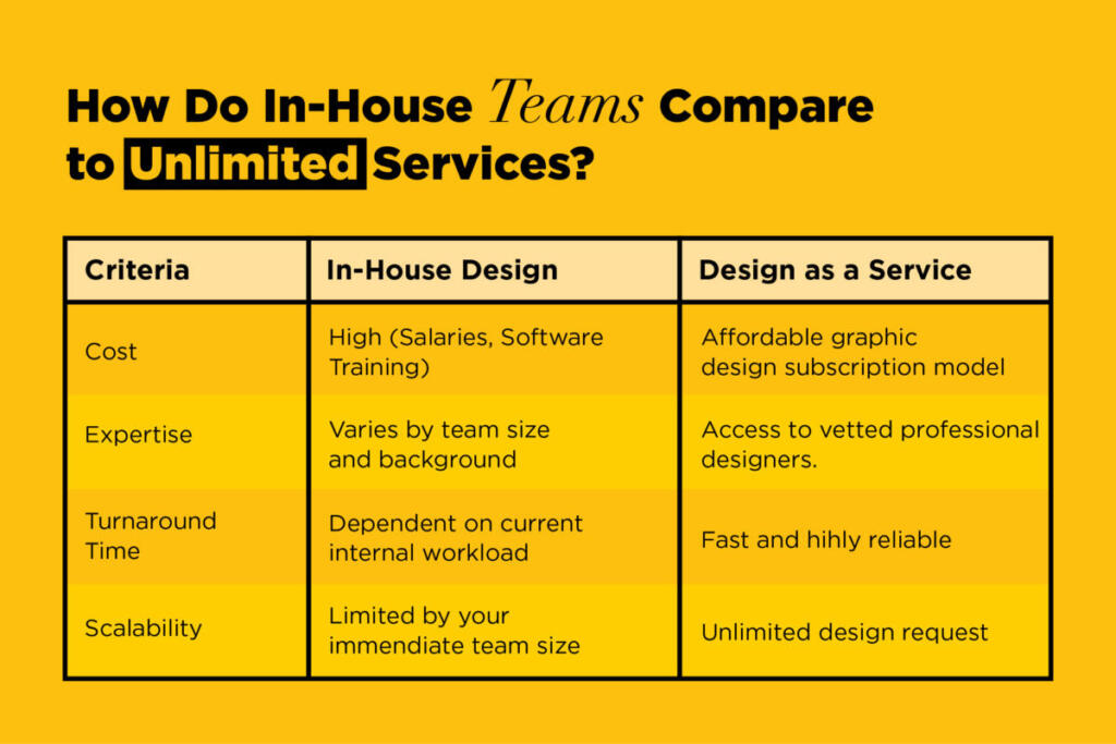
When you switch to design as a service, you can grow your business during busy times without giving up quality. It’s time to put these ideas into action now.
Are you ready to improve the look of your brand?
Your business can lose credibility, audience engagement, and money if you make graphic design mistakes. By avoiding common mistakes like bad typography, inconsistent branding, and cluttered layouts, you can make assets that really connect with your audience and fit your brand identity perfectly.
Here is a short list of things you can do to keep your projects on track:
- In each design, only use two or three fonts.
- For consistent branding, follow a strict style guide.
- In all of your layouts, make sure to leave space.
- Stick to the basic rules of color theory.
- Check all designs to make sure they meet accessibility standards.
Take the next step toward flawless visual communication. With Penji’s professional graphic design services, you can avoid these common mistakes and improve your work.
You can send in as many requests as you want and get them back quickly. Sign up for your graphic design subscription today and see how much better your agency can be with professional creative help.
Get a design package with unlimited graphic design
Try Penji risk-free for 30 days & get all the custom designs you need


Frequently Asked Questions
The most frequent errors include poor typography, inconsistent branding, cluttered layouts, bad color choices, and ignoring digital accessibility standards.
It actively reduces your credibility, user engagement, and total conversions, which ultimately impacts your bottom line.
Tools like Penji, Canva, Adobe Fonts, Coolors, and Stark provide excellent support to improve your layouts and maintain consistency.
You should include strict rules for your logo usage, color palettes, typography, and photography styles in a single, accessible document.
Consistent branding can increase brand recognition by 45%, and highly accessible, user-friendly designs improve engagement by 32%. Relying on unlimited graphic design subscription ensures you hit these metrics cost-effectively.
About the author

Je Ann Bacalso
Je Ann is a creative content writer who crafts engaging, SEO-friendly articles and web copy. With a passion for storytelling and a sharp eye for detail, she delivers clear, compelling content that connects with readers.


