
TL;DR: Accessibility in graphic design ensures everyone, including people with disabilities, can use your digital products effectively. It improves user experience through better color contrast, alt text, readable fonts, and keyboard navigation. Good accessibility practices benefit all users while meeting legal requirements and building trust with your audience.
Have you ever visited a website and found it hard to read the text or figure out where to click? Maybe the colors were too light or the buttons were too small. Now imagine how much harder that would be for someone who has trouble seeing, hearing, or moving. That’s where accessibility in graphic design comes in.
Accessibility means making sure your design works for everyone. It helps people with disabilities use websites, apps, and other digital tools without problems. And guess what? It also makes things easier for people who don’t have disabilities. That’s why it’s becoming a big deal in UX, which stands for user experience.
Why should we care about accessibility?
Let’s keep it simple. Accessibility in graphic design is important because:
- Lots of people have disabilities. That includes vision problems, hearing loss, or trouble using a mouse or keyboard.
- Good design helps everyone. Clear text, easy buttons, and smart layouts make websites better for all users.
- Some places have rules about accessibility. If your website doesn’t follow them, you could get in trouble.
If you offer web design services or want to hire a web designer, make sure they know about accessibility. It’s not just a nice thing to do. It’s the right thing to do.
What does accessibility in graphic design look like?
Let’s go over a few things that make a design more accessible.
Color contrast
This means using colors that stand out from each other. For example, black text on a white background is easy to read. Light gray text on a white background is not. People with vision problems need strong contrast to read clearly.
Alt text for images
Alt text is a short description of an image. Screen readers use it to tell blind users what the image shows. For example, instead of saying “image1,” you could say “A chart showing how users interact with a website.”
Every image in your blog or website should have alt text. If your post is about accessibility in graphic design, make sure the alt text matches that topic.
Easy-to-read fonts
Fancy fonts might look cool, but they can be hard to read. Use simple fonts for body text and make sure the letters are big enough. Also, leave space between lines so the text doesn’t feel crowded.
Keyboard-friendly design
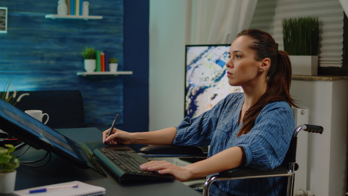
Some people can’t use a mouse. They use the keyboard to move around a website. Make sure your design lets them do that. Buttons, links, and forms should all work with just the keyboard.
If you offer design as a service, this should be part of your plan.
How does accessibility help UX?
UX stands for user experience. It’s all about how people feel when they use your website or app. Accessibility in graphic design makes UX better by:
- Helping more people use your site
- Making things easier to understand
- Building trust with your audience
If you offer UX design services, accessibility should be part of your work. It shows that you care about your users and want everyone to feel welcome.
What are the new trends in accessibility?
Design is always changing. Here are some cool things happening now in accessibility.
Micro-interactions
These are small things like a button changing color when you click it or a sound playing when something loads. They help users know what’s happening without needing to see or hear everything.
Responsive design
This means your website works on phones, tablets, and computers. It adjusts to fit the screen. That helps people who use different devices or need bigger text.
Smart tools
Some websites use tools that let users change the font size or colors. This helps people with vision problems or learning disabilities. It’s a great way to make your design more flexible.
These trends show that accessibility in graphic design is becoming more creative and helpful.
Mistakes to avoid
- Even good designers make mistakes. Here are some things to watch out for:
- Using only color to show meaning. For example, red for errors without any words.
- Forgetting alt text or writing something too vague.
- Adding too many moving parts like videos or animations that play automatically.
- Making designs that don’t work well on phones.
- Accessibility in graphic design is about thinking ahead and making smart choices.
How to get started
If you’re new to this, don’t worry. You can start with a few simple steps:
- Check your current designs. Use free tools like WAVE or WebAIM to find problems.
- Learn the basics. Look up WCAG guidelines. They explain what makes a design accessible.
- Test your design with real users. Ask people with disabilities to try it and give feedback.
- Work with experts. The team at Penji knows how to build accessible designs. You can also check out our work to see examples.
Whether you’re creating something new or fixing an old design, accessibility should be part of your plan. It’s not extra work. It’s a smart design.
Conclusion
Accessibility in graphic design is more than a trend. It’s a way to make sure everyone feels included. If you offer website design services or want to explore UI as a service, this should be part of your work.
Want to make your designs better for everyone? Hire a web designer who understands accessibility. You can also explore modern UI design to see how smart design helps users.
Build with Penji a web that works for all. That’s what good design is all about.
Frequently Asked Questions
What is accessibility in graphic design?
It means making designs that everyone can use, including people with disabilities.
Does accessibility help people without disabilities?
Yes. Clear text, easy buttons, and smart layouts help everyone.
Can I add accessibility later?
You can, but it’s better to plan for it from the start.
Is accessibility hard to learn?
Not really. Start with small changes and keep learning.
About the author

Flore
Flore’s passionate about turning ideas into clear, useful content that connects with people and performs on search. From blog posts and landing pages to full content plans, her work is grounded in purpose and always aligned with a bigger picture.


