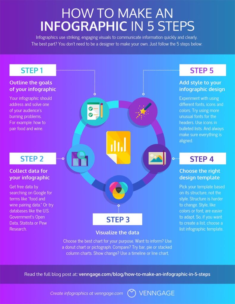
Infographics are useful when demonstrating a process or displaying facts. Using custom materials helps with visual storytelling, goal setting, or project planning. An information visual can make it easy for your target audience or your team to really understand your message.
Creating an infographic can be tricky. Making sure all your information is properly organized is important. Clunky infographics can be hard to read, and therefore hard to interpret.
Penji makes creating your own infographic simple. We are here to help with choosing your facts and picking your infographic template. With these 5 steps, you can create your own infographics easier.
Choose Your Design Platform
To make your own custom infographic, you will need a design platform to work off of. There are many platforms that offer free tools at your connivence. By choosing a design template, you can easily insert your data.
Design Platforms
These design platforms are excellent. If you have the time to develop your own infographics, you can easily create your own. However, creating content can be time consuming.
With Penji, we can develop custom infographics fast. Our design portal allows you to submit design ideas and your infographic facts to our graphic designers. You will receive unlimited revisions to ensure your infographic is exactly what you want.
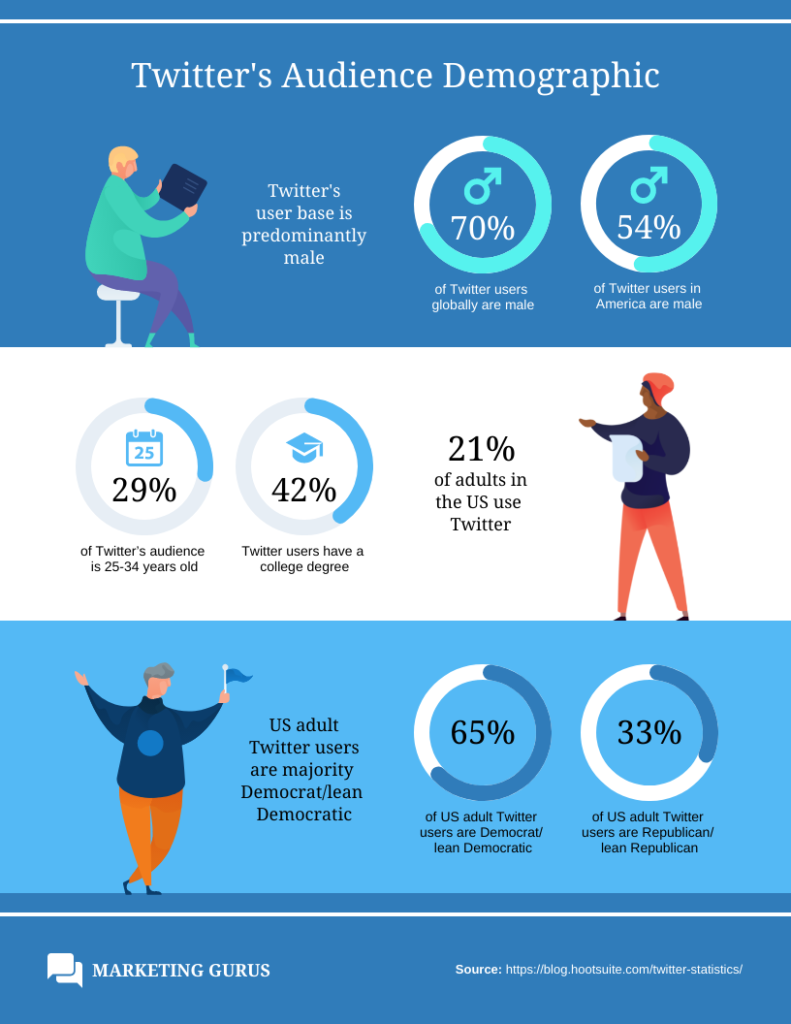
Check out our Infographic Example below!

Choose Your Infographic Facts
Choosing the right facts are important. When you are presenting an issue, process, or project, you need to stay relevant. With our factual relevance, your visual communication will be lost.
Hone in on the most relevant statistics or facts. Relevance will help capture your audience’s attention. Whether you are presenting to a team or a customer, you want to both capture their attention and hold it. This way, you can be sure your facts and steps stay with them.
Moreover, this insurance will help your overall goal be executed better. When researching, ask yourself what data and facts are most surprising, entertaining, or educating. This will ensure the infographic your presenting will matter to your audience as much as it matters to you.
Choose Your Design Template
The infographic design is what your audience first sees. Using a layout that is organized and visually pleasing enhances the user experience. This is because you are storytelling with complex data.
Complex data can become visually boring very fast. Similarly, your audience can get overwhelmed. Having unorganized but complex data is not fun to look at.
To help, we pulled some popular infographic layout examples.


There are a variety of design templates and layout aesthetics to choose from. Make sure that with your design choice, you choose one that best fits your brand. Combining the perfect aesthetic with complex data can be difficult.
Whether the infographic is for your social media, website, or company HQ it must follow your brand voice. Brand voice is what your company’s personality is. Therefore, involving your company colors, fonts, and visuals are important.
An infographic should feel personal and connected to your brand. This is so it can echo your brand with authenticity. If you mean it personally, creatively, or professionally, it should look that way.
With Penji, there is no design template to choose from. Each design is created and curated perfectly for you. When you download your infographic, you can be assured there is no other infographic like it. When we say custom, we mean it.
Create Your Own Infographic
When you work with Penji, your infographic creation process can be wrapped up in 3 steps. Our designers can take care of the hassle of designing, and sometimes redesigning. While we design, you can relax.
However, if you are designing your own infographic, you will have to remember important design elements.
First, your data needs to be spread out. Allowing your data to trickle throughout the page is good for user experience. This way, your viewer’s eye can follow along a data path. Meaning, you can increase your audience duration. The statistic can be bold to capture focus, and there can be a small blurb below it.
Remember, do not overcrowd your main points with too many details. Make sure the most important facts are assembled with 2-3 sentences following. The more information you have, the quicker your audience will lose interest.
Additionally, use direction widgets can be very useful. Arrows, banners, headlines, and diagrams are important elements. These tools help for creating direction and organization on your layout. Make sure their style is within your brand aesthetic.
Choosing Your Infographic’s Placement
Once your custom infographic is completed, you need to choose the best placement. Where you choose to post or place your infographic, could influence its impact. Before posting or placing it, decide where it can connect with your audience the most.
For instance, let’s say you are creating an infographic about fast fashion but work at a marketing agency. Your infographic will have the best impact on Instagram. This social media platform has a bigger focus on fashion, accessories and lifestyle.
However, let’s say you are creating an infographic about team bonding and still work at a marketing agency. This infographic has to do with concepts in house. Printing this out or using it in a presentation for your coworkers is most helpful.


