An ad that performed well today may perform poorly next month. Ad performances, especially on Facebook, change based on user’s behavior, holidays, and algorithm. The changes can be unpredictable, and it can be tedious to figure out why an ad isn’t performing (or why it IS suddenly performing).
At Penji, we design ad creatives for thousands of Ad agencies and get to see many of these changes first hand. We’ve compiled an easy-to-follow checklist that you can use to run through and fix ANY low-performing Facebook ad campaigns quickly.
Turn off audience network
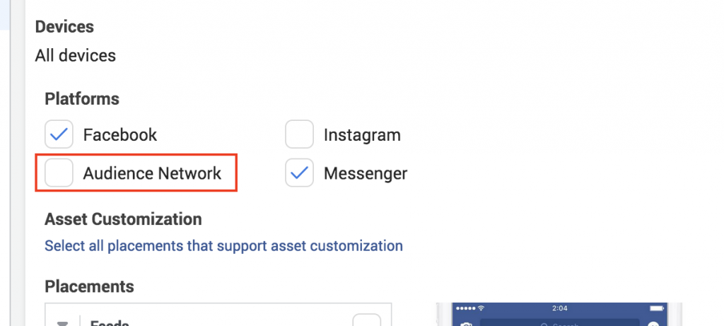
Audience networks can be a hit or miss. It’s Facebook’s way of letting you reach people off of Facebook’s platform. How and where exactly your ads are being displayed is currently a mystery. In some cases, turning on Audience Network can help you reach significantly higher reach, impressions, and lower CPM and CPC. However, CTR usually takes a hit with the Audience Network turned on.
Turning OFF Audience Network for a week can drastically change the ad’s performance and, in many cases, increase CTR and lower CPC.
Re-Write 1st line

Your graphic/video and copy go hand in hand to captivate your audience. Often, it’s not wise to drastically change your copy. For the Primary text, try changing just the first Line and A/B testing that. The first line of your Primary text is like your headline. Your audience will usually see that first before seeing the actual “headline” text below the image.
Update your landing page’s HERO Section
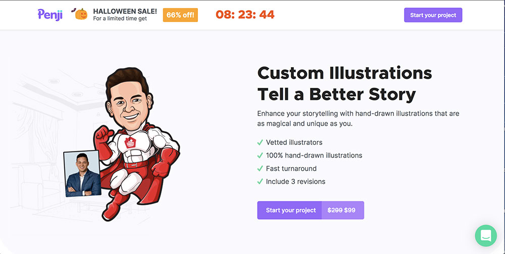
Don’t worry. A redesign of your landing page isn’t needed. Try updating just the Hero (topmost section of the page) section of your landing page. Usually, if there’s a disconnect between your ad and the landing page, performance could suffer.
Change Campaign Objective
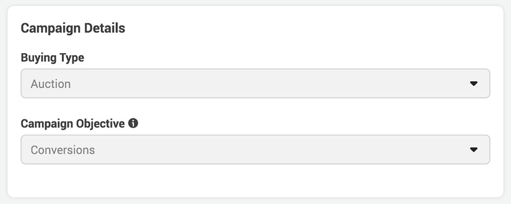
You may be used to creating ads under Traffic and Conversion. However, there’s a chance that audience behavior and algorithm changes have affected their performance. Try duplicating the campaign and only changing the Campaign Objective.
Check for overlapping audiences
Check to see if you have multiple campaigns or ad groups targeting the same audience. If you want to create different ads for the same audience, it’s best to do it all under one campaign instead of different campaigns. Too many campaigns targeting different creatives to the same audience could significantly reduce performance and increase the cost.
Structure your ads better
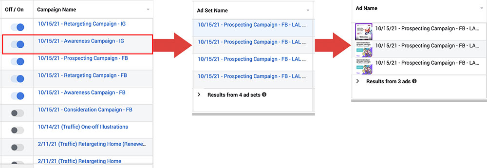
This quick fix won’t affect ad performances. However, it will make it easier for you to organize your client’s campaigns and quickly identify low performers. To start, don’t clump all of your ads and ad sets under one campaign. That’s a terrible practice. Create different campaigns, each with another purpose.
For example, you’ll want to create a campaign specifically for Holiday ads and another campaign for retargeting all users who have visited your site. These two campaigns have entirely different goals and should be separated.
Under each campaign, create ad sets for different audiences you want to target. And create your ads under each ad set.
Here’s an example of the ideal structure:
Campaign #1: Holiday Targeting
Adset #1: Engaged shoppers
Ad #1
Ad #2
Ad #3
Adset #2: People who have recently relocated
Ad #1
Ad #2
Ad #3
Update your graphics to use less Blue and more Yellow

Graphics with a higher concentration of blue tend to perform consistently worse than graphics with Yellow, Orange, or brighter colors. This is likely because Facebook is already blue, and users on the platform are used to ignoring blue elements, as it’s likely associated with Facebook. Yellow, Orange, and bright colors stand out more and will likely increase CTR.
Narrow by Cities
Update your audience to narrow by cities instead of nationwide. Target the major cities in the country you’re targeting. We recommend creating a different ad set for each city under one campaign. Often, changing the targeting from the entire country down to just the top 10 major cities can improve CPC, CTR, and CPM significantly.
Stop using stock photos

If you’re using stock photos and throwing on a layer of texts hoping that’ll do, I have some news for you. It won’t do. After designing 100,000 ads for some of the top agencies in America, the one pattern that we noticed in the high-performing ads is the complete absence of stock graphics.
Custom illustrations and custom-designed ads consistently outperform stock graphics. Check your images and videos and make sure they don’t look like you just downloaded them from Shutterstock.
Do A 7-day Manual A/B
Sometimes an ad was performing perfectly fine and then dipped. Facebook’s A/B tests can be effective but take more time and budget to complete. If you’re short on budget or don’t feel like waiting two weeks for results, try Manual A/B testing for seven days.
Create a new campaign. Then launch ad sets to A/B test new audiences, graphics, headlines, bid strategy, etc. Allocate anywhere from $20 – $50 per ad set and run the manual campaign for a week. It’s not a lot of data, and there will be a margin of error.
What you’re looking for here are the outliers. After the week is over, you’ll notice some ads performing even worse. Some will be the same, a few slightly higher, and hopefully 1-2 ad sets or ads outperforming by a wide margin. These are the outliers you’re looking for. Analyze them and make adjustments to your primary campaign as needed.
Diversify your creatives
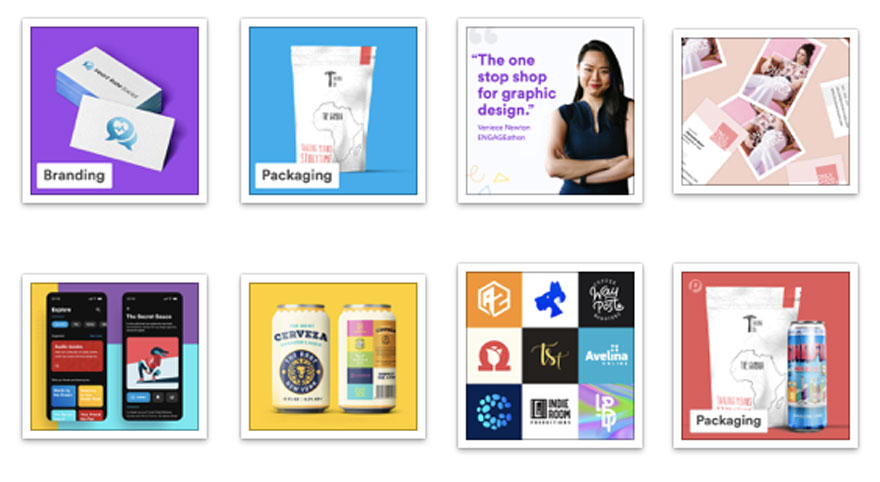
Dramatic changes will yield surprising results. If you’re A/B testing five different ad creatives, make sure they are different enough from each other. Minor changes often show insignificant results, if any at all. Make all five creatives uniquely different from each other. Combined with the previous strategy, you’ll quickly find breakthrough creatives that can drive better performance.
Start EXCLUDING people
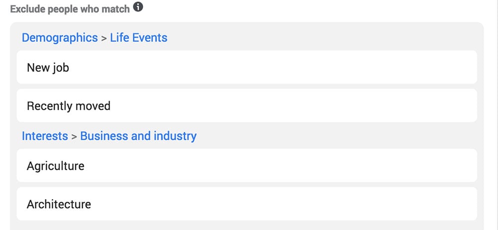
When creating an audience, you’re likely more focused on what to INCLUDE instead of exclude. Most agencies only exclude current customers from the list. However, we’ve found that narrowing your audience by Exclusions in addition to Inclusions can often bring higher CTR and lower CPC.
Here’s an example, let’s say you’re creating ads for a family practice law firm specializing in divorce. You’ve aggregated a nice list of things to Include to narrow down the audience. Adding “recently married” or “Recently moved” to the list of exclusions could yield unexpected results.
Change your copy’s tone
Ad copies that sound robotic or lack a clear subject tend to underperform. Please read your ad copies out loud and see how it sounds. Ideally, you want your tone to sound friendly, as if you’re talking to a friend. Use more “You” and “Yours” in your copy to speak directly with the reader. Changing your copy’s tone can improve ad performances because people are more likely to read something that seems friendly and written specifically for them.
Use Emojis
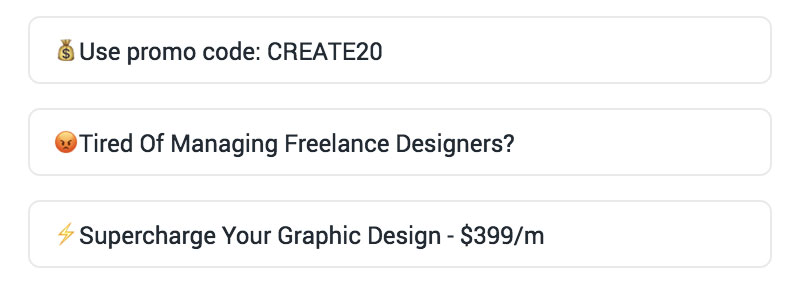
We often recommend using Emojis in the Headline of Facebook ads. However, sprinkling a few in the Primary text area can also work. Be tasteful and only use a few emojis. We found the best place to place them is at the beginning of the headline or primary text.
Here’s a couple of headlines that we’ve greatly improved with Emojis
😷You got 99 problems. Designs ain’t one.
😡Tired Of Managing Freelance Designers?
👋 Meet Your On-Demand Design Team
Create ad sets for Hyper-specific audience
If your audience is too generalized, the performance can be sporadic. Either create a new campaign or add additional ad sets to target a hyper-specific audience. Be as specific as you can in both the copy and graphic to appeal to that audience. Here’s an example of an ad that we went hyper-specific on.
Penji works with a lot of agencies. However, we decided to hyper-target Ad agencies in one of our campaigns.
Headline: 😡Tired Of Managing Freelance Designers?
Primary text: Are you an ad agency that’s struggling to find the right designer to work with your clients? Try Penji…(you get the idea)
This ad outperformed the generalized ad by 300%. Our cost per click dropped from $4.76 to $2.15 per click. Conversions also significantly increased as a result.
- Create retargeting ads
- Create Custom Columns
- Consistent CTA
- Simplify your message
About the author

Khai Tran
Khai is the CEO of Penji and is passionate about the economic development of recovering communities.
Table of Contents
- Turn off audience network
- Re-Write 1st line
- Update your landing page’s HERO Section
- Change Campaign Objective
- Check for overlapping audiences
- Structure your ads better
- Update your graphics to use less Blue and more Yellow
- Narrow by Cities
- Stop using stock photos
- Do A 7-day Manual A/B
- Diversify your creatives
- Start EXCLUDING people
- Change your copy’s tone
- Use Emojis
- Create ad sets for Hyper-specific audience


