How frequently do you see an aerial advertisement?
Nowadays, the instances of seeing an ad in the sky are few and far between. Still, they are regarded as an effective marketing tactic. Banner towing is arguably one of the most common forms of aerial advertising. If you’re planning to invest in this type of promotion, it’s natural you’d have difficulty finding sources and ideas. Here are 11 instances that you can learn from.
11. The Jewel International Kite Festival
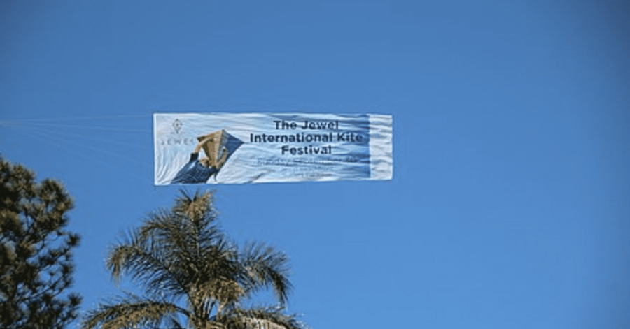
First up, we have the Jewel International Kite Festival. While it may not be immediately evident from afar, it’s certainly noticeable. Given that this is a Kite Festival, it’s only natural to place an advertisement in the sky. People who are more inclined to attend a Kite Festival are much more inclined to be outside. This audience is likely to see a kite festival advertisement through outdoor advertising.
Moreover, the use of a rainbow kite as a splash of color is a lovely touch. Not only does this remind people of nice weather, but multiple colors evoke happy sentiments. This advertisement is guaranteed to put folks in a positive mood.
[in_content_ads gallery=”logos” logo=”on” title=”Need graphic design help?” subtitle=”Try Penji’s Unlimited Graphic Design and get all your branding, digital, print, and UXUI designs done in one place.” btntext=”Learn More” btnlink=”https://penji.co”]
10. Wawa
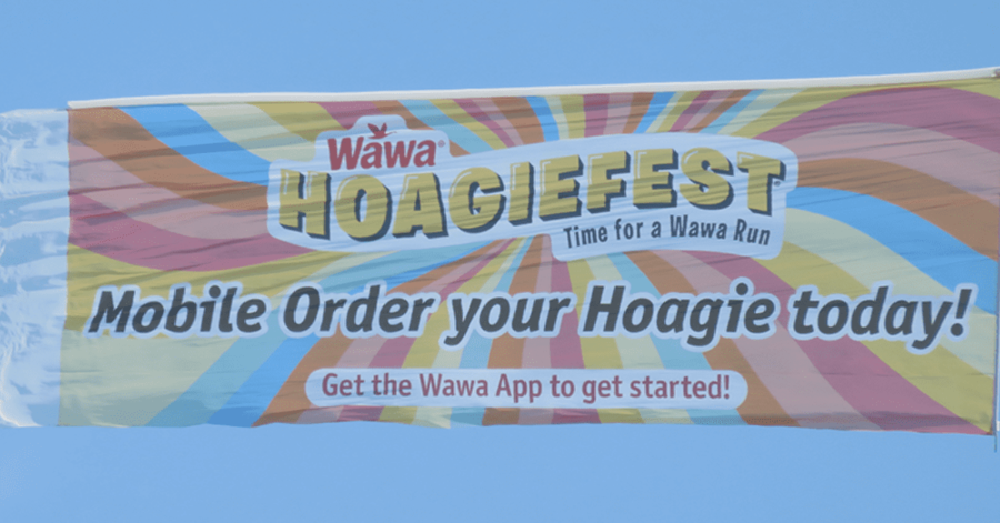
Here’s another colorful one. If you live anywhere on the East Coast, you’re probably familiar with Wawa’s Hoagiefest. Even if you’ve never taken advantage of it yourself, you’ve seen multiple ads for it, including this one.
To create a sense of urgency, the predominance of reds, blues, and yellows rapidly grabs people’s attention. Additionally, you’ll see that Wawa has a unique logo for this recurring event. This establishes a sense of trust, as you’ll likely recognize the logos from Wawa and their Hoagiefest.
9. GEICO
It’s not only the color choice that you must look out for. It’s also the vibrance and saturation. You see, Hoagiefest’s banner is fun, but you might’ve noticed that it’s a bit faded.
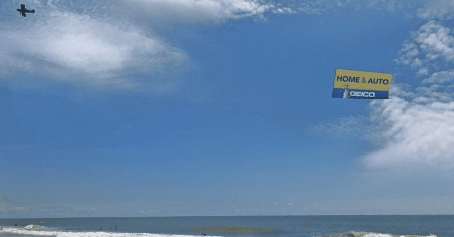
This GEICO ad, on the other hand, works to make sure that its colors stand out. While it only totes the primary blue and yellow colors, it’s enough to draw the human eye.
Not only does it have great colors, but it also includes a mascot. Although GEICO’s character is very famous, any good mascot will draw attention to your banner. Mascots are fun, fresh, and contribute to future brand recognition.
8. Dunkin Donuts
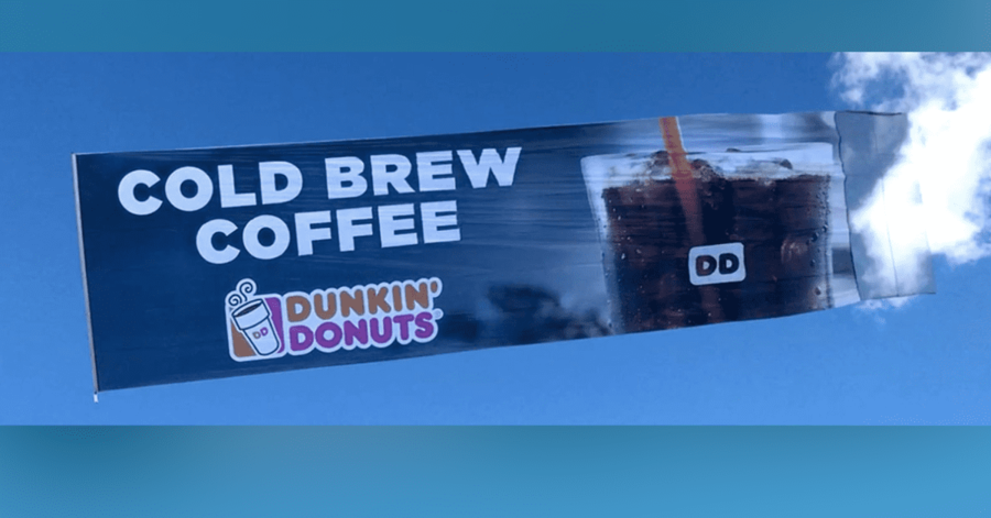
Simple, and to the point. Dunkin’ Donuts is telling you exactly what you want and where to get it.
When advertising any kind of food or beverage, you want to make sure to include imagery. Imagery is the key to igniting people’s taste buds. It doesn’t matter if the real life product is exactly as displayed. If you got a coffee to sell, get a close-up of said coffee, incorporate some detailed editing, and blow it up.
If you’re flying this aircraft on a hot and sunny day, then this will certainly get people’s mouths watering.
7. McDonald’s
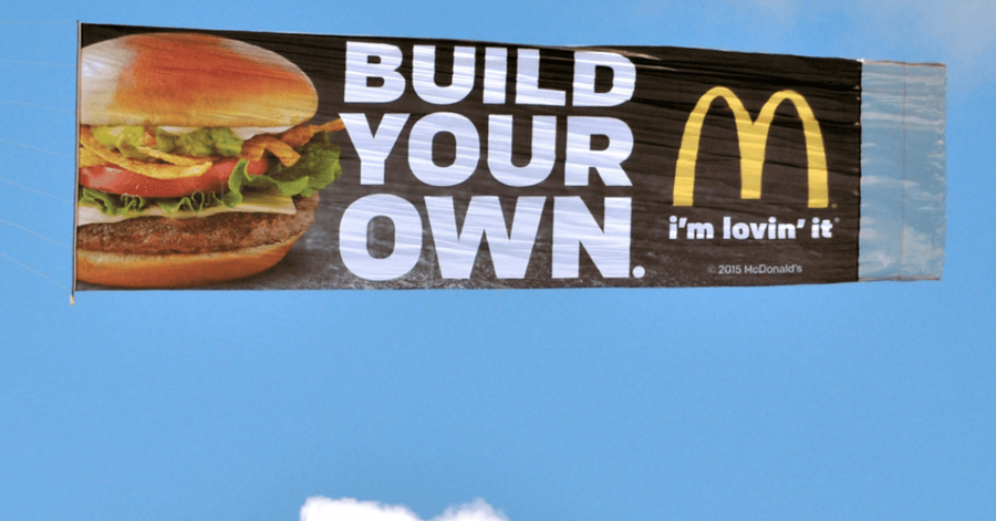
In this example banner towing, Mcdonald’s displays an ad that’s much similar to the previous one. It’s simple and to the point.
McDonald’s, however, uses direction instead of information. What does this mean? Well let’s look at the caption; the phrase “Build Your Own” implies a direct command. It announces that you can create your own burger when you purchase at their restaurant. It’s a simple call to action that includes the necessary information, with the provided logo.
Also, notice that this McDonald’s ad uses a close-up. It instantly invokes a sense of hunger in the viewer, regardless of whether they’ve actually tasted a McDonald’s burger.
6. Branding By Air.com
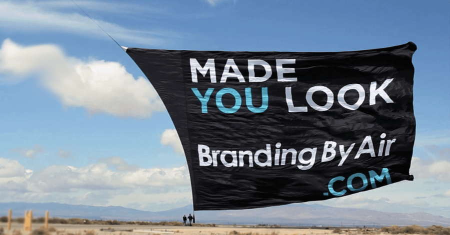
Here is a cheeky example of banner towing, from none other than a banner-towing company.
This is another ad that speaks directly to the viewer. The funny “made you look,” is seemingly unrelated to what it’s advertising. Upon researching things, you’ll find that this company can create the exact banners that initially “made you look.” You can capture people’s attention just as easily as they did yours. It’s honestly quite a clever usage for banner towing.
5. McDonald’s
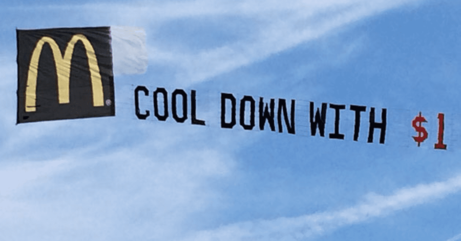
You may think that banner towing solely consists of rectangular flags that wave behind an airplane. While that makes up the bulk of it, aerial banners come in so many shapes and sizes. This is one of the many alternatives.
Instead of a full-on image, you’ve got letters attached thoroughly to a group of strings. This instance of banner towing gives the illusion that these letters are floating in the sky. They seem unattended and unconstrained by gravity.
While it’s very cool to look at, these types of banners normally contain a simple word or phrase. In this case, McDonald’s is displaying its well-recognized logo, while boasting a cheap price.
4. Dunkin Donuts
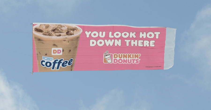
This Dunkin Donuts advertisement does two things at once. Firstly, is addresses the reader in a cheeky and comedic way. Much like a previous example, it acknowledges itself as an aerial ad, taking advantage of the fact that Banner Towing isn’t quite common.
The catchphrase itself reads “You Look Hot Down There,” presenting the viewer with a conflict. The resolution, of course, is in the imagery; a nice cold cup of iced coffee.
3. Sky Ads
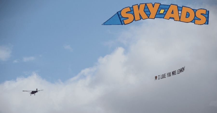
Here’s a beautiful shape created by Sky Ads, another company that provides banner towing services. This advertisement’s very bold with its big yellow logo along with a blue background. It stands out from other banners as it has a curved and slightly triangular shape.
Beneath this logo, another banner is displayed to give an example of what the company can do for you. Overall, this is a solid and unique advertisement.
2. Comedy Central
Comedy Central always knows how to put a smile on your face. It’s kind of their job. It’s no wonder that their sky banner contains the most hilarious caption on this list.
The yellow words along a black background offer a nice sense of contrast. It keeps things simple and doesn’t take away from the core punchline. At the bottom, it displays Comedy Central’s logo, so as to place their channel in the backs of people’s minds.
1. Primo
Of course, you don’t need a quirky catchphrase, a mascot, or reoccurring slogan to make an impactful aerial advertisement. This banner towing example, Primo, is the best on our list. That’s simply because it sticks out in the best ways possible.
It is always said that location matters, and that’s precisely what we see here. Primo decided to advertise their sky banner above a beach. This is where people are having fun, relaxing, and are most likely to grab a cold beer.
So let’s say you’re sitting at the beach, and do you notice the banner. The first thing you’re short to notice is the logo. The logo consists of white text on top of a vibrant, colorful background. Everything has a nice amount of contrast and saturation. This is truly a standout ad, in every way.
Featured Image from flyvalleyaviation.com


