Logos help audiences identify a particular brand. That’s why it’s more important than ever to invest in a unique logo that will attract audiences to your business. And if your business name starts with the letter i, you’re in luck! Here are some letter i logo design ideas you must check out!
The logos you’ll see below were made by our amazing Penji designers! And if any of those logos interest you, and you need a custom one for your business, scroll down below on how to subscribe to Penji!
What to Consider When Creating a Unique Logo

- Identify what makes you different with branding – Aside from your name, what other ways can you distinguish your business from other companies in your niche or industry? You may need to finalize some branding assets, such as typography or a color palette, to help you create a logo unique to your business.
- Take a look at your competitors’ logos – Before creating a unique logo, you also have to look at what your competitors have made. There, you’ll get an idea of the trends in the industry. Plus, you can eclipse your competitors with a better-looking and professional logo.
- Follow the elements of logo design – When designing a logo, there are five main elements to it: uniqueness, relevance, simplicity, memorability, and versatility. Logos aren’t just about adding your business name, colors, and typography there. You have to make sure that it’s relevant and recognizable to your target audience. Plus, you don’t have to make it complicated either. Let your target audience think in one look at what kind of brand you embody and what business you are as well.
- Play with different logo styles – Before deciding on what logo to choose for your business, sometimes you have to look at various designs. For example, you might consider a wordmark. Perhaps, a lettermark or abstract mark is better suited.
1. Ideal Homes
If you want a logo pleasing to the eyes, you can check out this logo for Ideal Homes. Although real estate logo ideas would have more striking colors to get the attention of potential homeowners, this one has a calmer motif. This implies that Ideal Homes can help their clients find a new home stress-free.
2. iDoll
If you have a specific niche in creating stuffed toys, take a look at the iDoll logo. As you can see, there’s a cute teddy bear in the middle of the logo, but it has traced lines on its body, showing us the i for that logo. The teddy bear once again appears next to the wordmark, signaling to the target audience that their business is related to dolls or stuffed toys.
3. igds Technologies
Tech company logos tend to be simple, using only a wordmark. And if you need a professional logo design inspiration, check out this logo for igds Technologies. It meets the components of a good logo design, such as simplicity, relevance, and modernity. Like the igds Technologies logo, why not add a splash of color to your wordmark logo? Remember, the colors you will choose should complement each other. This will make your logo more recognizable to your audience.
4. Immortal Dragons
Here’s one logo that stands out from the rest of this list. The logo for Immortal Dragon shows a dragon seemingly eating a round object upwards, creating the small letter i for this logo. Plus, the medieval-looking typography is also relevant to this logo, which further helps establish its brand identity.
5. Infinite Books
For publishers or bookstores, the Infinite Books logo is a letter I logo idea to look at for your business. It uses a combination mark, where the abstract mark shows a vertical book with a title. The abstract mark appears like a small letter i, and the book looks “infinite,” as per the name of their business.
6. Innovate Web
Here’s another letter I logo idea to check out for tech companies, but this one’s focused on websites. The logo for Innovate Web is a simple and relevant logo idea. To signify “innovate,” the logo has a lightbulb, which could also mean an idea. You will also see a small letter i on the lightbulb. And in color psychology, yellow can inspire people to take action, which is relevant to the business name.
7. Innovator’s Business
If your company is built around inventing products and creating innovations, check out this logo for Innovator’s Business. Similar to Innovate Web, it uses a lightbulb to show that ideas and thoughts are welcome in their business. Plus, you also see the letter i acting as the light bulb, signaling that their business can become the core of new products.
8. Instrumeta
When it comes to music-related logos, we usually see the notes or instruments, such as pianos or violins. And if you want a good example of a relevant logo from that industry, check out this logo for Instrumeta. It uses piano keys and pedals. Plus, the vertical lines are similar to music sheets or strings.
9. Intricate Space
Sometimes, especially with logo design, you don’t have to follow the meaning of your business name, which is the case for Intricate Space. Instead of having a detailed or complicated logo, the logo for Intricate Space is minimalist. You see the i in the logo taking center stage, which appears as a table, and the title looks like a light.
10. Intuxe
Here’s one letter I logo idea you should look at if you want a creative logo. The abstract logo mark shows a silhouette of a person wearing a tuxedo but without the sleeves, so the image is shaped like a small letter i. Meanwhile, the wordmark has a tie on the T as well, showing audiences that both ties and bows go best on tuxes.
11. Ivory Cargo
If you want to go for a simple yet luxurious logo, here’s the logo for Ivory Cargo. The gold gives the logo a luxurious feel, and it signals to customers that they are prestigious and one of the leading logistics providers. Plus, you can also see both small letter i and c added to their abstract mark.
12. Inside Job

The logo for Inside Job is a simple yet communicative design. The letter “I” represents the name pretty well by showing a half-open door. It also doubles as the small letter i’s period. The font choice dwells more on the modern appeal of the overall design. It’s bold and legible even on the smallest branding assets like business cards and stickers.
13. IPS Delivery
For a courier company like IPS Delivery, there is nothing like movement on your logo design that portrays your branding. The beautiful contrast of red and orange colors is a standout as it lets all letters shine. An arrow above the first letter is displayed on top to indicate movement and speed.
14. Ingen Research
This is an educational research company that caters to young professionals. Ingen Research communicates with its target audience by showcasing a logo that does just that. Instead of the letter “I,” the designer incorporated fun and creativity through the magnifying glass icon. This symbol doesn’t dominate the design but weaves into the entire ensemble cohesively.
15. Interplanetary Expeditions

Interplanetary Expeditions uses purple as its primary color. The typography in this logo design is commendable as it takes viewers’ attention. It exudes a modern appeal, suitable for an innovative company like this. Moreover, the brand icon also takes center stage as it leads the design from the top.
16. Itex
Nothing can get much simpler than this logo design Penji made for Itex. Itex is a gadget brand that sells every portable gadget imaginable. For a tech brand, this logo looks straightforward, communicating the brand’s offers.
17. Inka’s Cocktails
This food and beverage company takes on a traditional approach to a cocktail logo design. Inka’s Cocktails uses a serif font and dwells on color contrast to make each word stand out. The flat illustration icon of a martini glass seals the overall design in a fun and bright way, perfect for cocktail lovers.
18. Inflation Inc.
This car repair and service company features tools in its logo design. Inflation Inc. makes sure its target audience can identify what kind of company they are. And this is why a bold and straightforward font complements a wrench and two tires on both sides of the wrench.
19. Incom Incorporation

Your company logo should have the right vibe so your prospects can get a feel of your brand personality. Some brands may need to keep design elements subtle, especially if the branding is formal. Incom Incorporation is a telecommunications company that does this precisely. It shows a well-thought-out combination of text, colors, and icons, which makes this logo work.
20. Infinite Investments

What better way to represent Infinite Investments’s business than to feature an infinity symbol? This logo design gives way to symmetry and visual representation. Brands can only stand out from competitors if they create something familiar but still think outside the box while at it. And this logo is one such example.
21. Initech Office Space
Initech is a real estate company catering to business owners and entrepreneurs who want to lease office space. They offer a few listings in various areas, and future tenants can choose an office space through this company. The beautiful hues of purple and sky blue allow the logo to pop, making this design perfect for medium- and large-sized marketing materials.
22. Ignatius National High School
This logo design screams authority and credibility. First, the impressive emblem captures your attention. It is coupled with perfectly-balanced typography, with two various and distinct sans serif typefaces. The symbol is also worth noting as it carries all essential elements without overcrowding.
23. Irvin’s Laundry Services
Nothing can get even more straightforward than this. Irvin’s Laundry Services is your go-to place for quick and reliable laundry. The logo offers relaxed and playful vibes that seemingly attract prospects to drop laundry here.
24. Implement Law & Order Firm
Impement Law & Order Firm’s logo design exudes an air of trustworthiness, apt for a law office. It’s enough to keep the target audience engaged and appeased. Also, the color choice is suitable for a law firm like this, as gold is a symbol of success and affluence.
25. Izon Defense

For a company that sells guns, Izon Defense keeps its offerings and branding solid by donning this simple yet visually appealing logo. The creative genius behind this logo turned the first two letters of the brand into a gun symbol. Abstract logos are still a trend, provided the conceptual design doesn’t confuse the target audience.
26. UIX Inc.

UIX Inc. is another tech company selling gadgets and tech repair services. The typographical logo is good enough to stand out on branding and marketing collaterals. Tech companies must keep their logo design clear to avoid misinterpreting their brand identity.
27. Inversion Airlines
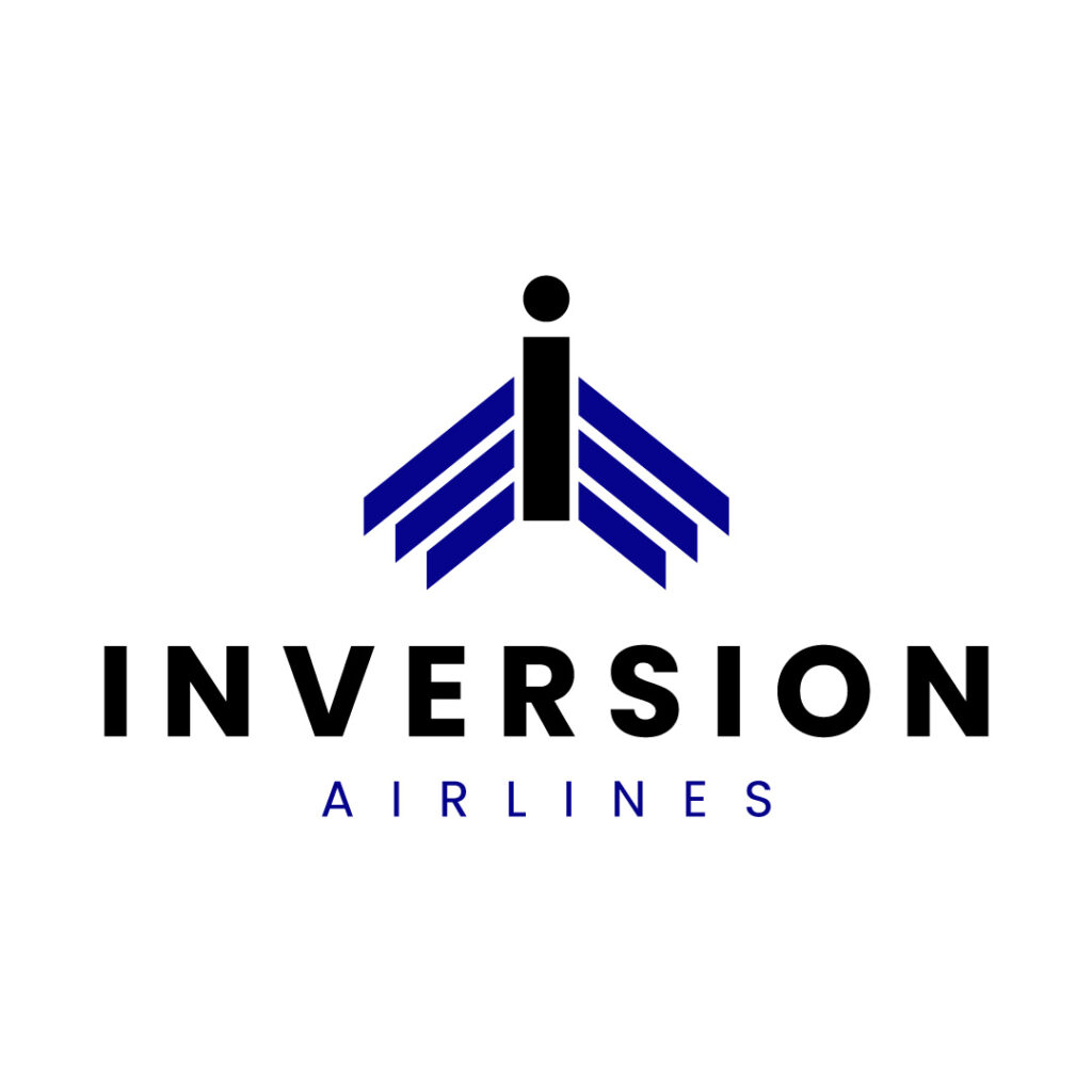
As you can see on Inversion Airlines’s logo design, the letter “I” also doubles as an airplane. It’s the first design component viewers will notice once they feast their eyes on this logo. Combining bold and light-faced fonts is also a way to keep the entire design coherent.
28. Impact Records

Impact Records’s logo design undeniably impacts prospects due to its eye-catching components. First, the red semi-circles surrounding the letter “I” instantly hook the eyes. Paired with a unique sans serif font, the text complements the icon cohesively.
29. Impaired Capital Investments
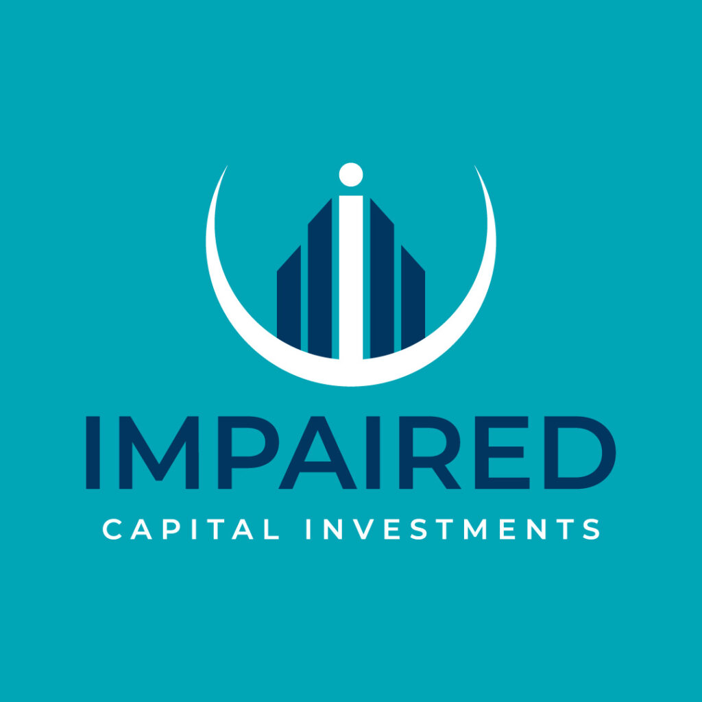
Impaired Capital Investments’s logo design offers an exciting twist to represent a financial company. It dons an icon showing the small letter “i” in the middle. But if you look closely, the letter also looks like a person standing tall and proud. Behind the letter is an abstract symbol of a building tied together by a white half-circle.
30. Indian Burger
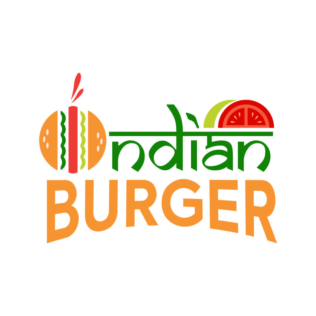
This burger restaurant offers a fun take on its logo design. Indian Burger has all the makings of a memorable logo that sticks in hungry consumers’ minds. The different colors welcome consumers through their cheerful and warm appeal. Although this design has many components, the most crucial text in green stands out the most and takes you to India.
31. Ignite Productions
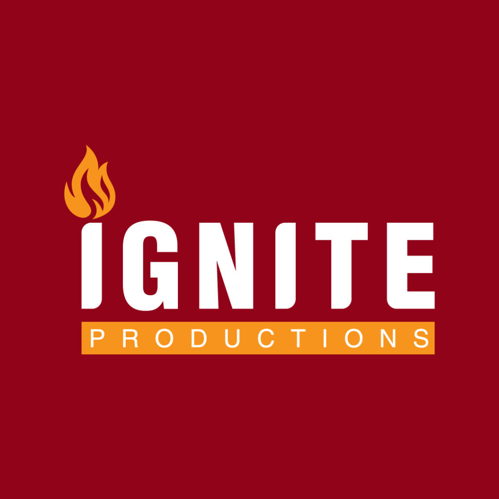
Ignite Productions keeps its logo design simple and clean with the brand name and a flame on top of the I. The color orange also gives it contrast by accompanying the white text. The font choice for the word “Ignite” suits an innovative movie production company such as this one.
Subscribe to Penji to Get Your Logo Design
If you need a custom logo for your business, you’ve landed on the right blog. Penji has the best designers to help you create a logo tailored to your business. What’s more, you can also request other branding designs for your business here. No need to find another designer to help you with your logo or branding needs. And if you’re ready to subscribe, just click here, and select the plan you need to start when requesting your new logo!
About the author

Katrina Pascual
Katrina is a content writer specializing in graphic design, marketing, social media, and technology. In her spare time, she writes monthly personal blogs to practice her craft.
Table of Contents
- What to Consider When Creating a Unique Logo
- 1. Ideal Homes
- 2. iDoll
- 3. igds Technologies
- 4. Immortal Dragons
- 5. Infinite Books
- 6. Innovate Web
- 7. Innovator’s Business
- 8. Instrumeta
- 9. Intricate Space
- 10. Intuxe
- 11. Ivory Cargo
- 12. Inside Job
- 13. IPS Delivery
- 14. Ingen Research
- 15. Interplanetary Expeditions
- 16. Itex
- 17. Inka’s Cocktails
- 18. Inflation Inc.
- 19. Incom Incorporation
- 20. Infinite Investments
- 21. Initech Office Space
- 22. Ignatius National High School
- 23. Irvin’s Laundry Services
- 24. Implement Law & Order Firm
- 25. Izon Defense
- 26. UIX Inc.
- 27. Inversion Airlines
- 28. Impact Records
- 29. Impaired Capital Investments
- 30. Indian Burger
- 31. Ignite Productions
- Subscribe to Penji to Get Your Logo Design

