Now, more than ever, eCommerce has dominated the world. Even the known brick-and-mortar stores are building their websites to penetrate a huge portion of the market. However, just putting up an eCommerce website isn’t enough. One should consider the principles of eCommerce UX design to ensure that potential customers will have the best experience using your website.
What to Include in eCommerce UX Design
If you want your eCommerce website to generate sales, here are the most important things you have to include in your UX design.
Intuitive Navigation
Back in the day, website owners are more particular about the aesthetic appeal of their website. That’s why they would use amazing photos or include jaw-dropping animations in the design. But things have changed in recent years. You are not just promoting your product since your website acts as an avenue where people could buy from it.
When designing a website, you must think about how easy it should be to navigate through different web pages. Ask yourself the following.
- Will they be able to see the menu clearly?
- Can they choose the right items without leaving the page?
- Are they able to read the description without clicking several buttons?
- Can they filter their choices easily?
- Is the checkout process seamless?
Let’s look at it this way. When you are in a physical store, and it’s hard to find items or the cashier is just too slow, you get turned off. Unless what you are buying is unique, you would rather leave the store. That’s the same principle here, and that is why building an intuitive eCommerce UX design is a must.
On-Site Search
We’ve noticed that most eCommerce websites still do not have a general search function. But you have to remember that when a visitor goes to your website, chances are, they are already looking for something. If your only option is to use the filter, it will take several seconds to find what they need. Remember, when we are talking about a good eCommerce UX design, we are all about efficiency.
Add Filters
Of course, a filter option is good too. If your visitor wants to see multiple options for a category, this could work best. For example, if you are selling clothes, you can filter them by size, color, or even price. And in the case of websites similar to Airbnb, you can use filters such as the number of beds, facilities, or parking.
As always, put yourself in the shoes of your potential customers.
Use Progressive Disclosure
When working on an eCommerce UX design, adding lengthy texts or product descriptions can be a sore. And that is why the use of progressive disclosure techniques has become a common practice.
This is where a secondary screen shows up if a visitor wishes to see more information about the product. At the onset, you will only have access to the essential details of the item.
Clearly Display Action Buttons
A seamless eCommerce UX design should leave your visitors the smallest window to think. This means your design must direct them to the next best logical move. In that case, place all the action buttons accordingly. Your checkout buttons or add to cart must be visible enough for them to click.
Ignore one of these tips and expect a high bounce rate. If you notice that people are leaving your website, it isn’t just about your products. It could be how you designed your website or app.
Samples of the Most Successful eCommerce UX Design
If you want inspiration, here are the best samples for this year. Follow their lead, and you will be making huge sales just like them.
POGG
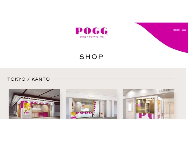
Who would have thought that a sweet potato pie can have a great eCommerce website? POGG is not just visually appealing, you can also easily navigate through their website. What’s good is that they included the maps of their store locations.
For those with physical stores, maps are a useful feature. It could bring sales both online and offline.
Hebe
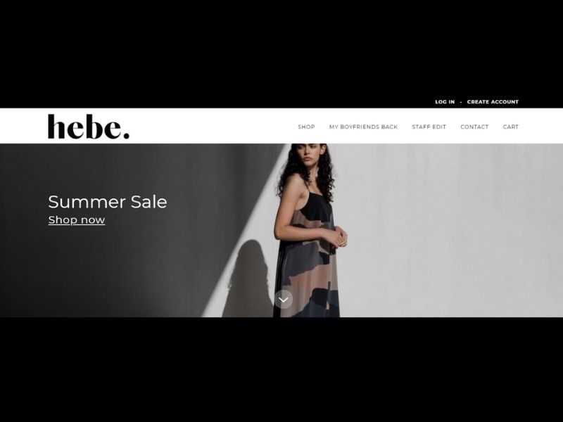
Take a look at hebe.’s website. As you scroll down through their platform, you will initially see their featured products with their price. It makes it easier to filter which ones are ideal for your budget. Plus, instead of just using plain photos of their clothes, they used models so buyers could have an idea of what it would look like if the items are already worn.
If you go to their SHOP menu, you can easily filter the choices. If you want to check their accessories, dresses, tops, or even selections under $50, you can easily do that.
Away
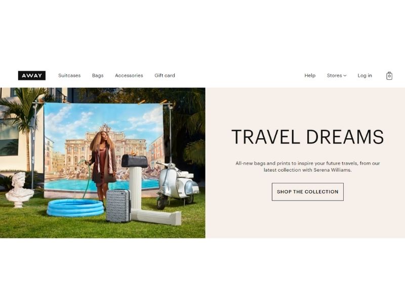
One of our favorites is Away’s website. The platform is straightforward, and you can quickly go to the items you wish to check out. If you go to their Suitcases menu, you will see several options lined up perfectly. And as you hover to the product, you can see the available colors, making it easier to choose and buy.
Allbirds
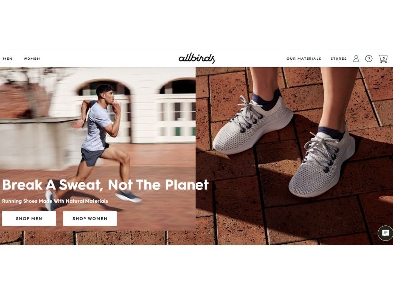
What we love about Allbirds’ site is their homepage that has two clear buttons where you can see SHOP MEN and SHOP WOMEN. This is perfect for eCommerce with different markets. They also use the progressive disclosure technique, where they highlighted first the best features. And if you wish to see more, you just have to click the arrows.
Amazon
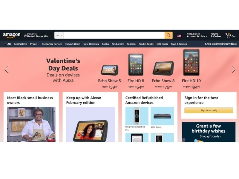
Amazon became an eCommerce giant for a reason. Even with thousands of products in their database, you can easily find what you are looking for. Remember how we emphasized the importance of the search feature? Amazon used that to their advantage.
Using Penji for eCommerce UX Design
We have to be straightforward. Only professionals can provide you with an eCommerce UX design that could generate sales. Sure, there are many designers out there. But the real question is, can they deliver? Are you going to achieve your business goals?
It’s crucial that you choose designers that have extensive experience in eCommerce UX design. The Penji team is one of the few that could handle your needs. They can create the best design for your website and app that ensures the best experience for your online customers.