
The best university logos are those that project a welcoming feel to visitors, students, and faculty. Just as with any business, educational institutions will also benefit from a well-designed brand identity. Here are 20 university logos that you can get ideas from for the brand recognition your organization needs:
1. University of Notre Dame
The University of Notre Dame has one of the most recognizable education logos. This logo is composed of its initials, N and D, overlapping. Try to avoid overcomplicating your design and sticking to the basics.
2. Harvard University

Mottos and symbols are ingrained into history. Consider Harvard University’s logo. The shield and saying “veritas,” meaning truth, had been used to symbolize Harvard for over two hundred years before becoming a part of the official logo.
3. The State University of New York
This logo plays on the word “sunny,” emphasizing the circle that surrounds it. Can you use your institution’s initials to make a logo that is a play on words?
4. American University
Color meaning plays an important role in the best university logos. American University’s logo is reminiscent of the colors of the United States. It contains the letter A and U in white, set by a square that is red and blue. The colors symbolize ties to America.
5. The University of Texas

Consider picking something fierce to represent your educational institution. The University of Texas chose a longhorn bull to represent all of its sports teams. This logo is unlike any other university logo and can be easily identified. The logo’s eccentric look and vibrant colors help it stick out.
6. Michigan State University
What does your school stand for? In MSU’s case, tenacious, bold, and world-changing were phrases that came to mind. The school’s use of a Spartan as its logo reflects the message they wish to share.
7. Yale University

Perhaps one of the simplest logos, Yale University’s logo is simply “Yale.” The logo contains no fancy font or creative wordplay. The logo promotes transparency. While it may seem like minimal effort was given, this strategy is crucial to the institution’s branding. Yale University has become a household name for its academic strides and achievements. When creating your own logo, avoid creating one so over-the-top that it takes away from your school’s achievements.
8. Stanford University
Stanford’s logo, a redwood tree, pays homage to the county in which the school is located. Consider how your education logo design can pay homage to your local area.
9. University of Miami
Most schools avoid using the U in University to create their logo. However, the University of Miami has changed the game with the use of this letter. Their iconic logo features a U that is half orange and half green.
10. Ohio State University
Known nationally for its block letters, OSU’s logo is like no other. It’s one of the best university logos because it shows how the organization of your typography can impact recognition.
11. Pennsylvania State University

The Penn State logo features the Nittany Lion upon a shield. The Nittany Lion is a statue that was gifted to the University over half a century ago. It symbolizes pride among students and faculty of the institution.
12. Angelo State University

This educational logo design combines both the university’s initials as well as its school Mascot, the Ram. This creative composition helps distinguish the school from Arizona State University, which shares the same initials.
13. John Hopkins University

This iconic University is known around the world for its ground-breaking education and research. Because of this, the school chose a logo that promotes its global outlook on education, knowledge, and research.
14. Princeton University
Princeton University is an Ivy League school known for its research and historic significance. Their iconic logo features a shield. What makes their education logo memorable is the use of vividly contrasting colors. Placing orange and black next to each other creates a visual appeal. The logo includes a ribbon that’s lettering translates to “Under God’s power she flourishes.” This saying unites all the people who have been positively impacted by the school’s 300-plus years of operation.
15. University of Central Florida

The University of Central Florida is a public state institution located in Orlando, Florida. They are one of only a handful of schools that have chosen to use a mythical creature for their logo. Their education design logo includes a winged horse called a Pegasus. The emblem is designed well to fit into a circle and is composed of a bright yellow set by black undertones. This color combo allows the logo to pop even more.
16. Cornell University
This logo looks very scholarly but sleek at the same time. Cornell actually has two logos: the first is more intricate with hollow forms for ceremonial use. The second (pictured above) is the simplified version and is used for digital media.
17. University of California, Berkeley
UC Berkeley takes pride in its logo and reiterates that it acts as its “signature, an identifier and a stamp of quality.” The logo, which uses a combination of serif and sans serif fonts, is used for both digital and print materials.
18. Massachusetts Institute of Technology (MIT)

MIT’s logo is a series of long black and red bars that spell out the words. It’s a unique way of spelling out a name while making the mark look modern and straightforward. MIT uses this logo from its print materials to stationery and t-shirts.
19. Johns Hopkins University

This logo was created in 2013, with images based on their official seal. According to their website, the globe represents their worldwide reach while the book signifies discovery and knowledge. The crest of Lord Baltimore, on the other hand, represents their connection and commitment to the community.
20. New York University
When it comes to simplicity, this logo surely takes the cake. The logo shows the “torch of learning.” According to NYU’s website, the group of four running figures in the logo symbolizes effort in the pursuit of learning.
How do you create a university logo?
The university logo creation process takes time and creative strategy. The best way to get a professional logo is by hiring a logo designer. But, here’s a rundown on how to make one:
- Assess your university’s personality
- Gather symbols, icons, patterns, colors, or typography that best represent your university
- Put all relevant and unique elements together and sketch a couple of logo examples
- Check if your university logo is memorable, unique, scalable, simple, and relevant
- Finalize the design on a design software or hire professionals and download the source file
What is a university logo?
A university logo is a symbol of the educational institution and the quality and type of education it provides to students. Moreover, a university logo also conveys a university’s personality, values, vision, mission, principles, and overall identity. It must comprise various design elements such as emblems or shields for more traditional institutions, or minimalist lines and symbols for modern institutions.
What is a university font called?
The overall font of a university logo can be defined as the institution’s typography. It consists of various typefaces in similar or different font families. Some examples of the most commonly used university fonts are:
- Univers
- Arial
- Adobe Caslon Pro
- Times New Roman
- Calbiri
How to Request a University Logo Design with Penji
Get a modern university logo design that will establish a connection with students and make them proud of their Alma Mater.
Create a New Project
Start the journey of getting a new logo design by clicking Create New Project on your Penji dashboard. Then, select “Logo” when the next page has loaded.
Provide Details of Your Logo Design
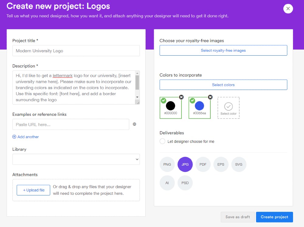
You will then see a page where you have to fill in information about your custom logo design. Be clear on the design requirements you have like color, size, logo type, etc. This way, you won’t encounter any miscommunication issues with your designer.
Review the University Logo Design
You’ll finally get a notification that the design is ready for your review. In most cases, you might have to ask your designer to revise your design. Provide feedback until you’re satisfied since on any Penji plan, you’re entitled to unlimited revisions.
Download and Mark as Complete
Once you receive a design that meets your standards and requirements, you can download the logo. This way, you can immediately add it to your branding and marketing materials.
Of course, you might need more than just a logo for your university. You want to promote your university through advertisements, banners, brochures, or flyers. So, go ahead and request that and add it to your queue. This way, a designer will work on it as soon as they can.
Sign Up with Penji for Unlimited Designs
Get your university branding and marketing needs by signing up for a Penji subscription.
You will no longer spend money on hiring a freelancer or a full-time graphic designer on your team. We take that out of the equation and ensure you’ll work only with the best expert designers. You can guarantee high-quality and unlimited designs no matter what tier of the plan you choose.
There’s no contract, so you can cancel your subscription anytime.
To learn more about the Penji platform and what else our designs can create for your university, find a clear time on your calendar to watch a demo. Learn how the Penji platform works, and see how we differ from other graphic design services.
About the author

Danielle Cloud
Danielle is a Digital Marketing Intern & Content Writer. She has a collegiate background in economics and marketing, and career experience in brand ambassadorship and marketing research.
Table of Contents
- 1. University of Notre Dame
- 2. Harvard University
- 3. The State University of New York
- 4. American University
- 5. The University of Texas
- 6. Michigan State University
- 7. Yale University
- 8. Stanford University
- 9. University of Miami
- 10. Ohio State University
- 11. Pennsylvania State University
- 12. Angelo State University
- 13. John Hopkins University
- 14. Princeton University
- 15. University of Central Florida
- 16. Cornell University
- 17. University of California, Berkeley
- 18. Massachusetts Institute of Technology (MIT)
- 19. Johns Hopkins University
- 20. New York University
- How do you create a university logo?
- What is a university logo?
- What is a university font called?
- How to Request a University Logo Design with Penji
- Sign Up with Penji for Unlimited Designs


