Since it was created back in the mid-’80s, PowerPoint has become a powerful tool for businesses. By allowing people to create professional and engaging slideshows, it enabled them to share ideas and strategies much more effectively than using traditional methods.
These days, however, it’s easy to take PowerPoint for granted. As a result, most people don’t put the time and energy into their PowerPoint slides as they should. Many times, the presentation is lacking on a fundamental level, all because the person who crafted the slides didn’t know how to show the information effectively.
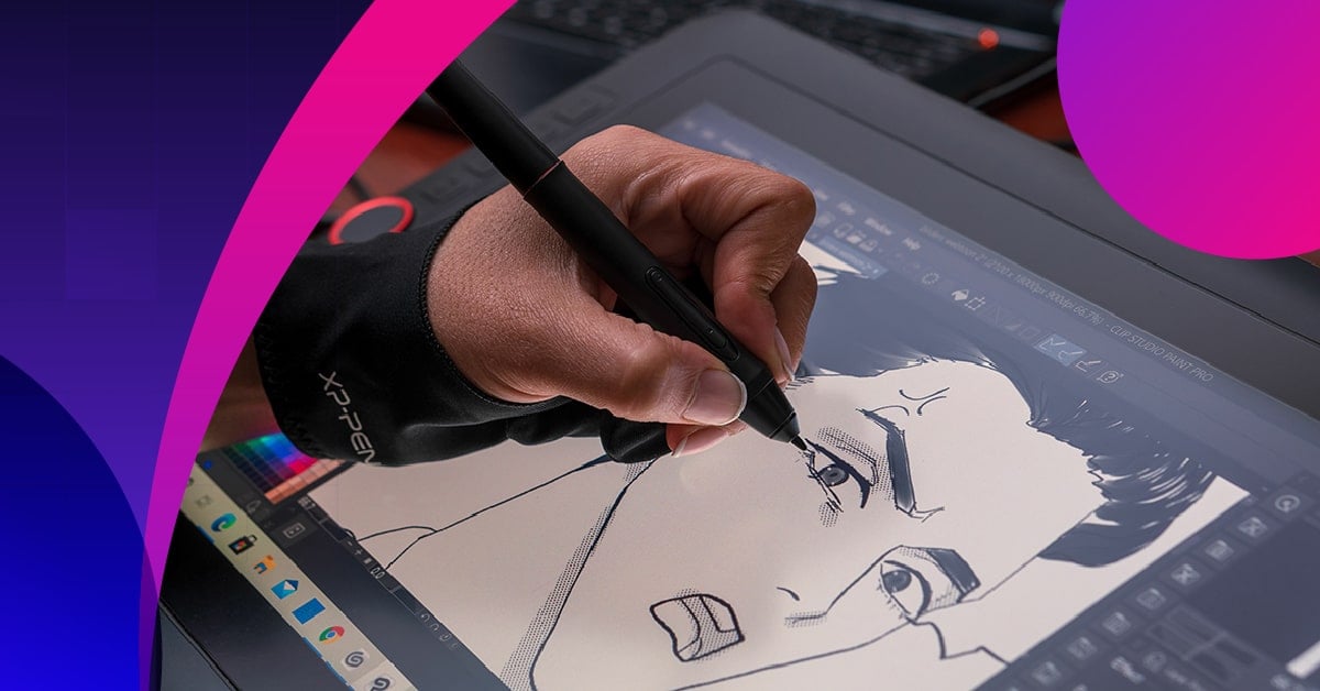
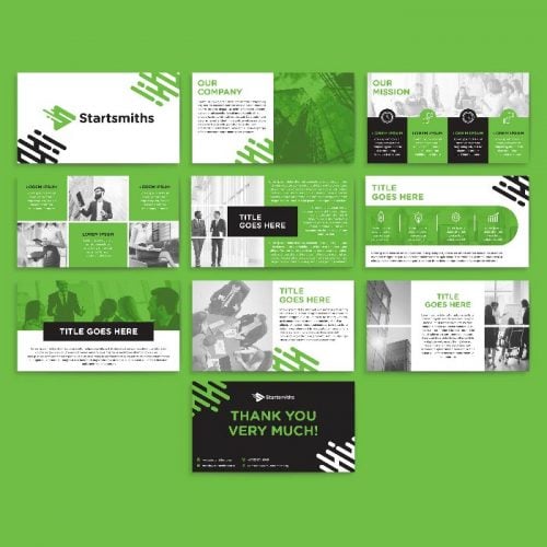
If you need well-designed PowerPoints, Penji is the best graphic design service for the job. Penji is an unlimited graphic design service. This means you can request different designs, such as business cards, merchandise, and so on. Rest assured, you’ll always get well-designed visuals from Penji. Discover what our designers have produced for our clients.
In the meantime, we’re going to discuss the top things to avoid when creating PowerPoint slides. As long as you don’t make these rookie mistakes, you should be able to hold the attention of everyone in the meeting.
Resources:
- Infographic on how to get more traffic for your website
- Unlimited graphic design startup that helps small businesses save $4789 per year
Too Many Pictures

Images and graphics are undoubtedly helpful for PowerPoint slides, especially to those that use PowerPoint. However, there is a point where the PowerPoint slides are too saturated, meaning that it’ll be much harder to retain the vital information contained therein.
The basic rule to follow here is “less is more.” Too many pictures or graphics can make the slides feel overloaded, which can reduce the impact of each one. With too much going on, viewers will instead tune out since they can’t focus on anything in particular.
So, to avoid this issue, make sure to choose the images that are most impactful to your presentation, and let them speak for themselves. Give each picture room to engage the viewer, and make sure that they are clear and easy to see.
Also, pay attention to things like contrast and color schemes, as they can drastically affect how the images are perceived.
Unnecessary Text
If too many graphics can overwhelm your project, then you can imagine the impact that an abundance of text can have as well. For the most part, people don’t want to read too much when looking at slides, so only use the text that is most necessary for your presentation.
A good rule to follow is to remove any redundancies that would otherwise be covered in your discussion. Since you will be narrating and providing commentary on the slides, you shouldn’t include text that will mimic what you’ll be saying.
With that in mind, however, there is another factor to consider. When it comes to stats and figures, it helps to have them listed on a slide, even if you are going to recite them as well. This is because most people can’t comprehend abstract concepts like numerical values without seeing them. As such, if you don’t include them in your slides, it can be harder to retain the information.
Overall, just make sure that your oral presentation is adding new information that isn’t on the slide. Use them as a means of enhancing what you’re saying, rather than relying on them to carry the majority of your text.
Clutter

When creating PowerPoint slides, remember that it’s always better to use more slides to spread the information out. Even though it may seem like more work on your end, it will create better results and engage your audience more than if you tried to condense it.
One method that you can use to determine if a slide is too cluttered or if it’s overloaded with information is to flash it on the screen for just 10 seconds. If you’re not able to tell what happened in that time, then chances are that you need to revise it.
Even though you can control the speed and allow your audience enough time to process what’s one each slide, this method will still significantly improve the overall message. Since everyone reads and absorbs information at his or her own pace, it’s better to appeal to the lowest common denominator in this situation.
Another thing to remember is that if you’re in doubt, change it. If you’re not sure if a slide is too cluttered, then just make adjustments to streamline it even further. As long as you’re not spreading it too thin (i.e., one sentence per slide), you shouldn’t have to worry about it.
Create winning presentations
Make a lasting impression with custom designed pitch decks and WIN that proposal.
Pick a plan![]()
![]()
![]()
![]()
![]()
![]()
![]()
![]()
![]()
![]()
![]()
![]()


Animated Transitions
This is where a lot of amateurs get hung up. Usually, the line of thinking is that you need something to catch the eye to keep people engaged. However, what typically winds up happening is that the audience starts to zone out, or the information becomes confusing because there is too much going on.
For example, having moving text on each slide will significantly lessen the impact that it has on the viewer. Reading and retaining information is hard enough as it is, but when you add animation to the mix, it becomes nearly impossible.
Once again, less is more. Overloading your presentation with too many transitions will make it feel too gimmicky, which will turn your audience off to what you have to say. Instead, keep things professional and straightforward, and only use animation if it’s necessary, or if it fits perfectly with the images or text you’re presenting.
For example, if you have a headline that reads “Falling Prices,” you can have it drop from the top of the screen to enhance its impact. However, only headlines or single lines of text work well with transitions, since there isn’t too much information to process at once.
Poor Color Choices

Although you don’t have to take an advanced course on color theory, it’s helpful to understand how colors interact with each other so that you can utilize them effectively. Here is a quick rundown of what to consider when picking out a color palette for your presentation.
Complementary vs. Analogous Colors
Hues that sit on opposite sides of the color wheel will stand out more when placed together. Green and red, for example, create a more dynamic image when they are adjacent, which can catch the eye more easily.
Conversely, colors that sit together on the wheel are more harmonious with each other. They can be classified as warm (exciting), cool (calming), or neutral, depending on where they are. Red and orange, for example, qualify as warm colors.
For the most part, analogous and neutral colors are the best way to go. You can break up your color palette with some warm or cool hues every so often, but usually, they will overwhelm your audience rather than engage them. Remember, there is already a lot to process with images and text, so don’t add even more stimulation by putting bold or harsh colors in the background.
Color and Text
Another thing to remember is how readable your text will be in certain colors. If they clash, or if they are too similar, then it will be much harder to read. For example, black text on a red background is harder to read than if it were on a blue or green background. No matter what, never use complementary colors in your text, as it will make it much more challenging to process what it says.
Unnecessary Sound

Your audience will almost always assume that your project is going to be silent, at least with regard to what’s happening on screen. Your voice should be the only sound during your presentation, so don’t add any effects to the slides.
If you are going to add sound, then you better know what you’re doing. Don’t just add an effect because you think it will be cool or you hope that it will engage your audience. When in doubt, cut it from the presentation. Since no one is expecting any extra noises to happen during your project, you’re under no obligation to put them there.
Comic Sans (or Other Terrible Fonts)
On the surface, it may seem like the hatred surrounding Comic Sans is unjustified. However, the reason behind it is that it creates an amateurish vibe to your whole presentation. Just as generic clip art can feel too “sterile” and cliche, fonts like Comic Sans have the same effect.
When picking out text for your PowerPoint slides, just stick to professional and easy to read fonts like Helvetica or Arial. Fonts with a serif (like Times New Roman) are usually a bad idea because they can be harder to read when projected on the screen, so try to use non-serifed text instead.
Another reason that Comic Sans is so despised is that it’s a weak attempt to break the mold. Since it’s a default option with most word processing software, it implies that you didn’t take any time to find a more suitable choice.
So, if you’re going to try to utilize different fonts to enhance your presentation, put a little more effort into it. Search around for other options that can be more meaningful than the default ones that come with the program.
Too Much Text
Finally, you want to avoid large blocks of text anywhere in your presentation. A good rule to follow is that you shouldn’t have more than three lines for each paragraph. Any more than that and it will be much harder for your audience to process all of the information. Instead, they will probably skim it and miss most of the key points that you’re trying to get across.
How to Request for Effective and Well-Designed Powerpoints?
Receive a well-designed presentation in three easy steps by using the all-in-one Penji platform.
1. Create a Project
Head on over to the Penji dashboard and click New Project. You will then be directed to a new page where you can provide your design details.
Make sure to supply a Project Title and choose a Design Category. Since you’ll request for a Presentation, click Presentation & Pitch Deck.
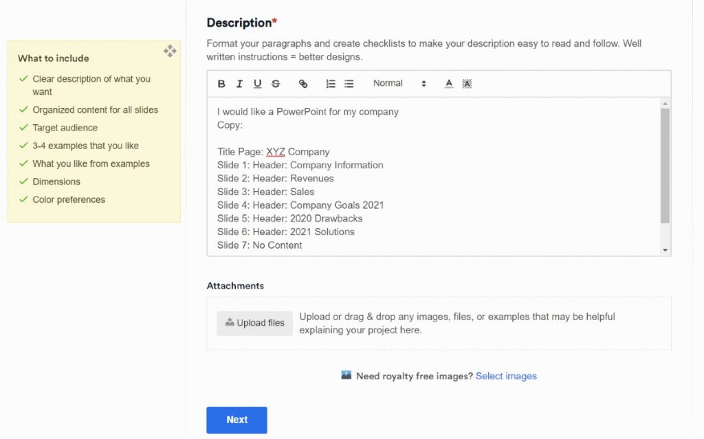
From there, you may choose the dimensions of your presentation. Choose Custom if you have custom dimensions. Select the Number of Slides from the drop-down menu. You may also skip this, but make sure to specify the size and number of slides on the Description.
On the Description, provide the design brief and follow the What to Include guidelines. This way, your designer knows how to produce an effective presentation design.
Once you submit it, a designer will be assigned to your project. They can submit and provide the first drafts within 24 to 48 hours.
2: Review and Provide Feedback
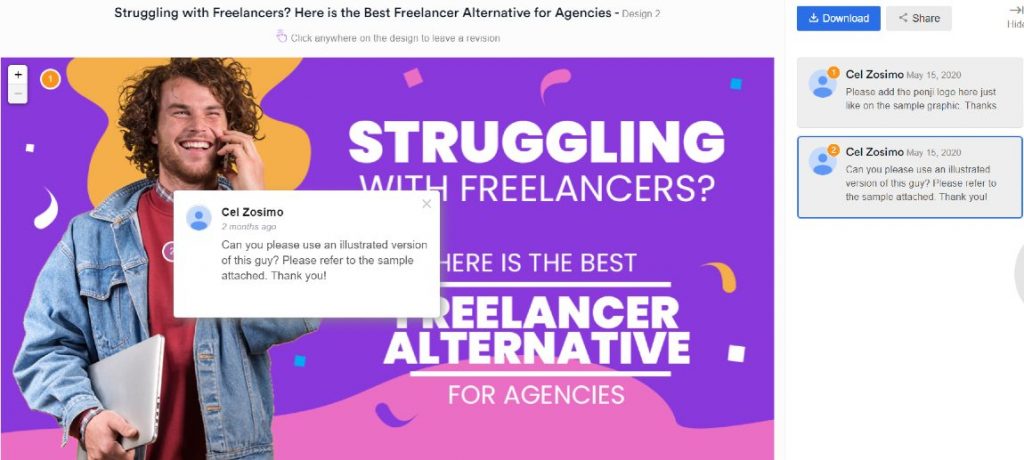
Once you receive the first draft, you can let the designer know if it needs revisions. You can message the designer or use the point-and-click feature. This alerts the designer on how they can improve the work until you’re satisfied. Plus, you have unlimited revisions too. So, you can review it until you’re 100% happy with it. No hidden fees. No extra costs.
3: Download the Design
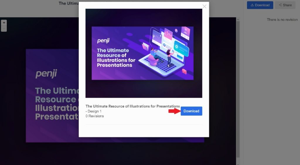
When you get the design you love, just click Download, and the design is yours! Once the files are downloaded, you have complete ownership too. Plus, you can download the design again if needed. We store your files on the Penji cloud, and you can download it again on the Penji platform.
Bottom Line
When making PowerPoint slides, try to approach it from a design standpoint rather than an informational one. Think of each slide as an image, not a means of sharing information. By that, we mean that you should pay more attention to framing, composition, and aesthetics than anything else. This will ensure that you avoid most or all of these mistakes, and it will make your PowerPoint slides much easier to follow in the end.
You can leave the designing to Penji while you focus on your business. You can rest easy with dependable and vetted Penji designers. Plus, they ensure that you receive the best designs half the time, unlike other graphic design services. You won’t have a bad experience while subscribing to Penji.
Get started on the Team plan. For only $499/mo, receive website designs, custom illustrations, among others. You won’t have to subscribe to another plan to get those designs. It’s all integrated into an all-inclusive, affordable plan. Sign up now and try the platform free for 15 days!